Principles
Responsive and harmonious structure
The grid system adapts seamlessly across devices, creating a harmonious and balanced structure. This ensures that from the smallest phone to the largest desktop, the design retains its integrity, offering a consistent and engaging user experience.
Adaptable and intuitive design
Embracing the diversity of screen sizes, the grid layout is intuitively adaptable. It naturally transitions to a vertical stack on smaller screens, ensuring clarity and ease of navigation.
Creative flexibility with purpose
The use of nested grids offers creative flexibility while maintaining purposeful design. This approach allows for intricate and varied layouts, all while ensuring that each design decision is aligned with the needs of the user at every breakpoint.
Characteristics
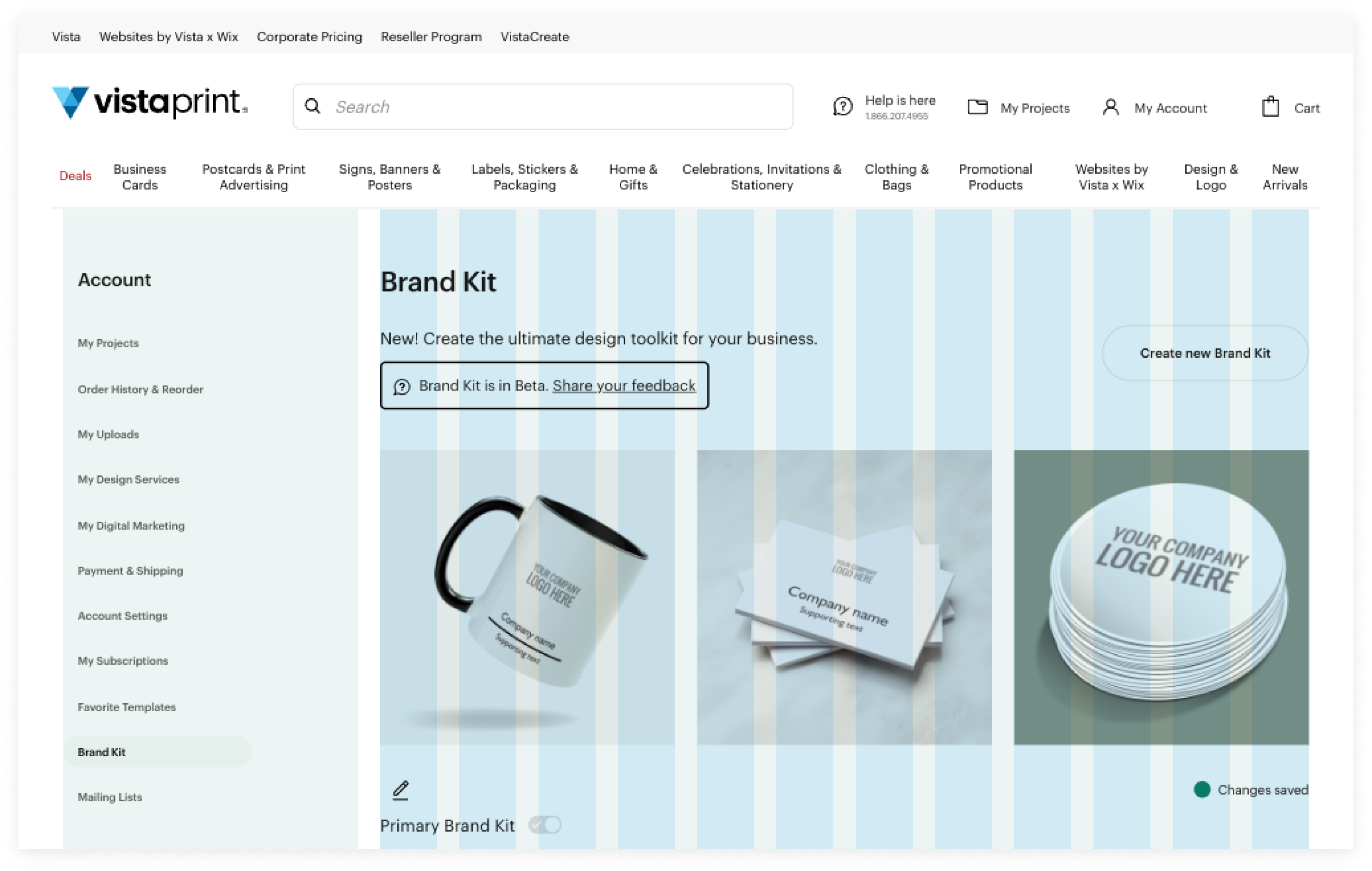
- The Grid is divided into 12 equal-width Columns. Common layouts include evenly divided spaces, such as three 4-column or two 6-column segments, but you have the flexibility to divide them as needed.
- The Grid features fluid widths for its columns so as the overall grid width increases, the columns proportionally expand as well.
- The Grid's Gutter (between elements) and the Bounded Content padding (around the entire Grid) vary with screen size, providing larger screens with more whitespace.
- The Grid allows for Nested grids to create more flexible layouts.
Refer to Grid’s Usage.
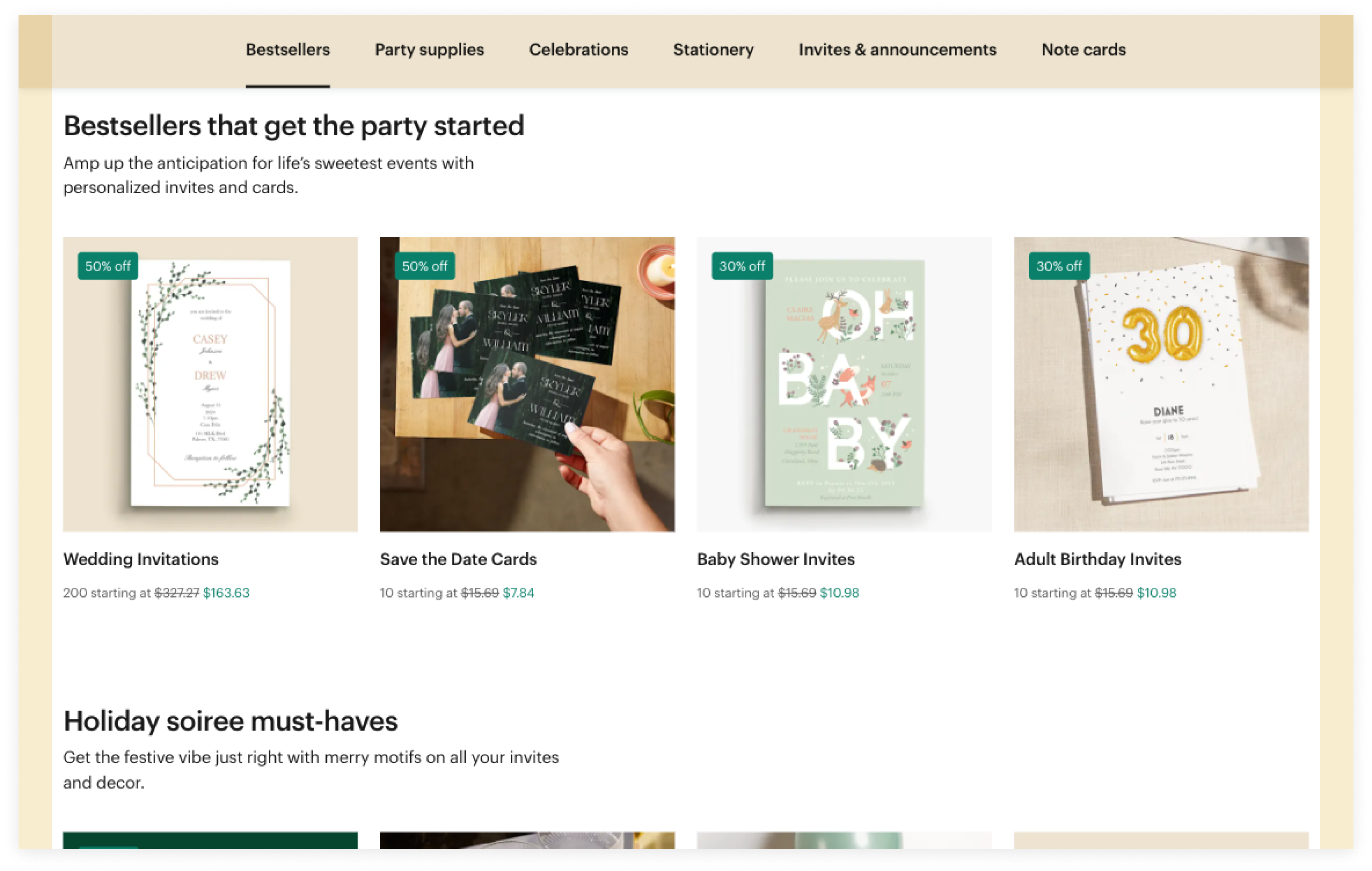
Bounded Content
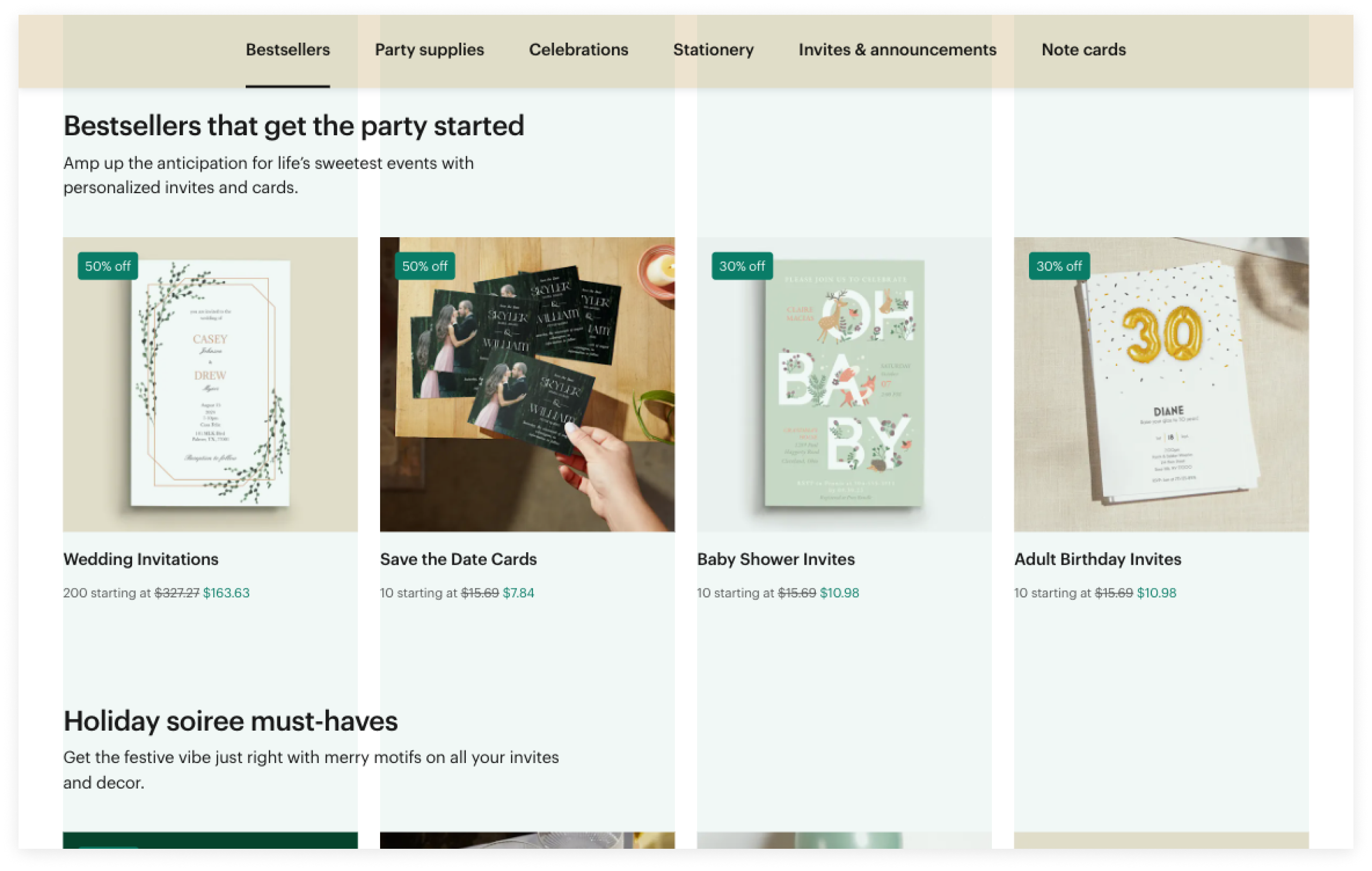
Columns
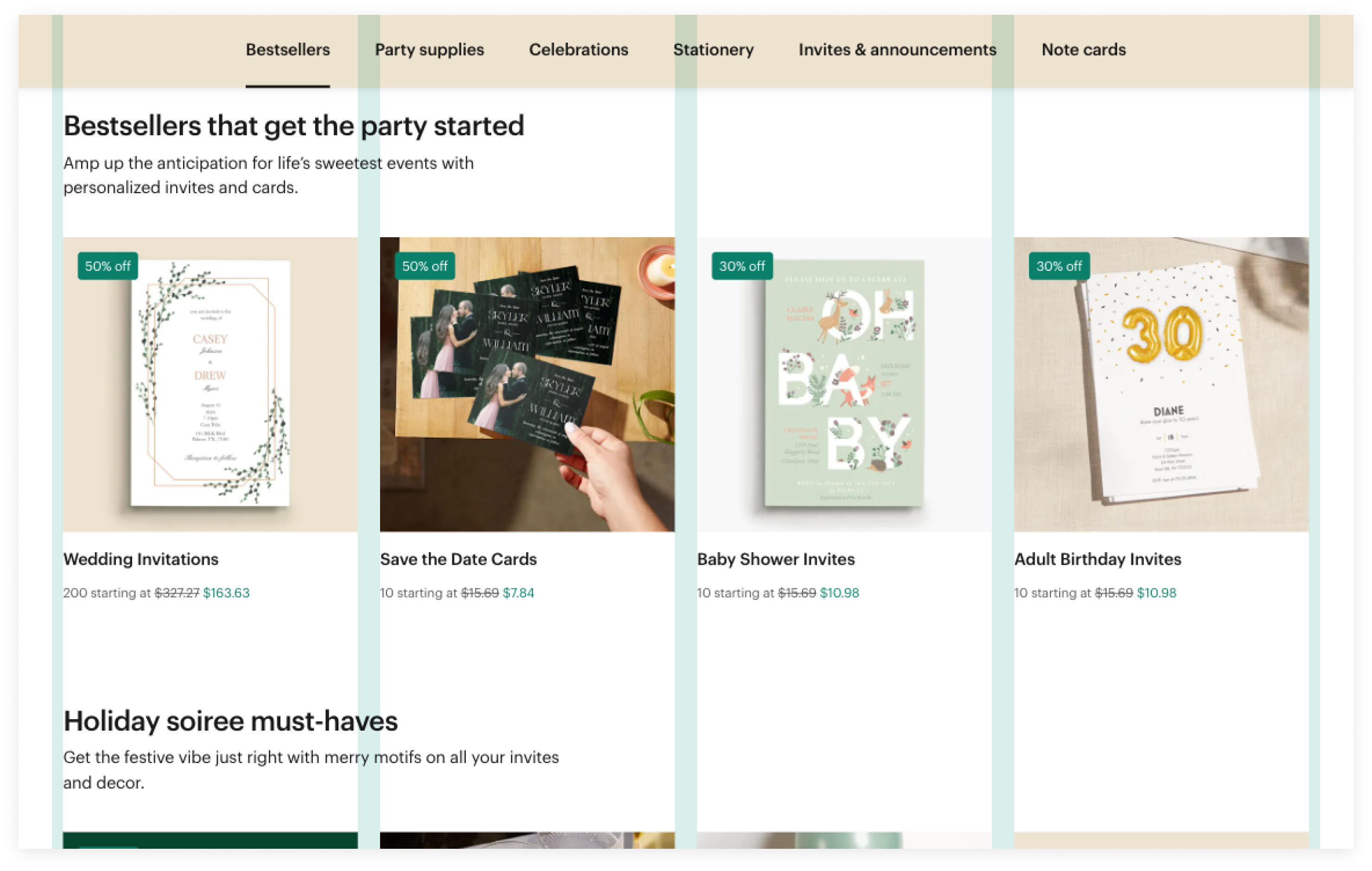
Gutters
Nested grid
The preview has been updated.
Screen sizes
Standard mode
Screen size | Range | Columns | Bounded Content | Gutter (inner padding) | Gutter (external padding) |
Extra Large |
| 12 | 32px | 24px | 12px |
Large | 1440px - 1919px | 12 | 32px | 24px | 12px |
Medium | 1024px - 1439px | 12 | 32px | 24px | 12px |
Small | 768px - 1023px | 12 | 8px | 16px | 8px |
Extra Small | <767px | 1 (default) | 8px | 16px | 8px |
Compact mode
Screen size | Range | Columns | Bounded Content | Gutter (inner padding) | Gutter (external padding) |
Extra Large |
| 12 | 8px | 12px | 6px |
Large | 1440px - 1919px | 12 | 8px | 12px | 6px |
Medium | 1024px - 1439px | 12 | 8px | 12px | 6px |
Small | 768px - 1023px | 12 | 8px | 12px | 6px |
Extra Small | <767px | 1 (default) | 8px | 12px | 6px |
Implementation
Use the Bounded Content component to set a maximum width around the content and add an horizontal spacing to keep content from touching the edges of the browser window.
Use the Grid component to build pages using Columns and Gutters.

