Typography guides users through an experience by organizing information and creating a clear visual hierarchy.
Typography decisions are stored in design tokens which sync between code and Figma. All typography-related design tokens start with the word font, followed by a property: family, size, weight, line-height, letter-spacing, and case.
See the All Tokens page for a full list of typography tokens.
For a quick overview of Typography, take a look at the following learning materials:
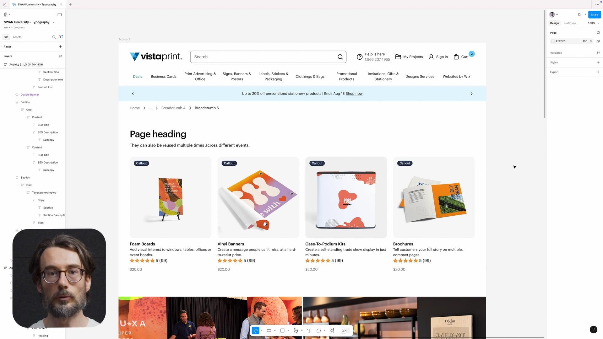
Font skin
The recommended path for setting typography is the fontSkin prop, which bundles together styling decisions for font size, font weight, font family, line height, and letter spacing. Don’t use other explicit typographic props (e.g. fontFamily) in combination with fontSkin.
The preview has been updated.
Font size
Font sizes scale seamlessly with different breakpoints—sizes are smaller on XS & SM, increase on MD, and increase again on LG & XL. Note that in Compact mode, font sizes are consistent across all breakpoints.
Font size is bundled in with other design decisions as part of fontSkin. However, for text not using fontSkin, there is the fontSize prop, which bundles together styling decisions for font size, line height, and letter spacing.
The preview has been updated.
Font family
Font family is bundled in with other design decisions as part of fontSkin. However, for text not using fontSkin, there is the fontFamily prop, which has two options: primary and secondary.
Font weight
Body text is fontWeight="normal" by default. Use fontWeight="bold" to emphasize specific content. Avoid using bold for large paragraphs of text.
Font weight is bundled in with other design decisions as part of fontSkin. However, for text not using fontSkin, there is the fontWeight prop, which has two options: normal and bold.
Line height and letter spacing
To aid with readability, smaller text sizes should have greater line height and letter spacing, while they should be reduced on larger text sizes.
Line height and letter spacing are bundled in with other design decisions as part of fontSkin and fontSize. They should not be adjusted separately.
Case
Used to apply text-transform properties such as capitalize and uppercase to font skins.
Color
The textColor core prop can be used to change the color of body text. Use standard color for most text across Vista. subtle can be used in select cases to help distinguish the content hierarchy. Headings should always use standard.
For more information, see Color.
Modes
Text colors are reversed under Dark Mode, better pairing with dark-colored backgrounds.
Type sizes change under Compact Mode, increasing the density while maintaining readability.
For more information on modes, see Modes.
Alignment
Text is left-aligned by default. This helps with readability and consistency across the site.
Center-aligned text is allowed for some scenarios, such as text in banners. Consider the context and adjust as needed.
Line length
The optimal line length for your body text is 60-80 characters per line, including spaces. If a line is too short, readers have to travel back too quickly, breaking their rhythm — and if a line is too long, it makes it difficult for the reader's eyes to focus, and they will not be able to gauge where lines start and end.

Components
SWAN has the following components with typography as the primary element:
- Heading (H1–H6): Use based on the document hierarchy of the page content.
- Typography (component): Use to depict most body text.
