SWAN Tokens capture design decisions and apply them consistently across UI. They are designed to support multiple themes for the Cimpress Experience Platform (CEP) and provide a shared foundation for building cohesive, scalable experiences.
A list of all tokens can be found here: All Tokens.
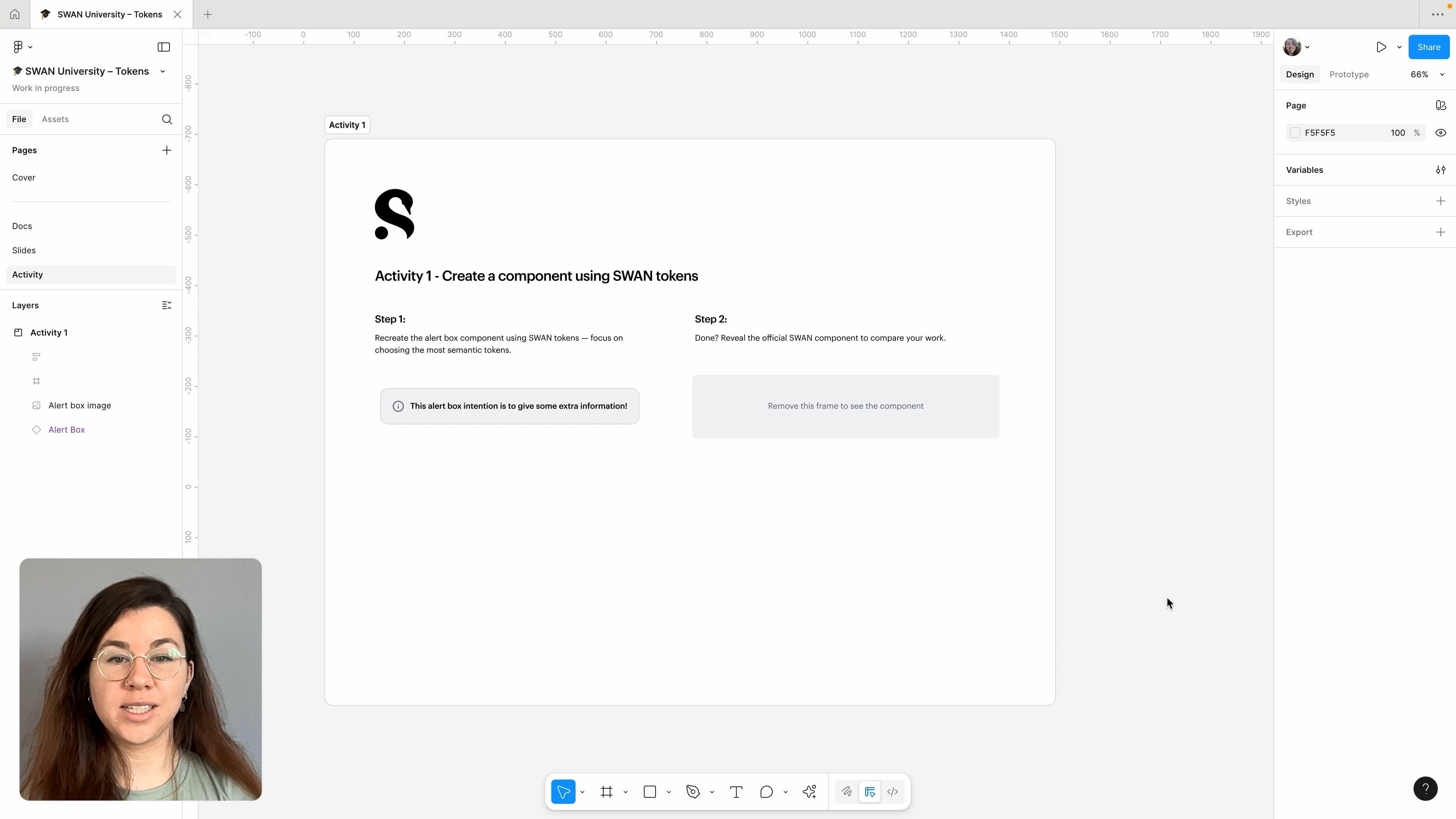
For a quick overview, refer to the following learning materials:
Understanding Tokens
What Are Tokens?
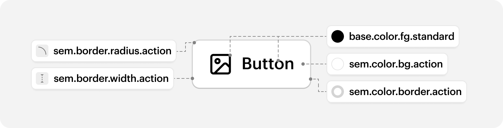
Tokens, also known as design tokens, are reusable variables that define properties such as color, typography, and spacing. They capture shared design decisions across the UI and help designers and developers create consistent experiences using a shared language.
Why Use Tokens?
- Introduce semantic meaning – Tokens add context to design decisions and clarify how values should be applied across the UI.
- Enable design change at scale – Tokens reduce the effort required to roll out visual updates across the product UI.
- Support modes – Tokens adapt to different product experiences by changing their output when modes are applied.
- Strengthen cross-discipline alignment – Tokens create a shared language that improves collaboration and consistency between designers and engineers.
When to Use Tokens?
Before using tokens, consider the flexibility already available in SWAN. Use SWAN components first, then core props for small visual or behavioural adjustments. Use tokens only as a last resort.
Do
- Use SWAN components first
- Use core props for small adjustments
Don't
- Use tokens as a shortcut for styling changes
- Use tokens to recreate or heavily modify SWAN components
How to Use Tokens
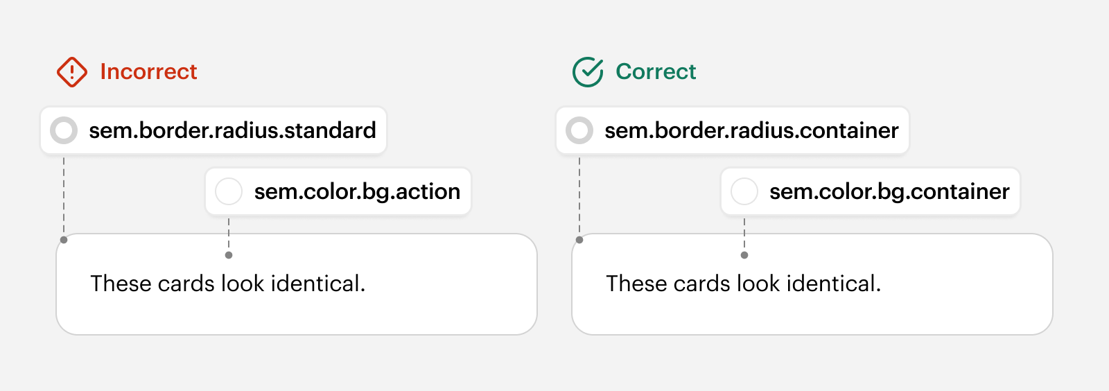
Use the most semantic token available for the UI element you are styling, even if a more generic or different semantic token currently has the same value. For example, when styling a container, use sem.color.bg.container instead of sem.color.bg.action, and sem.border.radius.container instead of sem.border.radius.standard. Choosing the more specific token preserves flexibility for future visual language changes.
In Code
Tokens are displayed in language-agnostic dot notation, but their syntax varies by language. For example, base.color.transparent is equivalent to $swan-base-color-transparent in SCSS and SwanBaseColorTransparent in JavaScript.
Tokens are available in CSS, SCSS, LESS, Stylus, and JavaScript, and all reference underlying CSS Custom Properties. These point to CSS Custom Property, allowing tokens to respond to breakpoints, modes, and other system behaviour regardless of language.
Tokens are read-only and should never be set by consumers, whether through CSS variables or otherwise.
The import path for SCSS/LESS/CSS/Stylus is simply:
The import path for JS/TS is:
In Figma
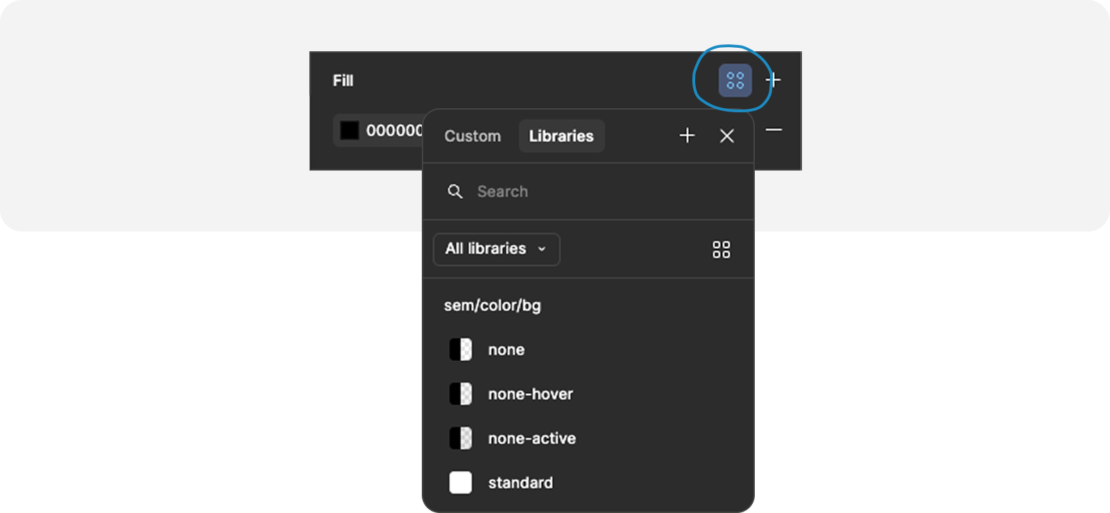
Tokens are available via Figma variables in the SWAN UI Kit. They can be applied directly to Figma elements such as text, fill, and border. Tokens are also built into all SWAN components and synced with their code counterparts.
Token Taxonomy
Tokens are named following a consistent hierarchy of sections. Not every section is used in every token name. We represent tokens using language-agnostic dot notation, where each dot represents a level in the hierarchy.
tier.component.variant.category.property.intent/concept/role.scale.state
- Tier – Specificity. e.g.
base,sem,comp - Category – Token type. e.g.
color,border,font,elevation - Property – Attribute. e.g.
fg,bg,width,radius,size - Intent – Semantic grouping of components. e.g.
action,control,input,container - Concept – Semantic application. e.g.
floating,overlay,focus,partition - Role – Semantic role. e.g.
info,success,warning,error,promo,help,accent - Scale – Defines intensity or size levels. e.g.
100,600,strong,subtle - State – Represents interaction states. e.g.
hover,disabled,selected - Paired –
paired. Indicates that the tokens for foreground and background should be paired, e.g.fg.brand-pairedandbg.brand-paired
Component tokens also have component and variant sections. eg: comp.button.primary.color.bg
Tier
The token architecture consists of three main tiers base, sem, and comp. Token tiers reflect increasing specificity, from base to component, with each tier often referencing the one above it. Consumers should first reach for semantic tokens. Base tokens should only be used when no suitable semantic token exists. Component tokens exist only where necessary to support theming.
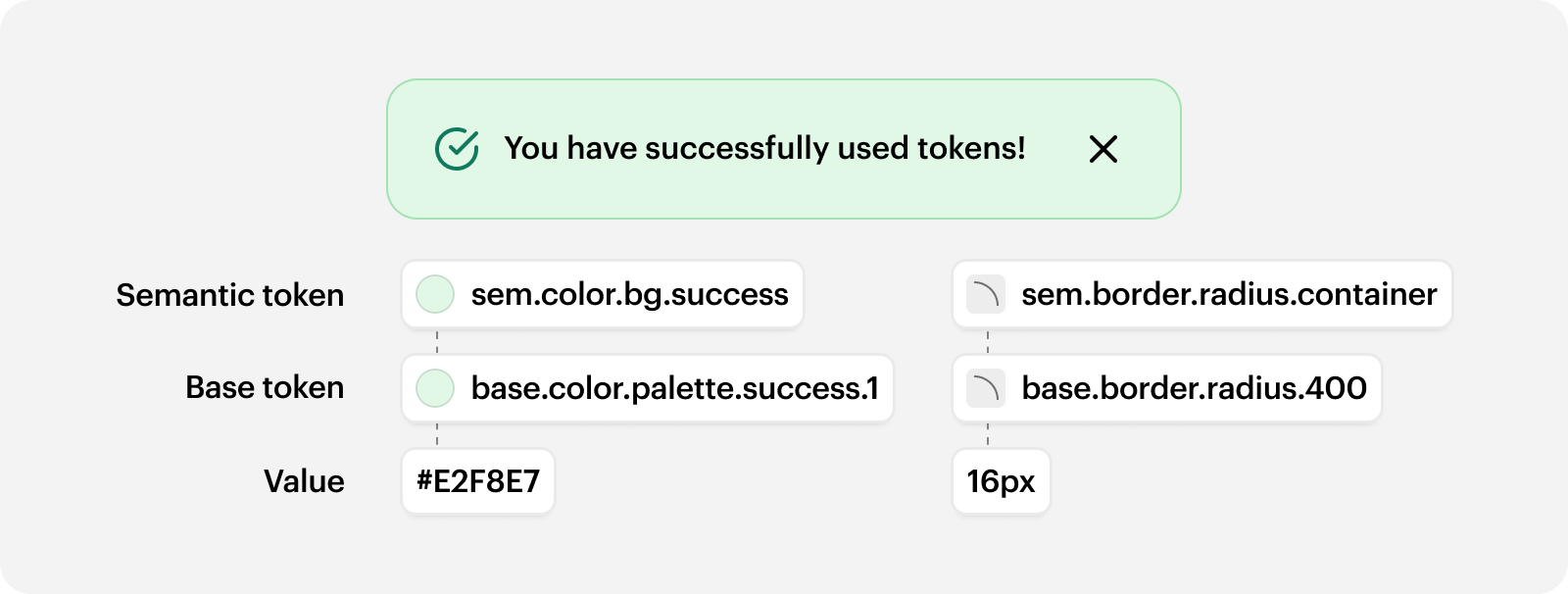
base– An abstraction over raw values, representing the scales and options that other tokens pull from.sem– Semantic tokens that represent shared design decisions.comp– Component tokens that represent component-specific outlier decisions.
A seperate internal token tier exists for SWAN internal use only. These tokens are used for component-level styling that needs to stay in sync but can’t be themed, as well as for better organisation of mode values.
Category and Property
Defines the token type. Paired with a property when required. e.g. color.bg, font.skin, border.radius.
For more detailed information on particular categories, see Color, Space, and Typography.
Paired
Tokens with the suffix, paired, must be used together to ensure accessible contrast. Used on strong tokens for fg, bg, and border. e.g. sem.color.fg.help-strong-paired must be used with sem.color.bg.help-strong-paired. However, border tokens are the exception in that they can be used by themselves.
Intent and Concept
Defines an interaction purpose that groups related tokens across multiple categories. Tokens are organised by shared intent rather than appearance, so values that should evolve together share the same semantic token.
action– For UI that evokes an action, such as Button, Buttonbar, File Input, Zoom Controls, Pagination.control– For non-text input UI, such as Checkbox, Radio, Toggle Switch, Range, Color Swatches, Selection Set.input– For text input UI, such as Text Input, Text Area, Combobox, Dropdown, Listbox, Form, Search Input.container– For UI that contains content or other components, such as Card, Popover, Menu, Combobox Popover, Listbox Popover.floating– For UI that overlays a small area of content, such as Popover, Menu, Combobox Menu, Listbox Menu.overlay– For UI that overlays the page, such as Modal Dialog, Anchor Bar, Price Barpartition– For UI that separates elements, such as Listbox Separator, Grid, Table, Divider, Pipe Separator
Role
Defines a semantic role. Often used for color tokens for semantic skins with Alert Box, Status Message, and Callout.
accent– Standout area or a brand momentinfo– Neutral informationsuccess– Positive outcomewarning– Caution of a possible action or occuranceerror– Negative outcomedestructive– An action that will destroy datapromo– Promotional contenthelp– Content relating to customer supportsustainability– Sustainable product options or initiatives
Scale
Represent hierarchy. Different scales exist for different purposes.
- Ordered –
0,100,200,300, etc. The numbers having meaning correlating to the token value. - Enumerated –
1,2,3, etc. The numbers have not correlation to the token value, - Progressive –
primary,secondary - Emphasis –
none,subtle,standard,strong,max - T-shirt –
xsmall,small,standardormedium,large,xlarge,x2large, etc.standard– the default value.medium– a value in the scale.
Modes
Modes modify token values to support different UI requirements.
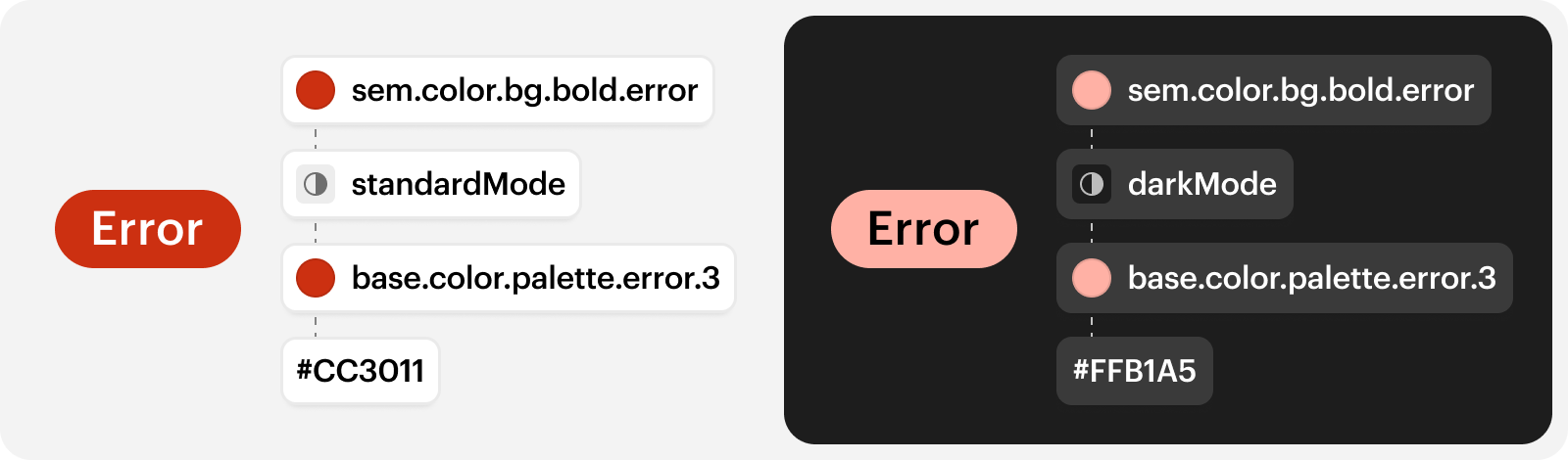
standardMode– the default mode.darkMode– modifiescolortokens to inverse UI. Often used in Banners or section of the UI with dark backgroundscompactMode– modifiesspace,size,border-width,border-radius, andtypographytokens for a more dense UI. Intended for use across entire pages, such as the Studio editing experience.
Modes do not have different values across breakpoints. If a mode defines a value, it overrides any breakpoint-based value.
For more detailed information on how to use modes, see Modes.
Can’t find the right token?
Come chat to us. If there’s a token you need, let’s have a discussion and see if it’s missing from SWAN. Tokens are part of our public API, so the process in our contribution guidelines applies here.
