Color is a fundamental part of the visual language, used to convey meaning, emphasis, consistency, and hierarchy across the UI. Color palettes help differentiate elements, guide interactions, and maintain a cohesive experience.
For a quick overview, refer to the following learning materials:


Neutral Palettes
SWAN’s neutral colours provide the visual foundation of the interface, supporting structure, hierarchy and readability. They do not convey status or meaning.
The preview has been updated.
Role Palettes
Semantic colour roles provide feedback for user actions, convey information, and indicate state. These colours are named by their purpose, not their hue. For example, success and error rather than green and red, allowing roles to be represented by any colour.
The preview has been updated.
Theme Palettes
Colors used by themes to apply brand identity across the UI.
Brand
brand is used to apply specific foreground, background, and border colors to high-profile UI, that drives customers toward purchase or task completion.
The preview has been updated.
The preview has been updated.
Accent
accent is a supporting brand palette used across the UI to reinforce the brand.
The preview has been updated.
The preview has been updated.
Surface
surface colors are used as large background color areas behind content. Surfaces are either light or dark, and can only be used in their respective modes to meet contrast requirements.
The preview has been updated.
The preview has been updated.
Foreground, Background, and Paired
Text and icons are styled together using foreground fg color tokens. These tokens always provide accessible contrast against the background bg token they are applied over.
In some cases, this contrast is built into the underlying palette, as with role colors. In others, it is achieved through explicit fg and bg pairings, as with brand colors.
If a color token has paired in its name, it must be used with its corresponding paired color token.
The preview has been updated.
Interaction States
Interaction state colors are available for backgrounds, borders, and text, with variants such as hover, active, and focus.
The table below shows the interaction states available for sem.color.bg.input.
The preview has been updated.
Dark Mode
Dark mode reverses the colors of a section of your page, enabling text and components to be legible on darker backgrounds.
For more information on modes, refer to Modes.
Using Color
Tokens
Color decisions are managed through design tokens that synchronize between code and Figma, with their application defined by their semantic purpose.
All color tokens are prefixed with base, sem, or comp. sem tokens are followed by their intended property: bg, border, fg.
For more information on modes, refer to Tokens.
Props
SWAN provides textColor and backgroundColor props to utilize these tokens in code.
For more information on modes, refer to Color Props.
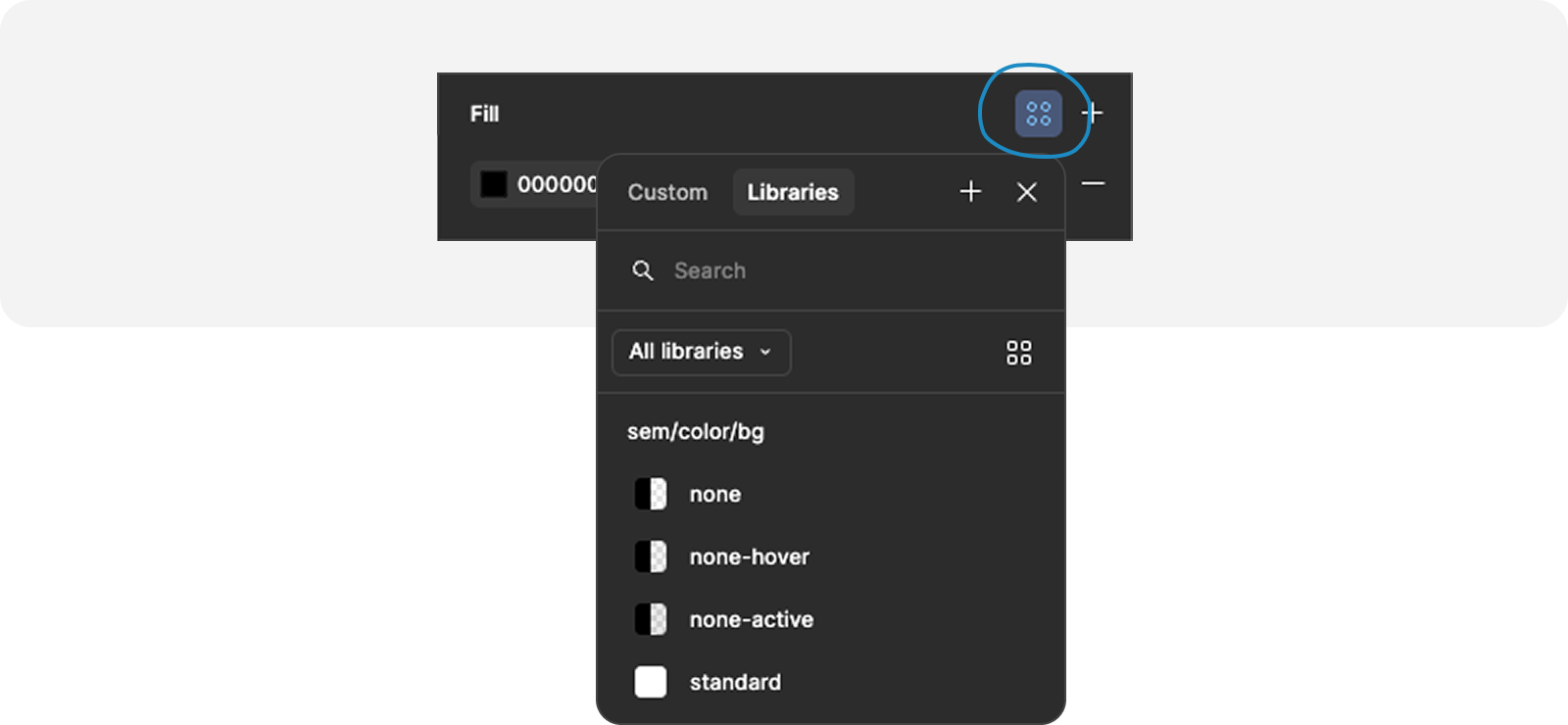
Figma
In Figma, color is managed using variables.