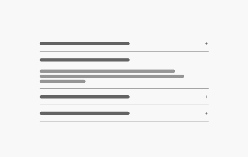
Accordion
A group of Collapsible components that open and close when pressed, showing or hiding content.
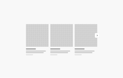
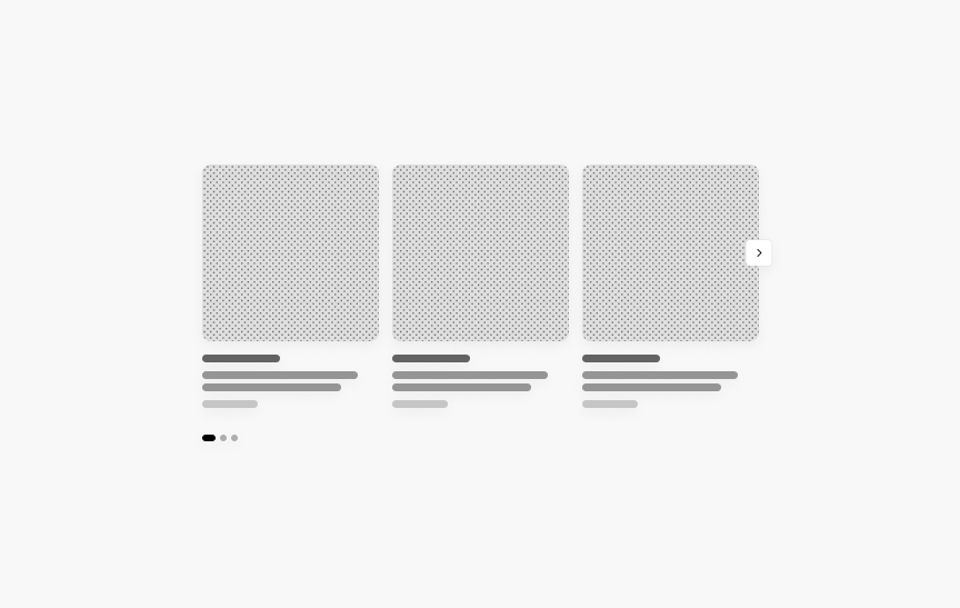
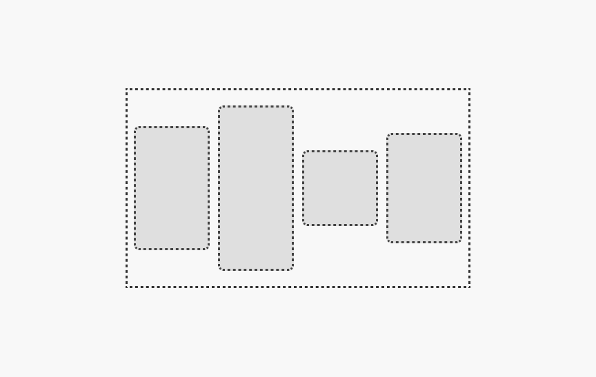
Adaptive Carousel
Displays a series of content that can be navigated horizontally.
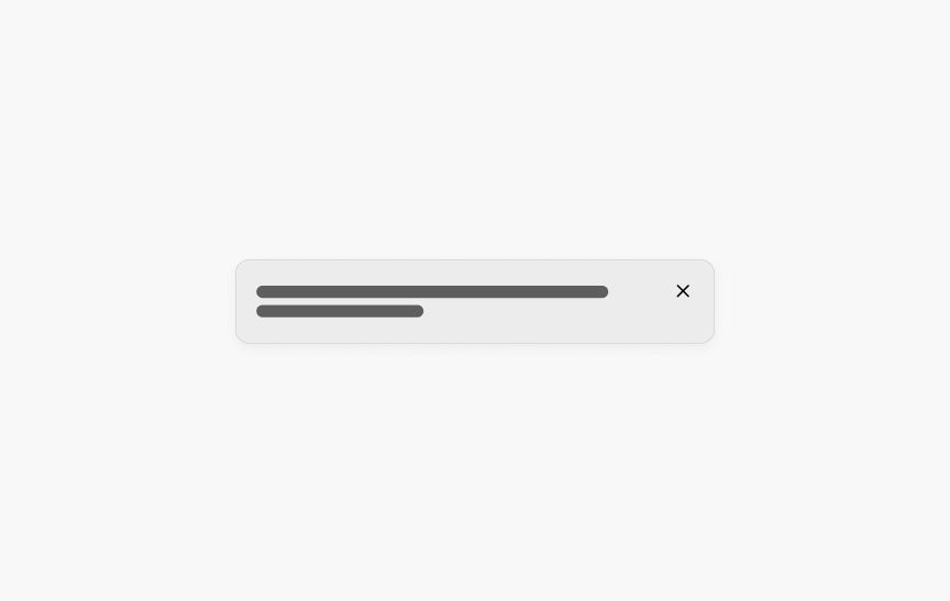
Alert Box
A prominent method of messaging users about important information.
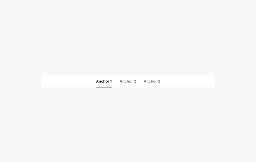
Anchor Bar
A horizontal sub-navigation component composed of anchor links. It is used to link to other parts of the current page and can be made stick to the top of the page on scroll.
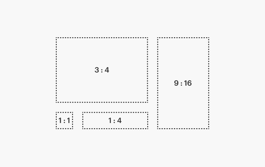
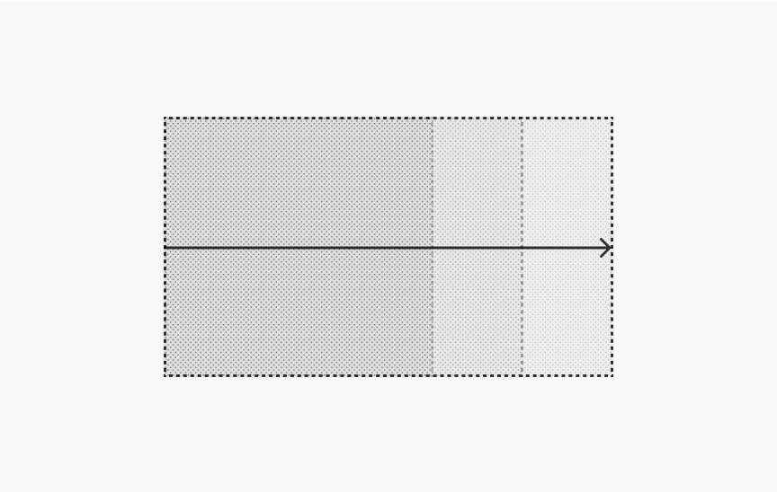
Aspect Ratio
A container with a consistent width-to-height ratio.

Avatar
A graphical representation of a user's profile image to visually identify them in different contexts.
Banner
A powerful tool to showcase promotional offers, simplify user journeys and reinforce brand perception through visual storytelling.

Base Tile
Base components to create consistent Tiles in the Tiles Expansion Pack.
Bounded Content
Sets a maximum width and outer padding for page content.
Box
A basic building block that can be used as a simple container or the foundations of a component.
Breadcrumbs
A series of links indicating the user's location within the site's hierarchy. Allows users to return to pages higher up in the hierarchy.
Button
Used to trigger an in-page action such as submitting a form or showing/hiding an interface component.
Buttonbar
A set of closely related controls or actions, where selecting one applies it immediately.
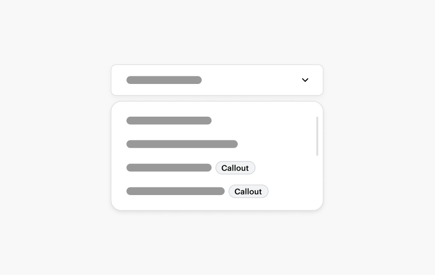
Callout
A status label that calls attention to a product or service.
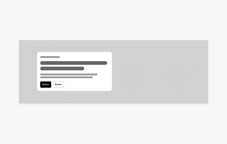
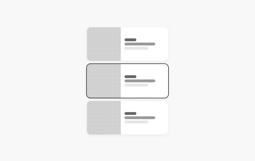
Card
A simple container for grouping related content.
Carousel
DeprecatedA carousel allows multiple pieces of content to be browsed in a cyclical view.
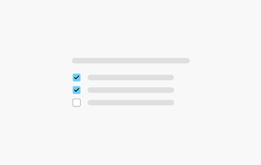
Checkbox
Checkboxes can be used to turn an option "On" or "Off". SWAN checkbox provides the same functionality as a native <input type="checkbox"> enhanced with styling.
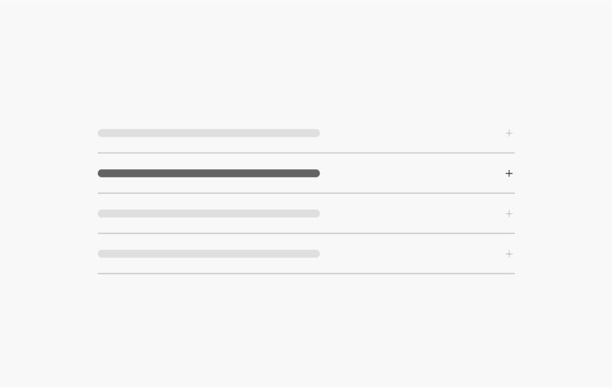
Collapsible
A Collapsible is a section that can be toggled open and closed. It is typically grouped with other Collapsible into an Accordion.
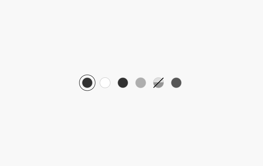
Color Swatches
A collection of color samples to present and select color options for products.
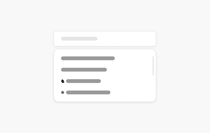
Combobox
Input field that combines a text input and a list of suggested values that appear when the user enters text into the text input.
Convenience Elements
Convenience Elements provide a wrapper component for many commonly used HTML tags like p, h1-h6, img, section and span. These convenience elements enable use of the system's core props (`margin`, `padding`, `fontWeight`, etc), and are optional.
Count
Numeric message indicating an amount.

Date Calendar
NewAn interactive grid for selecting a date or range of dates.

Date Picker
NewInput field and calendar for choosing a date or range of dates.
Divider
A horizontal divider to segment content.
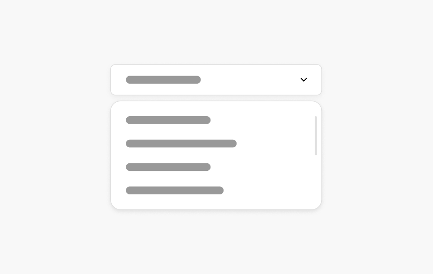
Dropdown
A pull-down list of items that appear when the input is selected.
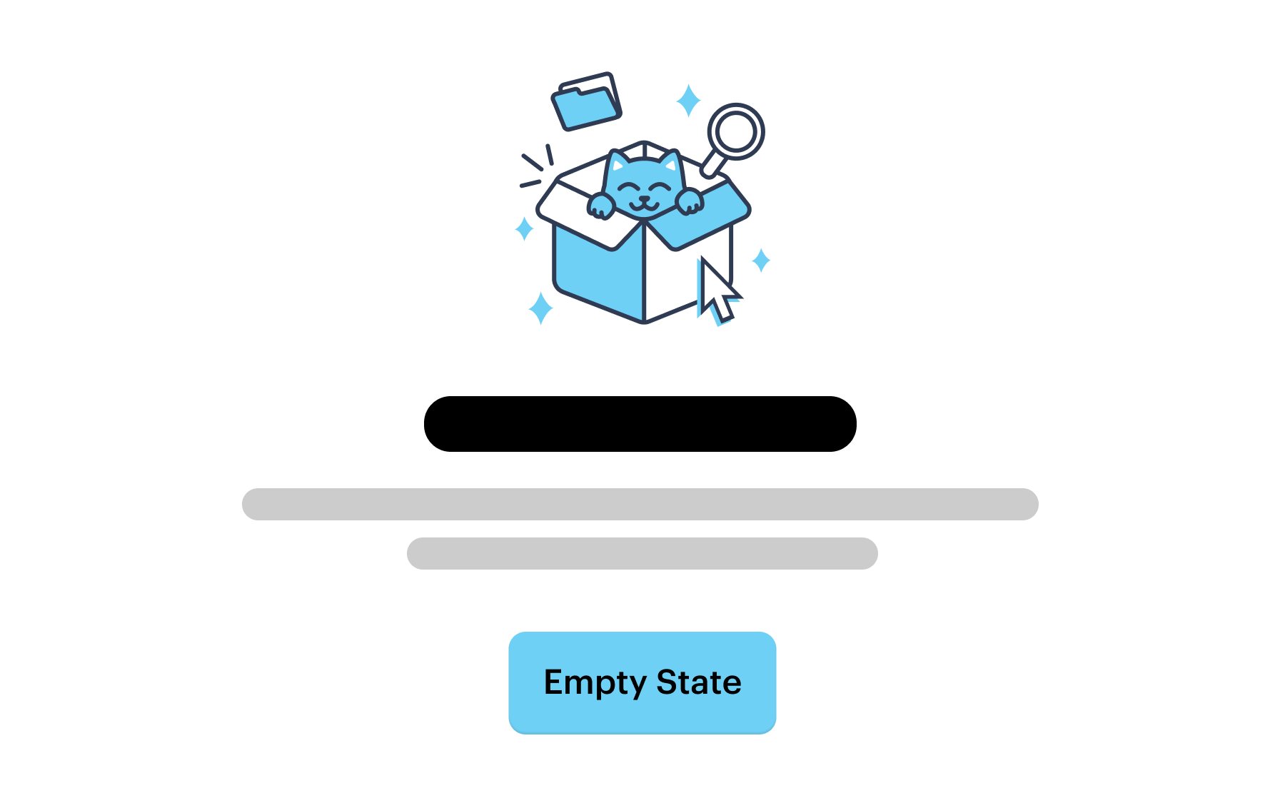
Empty State
An indication to the user that there is no content to display in the current view. Provides an explanation and the next best action.
Error Boundary
A React feature to detect if there has been a code error, and if so, display a fallback UI.
Fieldset
A <fieldset> groups several related form-fields (and their <label>s) together within a single <form>. A <legend> inside of a <fieldset> provides a caption that describes the field grouping.
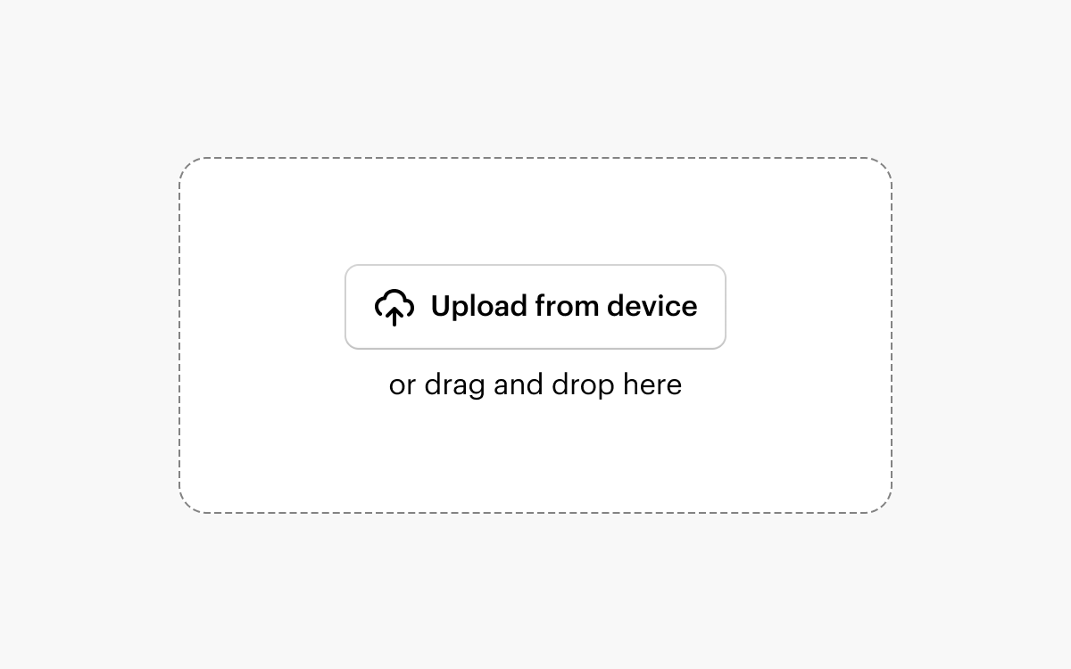
File Dropzone
Allows the user to upload one or multiple files from their device. Uploads are initiated via drag and drop or the native OS file picker.
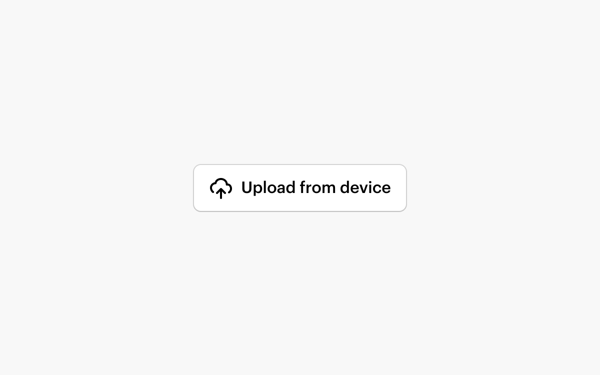
File Input
Allows the user to upload one or multiple files from their device. Uploads are initiated via the native OS file picker.
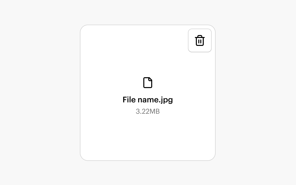
File Tile
A representation of a file such as an uploaded image or a template asset.
FlexBox
A simple, unstyled container that understands CSS flex layout without the need for adding any custom CSS.
Fluid Image
A simple, responsive image that will maintain its aspect ratio and grow to fit the width of its container.
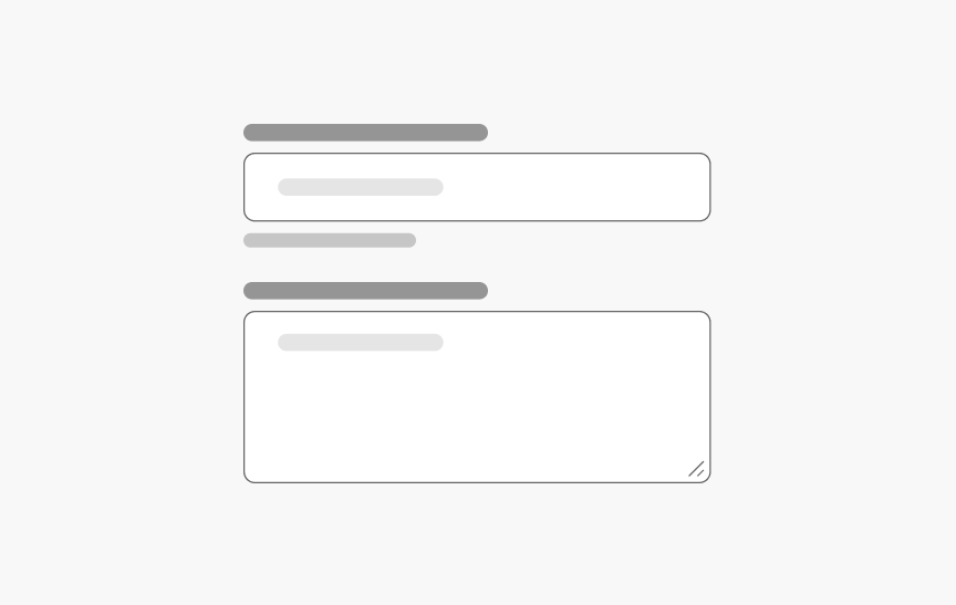
Form
Standardized layout for the form elements.
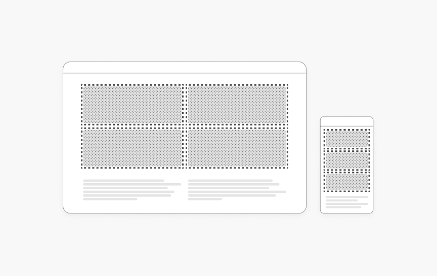
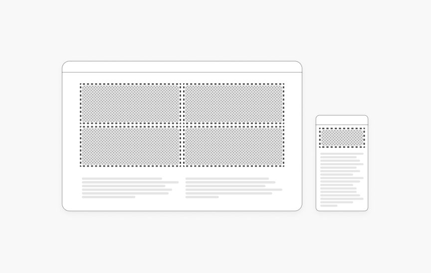
Grid
Provides a structured layout framework for page content, ensuring consistent alignment, spacing, and responsiveness across components and screens.
Heading (H1–H6)
Headings help to structure content on a page by creating clear visual hierarchy. SWAN has six heading components that render stylized HTML <h*> tags.
Hidden
Hidden is a utility feature that allows you to hide content based on the size of the user's screen/window.
Icon Button
Button component for actions represented purely by an icon.
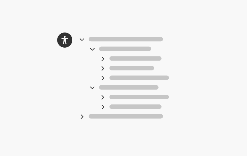
Left Hand Navigation
A vertical list of links to navigate through different sections of the site.
Lightbox
NewA dedicated full-screen modal component designed for focused media display.
Link
Hyperlinked text for navigating to a new page.
List
Related items that are organized vertically.
Listbox
Input field that displays a list of items when selected.
Menu
A dropdown menu of buttons and/or links.
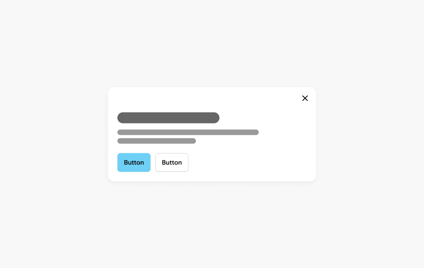
Modal Dialog
A card or panel that appears over the page content, requiring user interaction before returning to the content.
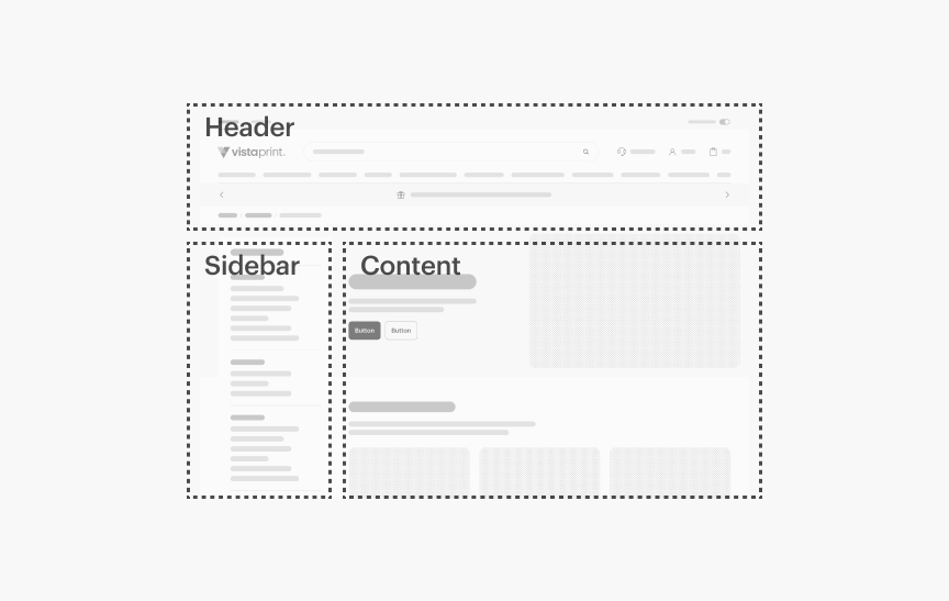
Page Wrappers
Used to define the page structure and ensure consistent behavior across the site.
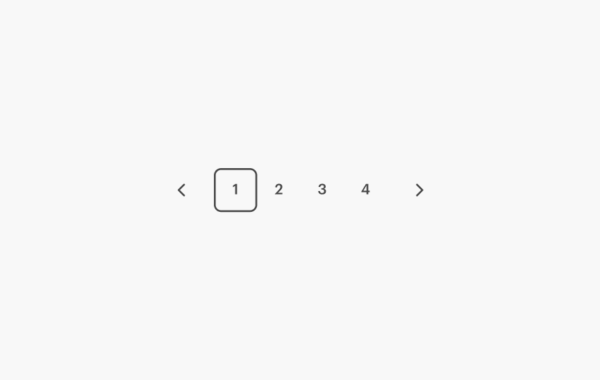
Pagination
For navigating across pages of related content.
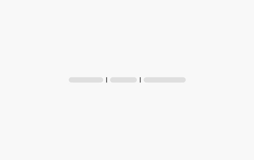
Pipe Separator
A vertical divider to segment inline content.
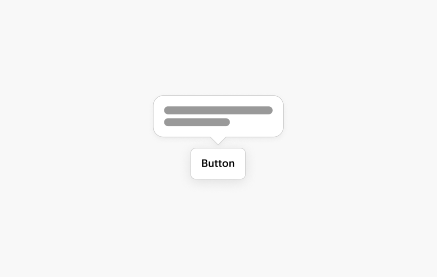
Popover
A container that pops up from another element over other content. Triggered via click to give short, additional information in-context.
Price Bar
Displays price information and related content during the product flow.
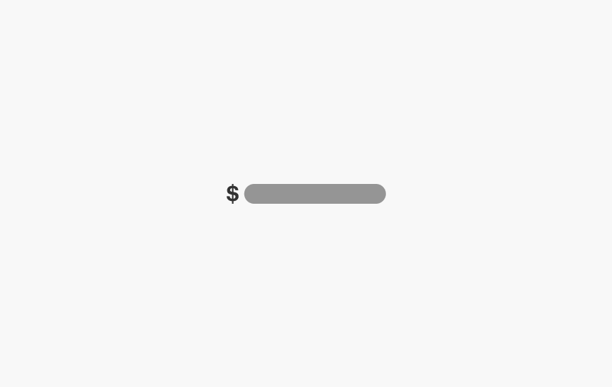
Pricing
Styling to display prices.
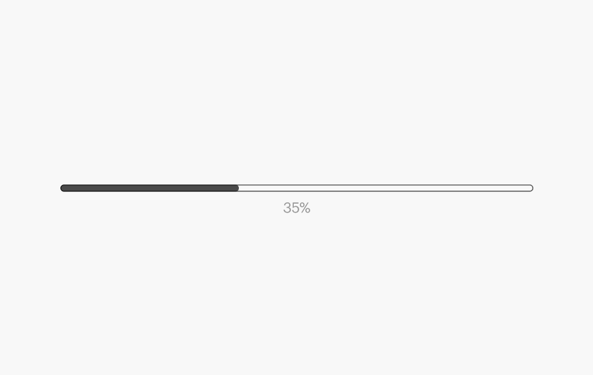
Progress Bar
Displays the percentage of completion of a system operation.
Progressive Image
Defers the loading of large images to improved the perception of page load times.
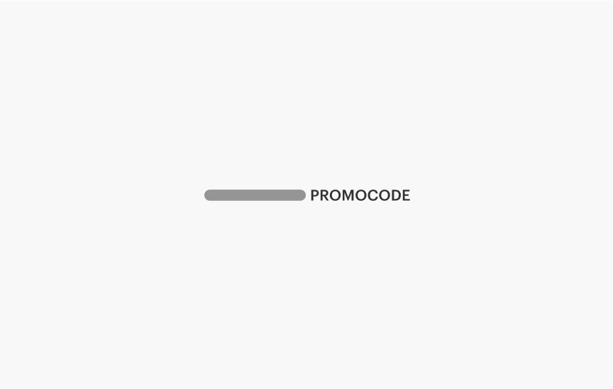
Promo Code
A code to receive a discount at checkout.
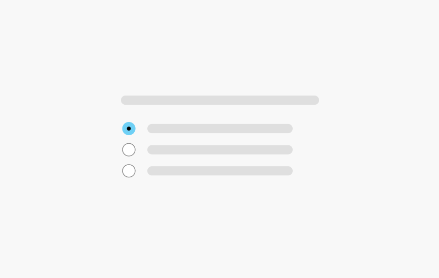
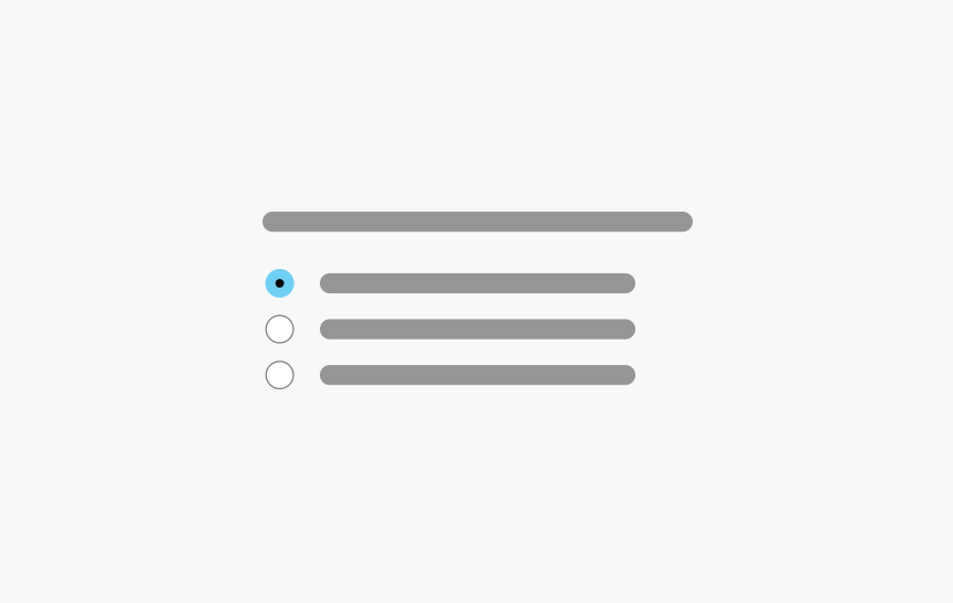
Radio Button
A set of mutually-exclusive choices.
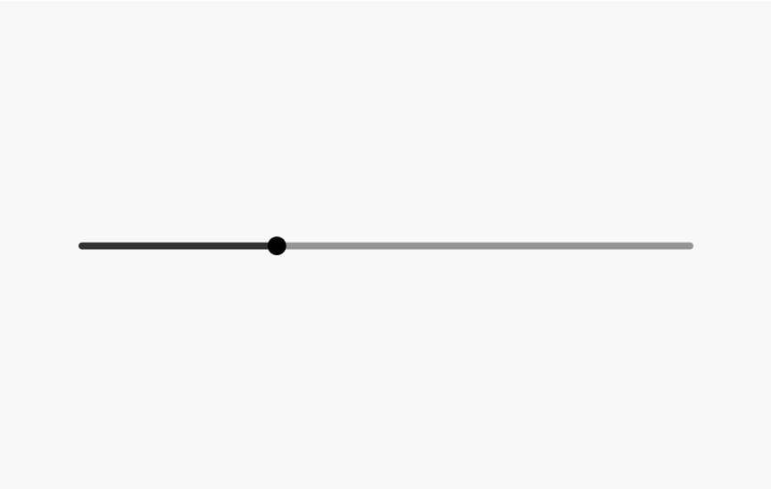
Range
Input a numeric value along a track using a handle.
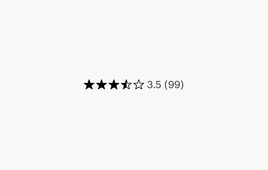
Ratings Stars
Display a product rating.
Responsive Image
Responsive Image is the preferred method for rendering an image when you know the aspect ratio of your image ahead of time.
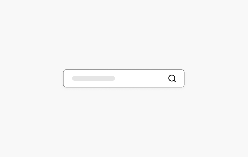
Search Input
Input field for search queries.
Selection Set
A set of options to choose from.

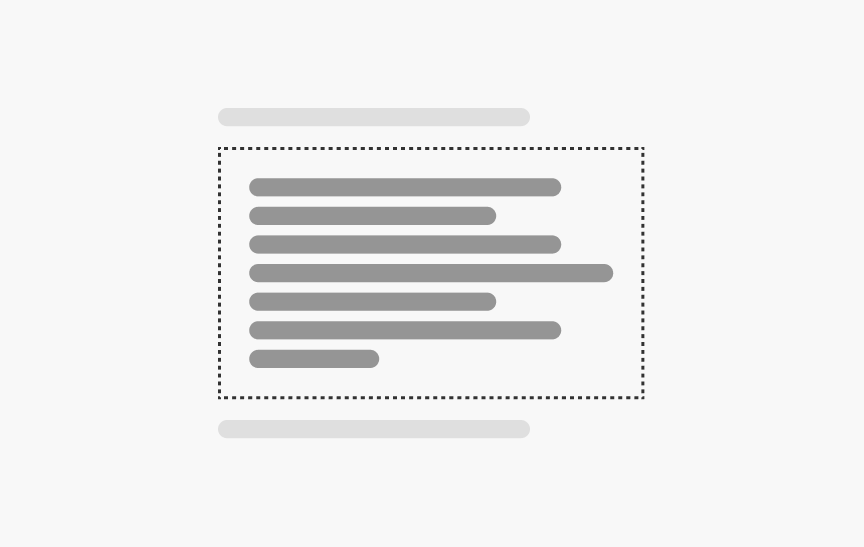
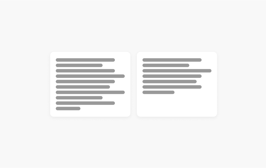
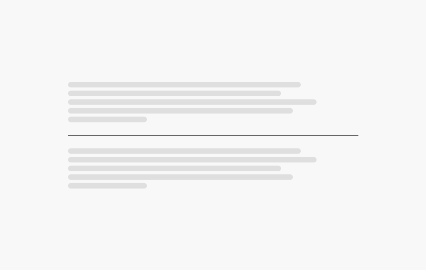
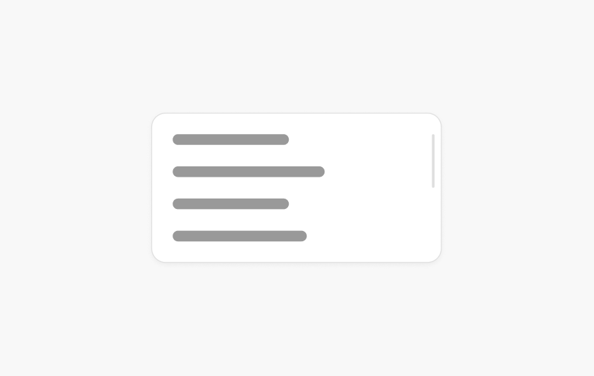
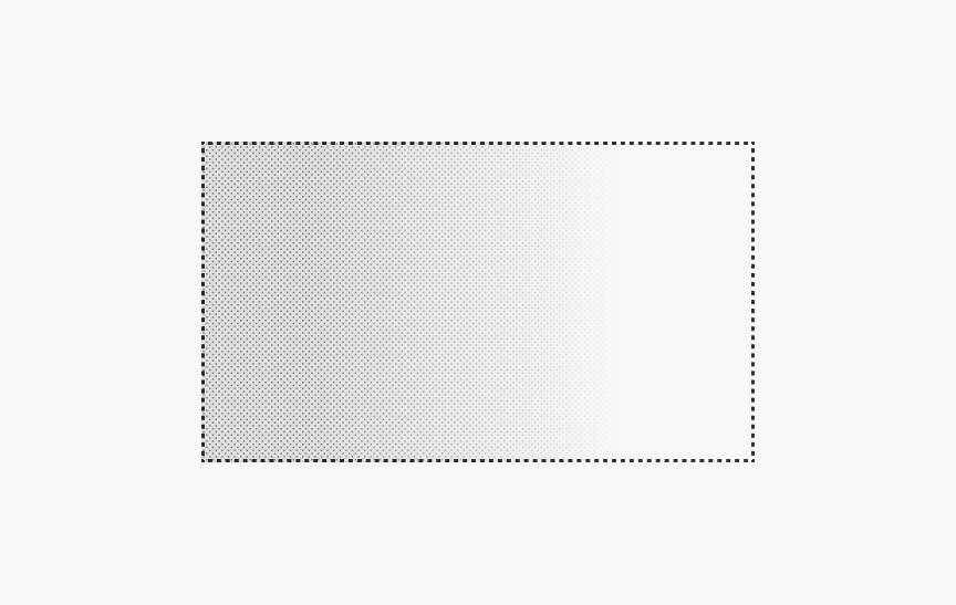
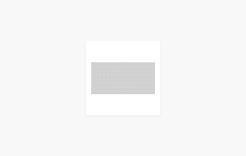
Skeleton Text
Placeholder boxes that resemble blocks of text, used while the real text is loading.
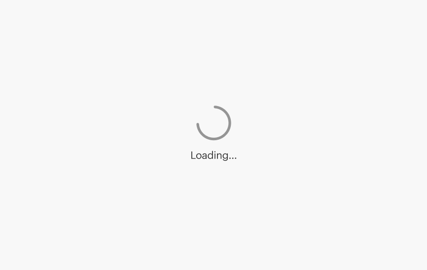
Spinner
A visual indicator that a process is happening in the background but the interface is not yet ready for interaction.
Square Image Container
A Square Image Container creates a square element that centers a Fluid Image inside it, and stretches the image to fill the width or height of the square as appropriate for the image's aspect ratio.
Standard Tile
An image paired with descriptive text. Often used to present products.
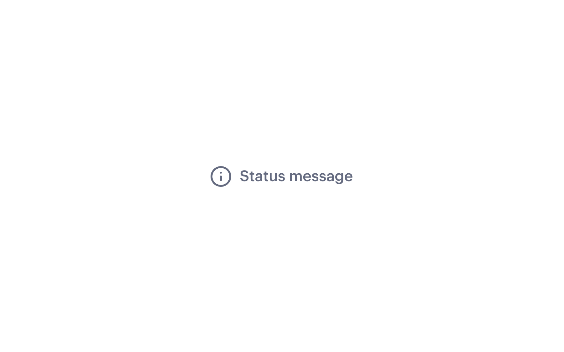
Status Message
Context-level notice to draw attention to success, information, warning, error, or help messages.
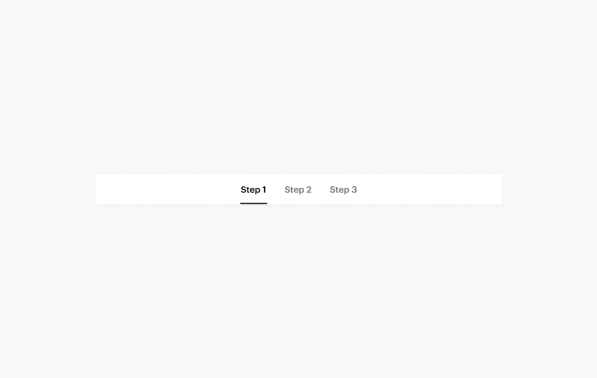
Step Indicator
A navigational element that shows the user's progress in a series of steps within a design or order flow.
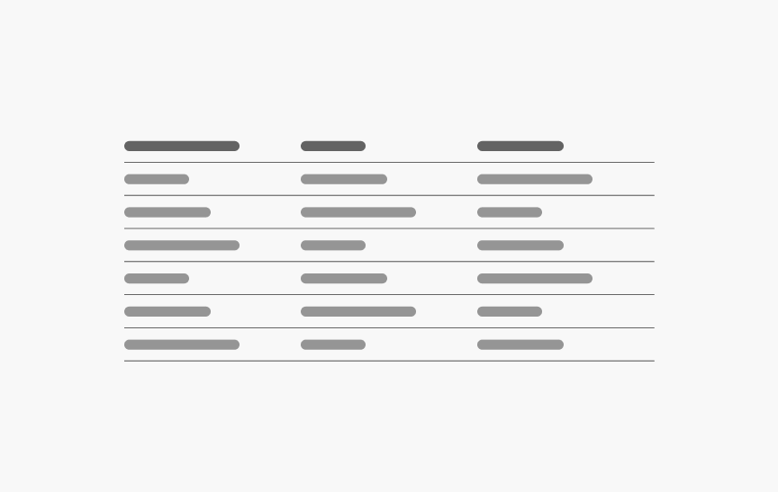
Table
Organize and display data efficiently in columns and rows.
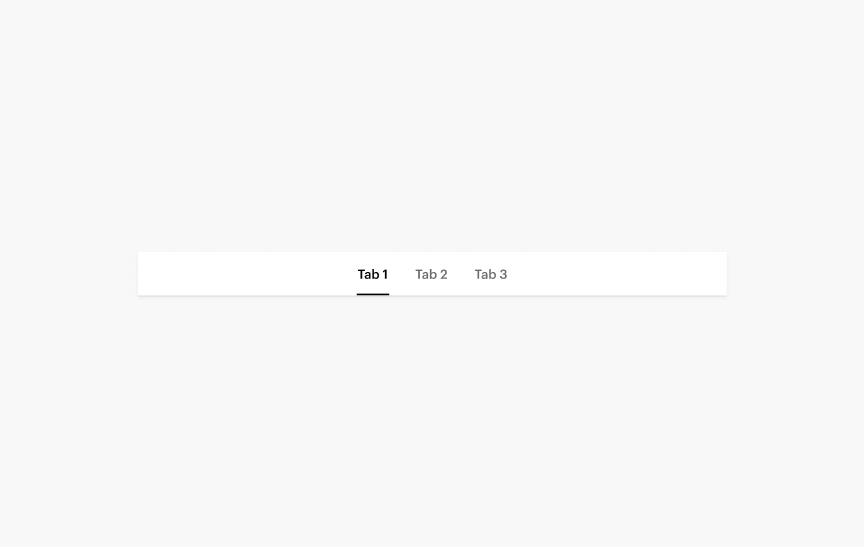
Tabs
Navigate between different types of related content at the same level of hierarchy.
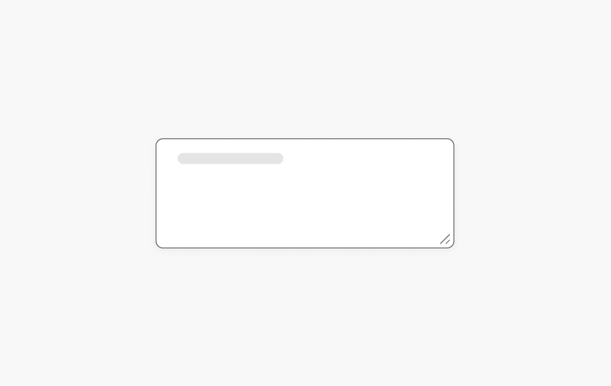
Text Area
Input field for entering more than one line of text.
Text Input
Input field for entering alpha-numerical information.
Thumbnails Hero
DeprecatedA carousel of large images with thumbnails navigation.

Time Picker
NewA standardized and compact way for users to select a point in time or time slot.
Toggle Switch
A choice between two mutually exclusive options.
Typography
Use to define body copy styles.

Uncustomizable Markup
Use to apply SWAN styles to rich text editor of a CMS.
Visible
Show content based on the size of the user's screen/window.
Visually Hidden
Hide content while still making it available in browser Accessibility Trees.
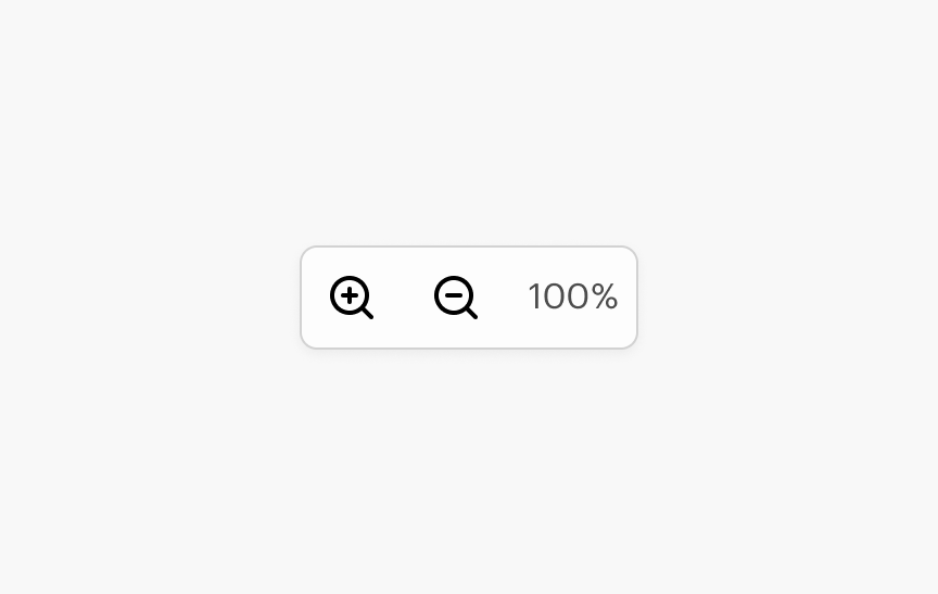
Zoom Controls
Zoom in and out of the current view.
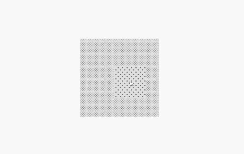
Zoomable Image
NewAn interactive image wrapper that provides inline zooming and panning for detailed product inspection.