Unlike other SWAN components, BaseTile should not be used directly outside of the Expansion Pack repository. Tiles are an important part of the visual language of Vista, and as such, usage is regulated by the Tiles Expansion Pack Working Group. For more information, see the Charter here.
Base Tile
Base components to create consistent Tiles in the Tiles Expansion Pack.
styleKeys: baseTile
Use Base Tile...
- To create an approved Tile as part of the Tiles Expansion Pack.
Don't use Base Tile...
- To create ad-hoc Tile components for a single use case.
Base Tile provides a flexible low-level API that allows Tile Authors to create an accessible UI, while allowing freedom of design. When creating a new Tile, care should still be taken to ensure their composition remains accessible, including appropriate click areas, tab ordering, validate HTML, etc.
Terminology
Visible Target - An interactive element that is visible to the user. In most cases, this would be a Link or Button.
Click Area - The dimensions that the user can click (or tap) to interact with some part of the Tile. Examples include the Tile itself, Tile Name, Tile Image, or a Favourite Checkbox.
Outcome - The result of interacting with a Click Area. Depending on the interaction, this may be like a button (e.g. ‘Add to Cart’), or like a link (e.g. link to a product). The latter of the two is more specifically known as ‘Pathing’ to align with Storefront’s vocabulary.
Visible Targets vs Click Areas
The key complexity in creating Tiles is the difference between Visible Targets and Click Areas. A common example of this is a Tile containing a single Visible Target for a Tile Name, but the entire Tile should act as a Click Area.
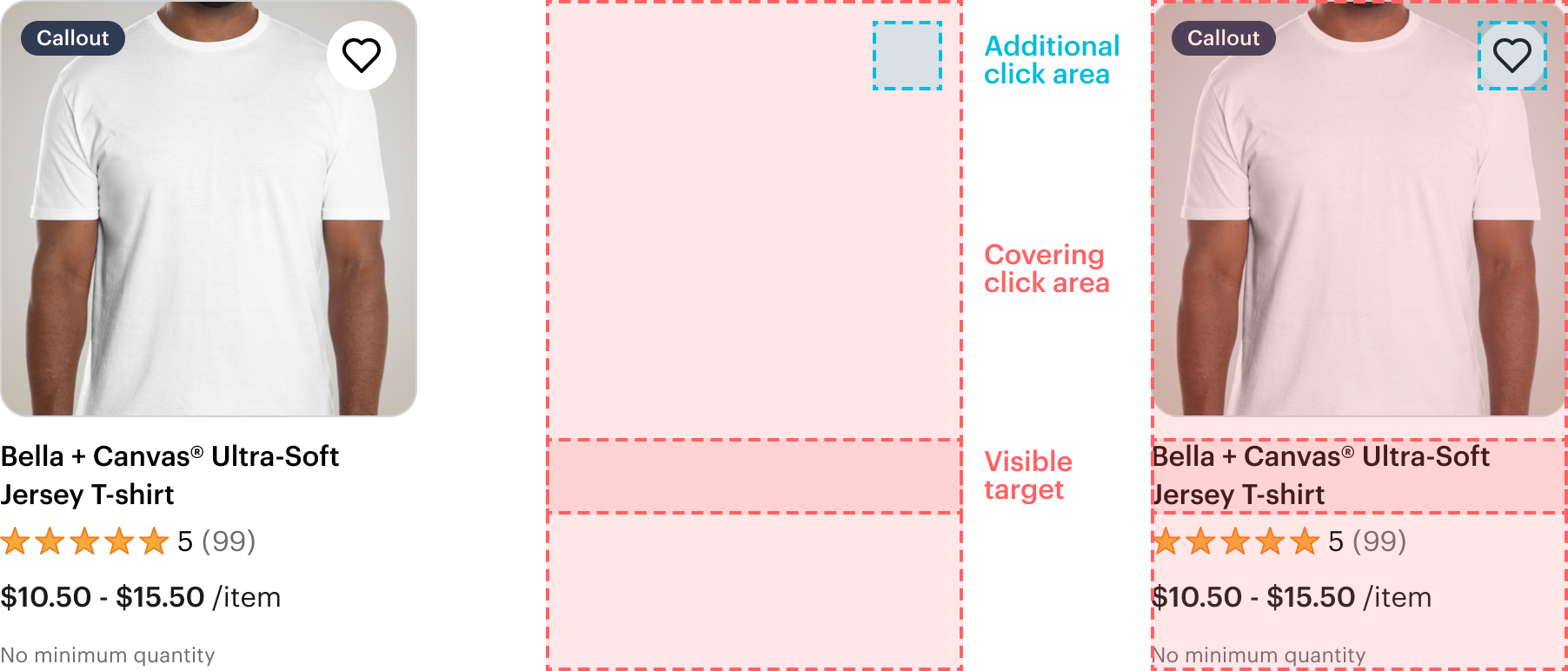
BaseTileTargetAdditional, BaseTileTargetCovering, and BaseTileTargetImage can be used to accessibly separate the Visible Target from its Click Area. As all Tiles need an accessible name, it’s easiest to visually render at least one Visible Target somewhere inside of the Tile.
If needed, it’s possible to add visually hidden text inside of Visible Targets. This should be used to provide context for more ‘generic’ copy, such as a ‘Read more’ button.
Use BaseTileTargetCovering to grow the Click Area of its direct descendant Link or Button to cover the entire Tile. This is typically used in conjunction with BaseTileName.
Use BaseTileTargetAdditional to raise the z-index of its direct descendant Link, Button, Checkbox, etc. to allow interactivity ‘above’ another element using BaseTileTargetCovering.
Use BaseTileTargetImage to wrap BaseTileImage to allow interactivity on the image itself, only when there is not a more suitable target (e.g. BaseTileName). Render additional Visible Targets after BaseTileTargetImage within BaseTileHeader to allow additional interactivity.
Scenarios
The Design System Team has identified common scenarios of Tiles, with examples of each to get you started. If your Tile does not fit into one of the scenarios below, or you feel like something is missing from the API, please reach out! The Design System Team is happy to work together to ensure we’re following best practices and achieving an accessible result.
Whole Tile clickable, one Visible Target
Use BaseTileTargetCovering on the primary Visible Target.
The preview has been updated.
Whole Tile clickable, multiple Visible Targets
Use BaseTileTargetCovering on the primary Visible Target, with any other interactive elements wrapped in a BaseTileTargetAdditional.
The preview has been updated.
Whole Tile clickable, no Visible Targets
When there are no Visible Targets, the image can be made clickable by wrapping BaseTileImage in a BaseTileTargetImage. Use BaseTileTargetAdditional on any other interactive elements.
The preview has been updated.
Multiple Visible Targets
If there are multiple Visible Targets with regular Click Areas, no BaseTileTarget* components should be used.
The preview has been updated.
Skin
Standard
Use skin="standard" for open Tile layouts. This is the default skin.
The preview has been updated.
Card
Use skin="card" to contain the contents of the Tile within a card.
The preview has been updated.
Card (full bleed)
Use skin="card-full-bleed" to remove the padding around the image.
The preview has been updated.
Overlay
Use BaseTileOverlay with an explicit position to position content on top of the Tile Image. If the Overlay contains an action, such as Favourite Checkbox, use inset=”action”.
The preview has been updated.
Use showOnHoverOrFocus to hide the overlay content until the Tile is hovered or focused. When an input device doesn’t support hover (e.g. mobile), the overlay content will always be shown.
The preview has been updated.
Even Height
Use evenHeight to expand the height of BaseTile to fill its container. If BaseTileFooter is used, the footer will be automatically aligned to the bottom of the Tile, with empty space above it as necessary.
The preview has been updated.
Images
Use BaseTileImage to render your image. Note the accessibility guidelines regarding alt text below.
The preview has been updated.
By default, the aspect ratio of BaseTileImage is 1. If needed, use aspectRatio to provide an explicit aspect ratio for the image container.
Note that unlike other aspectRatio props, this syntax matches the CSS property.
The preview has been updated.
Tab and content order
To provide a proper content order and tab order, Tiles have to be created in a slightly unintuitive way. BaseTileHeader should be rendered last in the DOM - BaseTileBody, BaseTileFooter, BaseTileHeader. CSS will then re-order the elements visually.
To simply rendering content on top of other elements, BaseTileImage should be the first child of BaseTileHeader.
Accessibility
- Ensure the appropriate context is provided to non-descriptive elements, such as ‘Read More’. See visible targets.
- Ensure the Tile has an appropriate accessible name.
- A Tile can have multiple interactive elements, but no two distinct elements should lead to the same outcome. Instead, modify the Click Areas as appropriate, see visible targets.
- Tile images have a specific requirement for
altattributes:- Use an empty
altattribute for images when nearby HTML text already describes the image, to prevent screen readers from repeating the same content twice. - Provide a meaningful
altto provide an accessible name when usingBaseTileTargetImage.
- Use an empty
Props
BaseTile
This component is implemented using the
<div /> as the root element. You can utilize the native attributes supported by <div /> tag. The ref is directly assigned to the root element, allowing you to access and manipulate it as needed.See core props for additional props that can be applied to this component.
| prop | type | required | description | default |
|---|---|---|---|---|
| skin | "standard" | "card" | "card-full-bleed" | false | The visual style of the BaseTile | standard |
| evenHeight | boolean | false | Sets the height of the card to 100% to fill its container to match heights of surrounding tiles | false |
BaseTileBody
This component is implemented using the
<div /> as the root element. You can utilize the native attributes supported by <div /> tag. The ref is directly assigned to the root element, allowing you to access and manipulate it as needed.See core props for additional props that can be applied to this component.
BaseTileFooter
This component is implemented using the
<div /> as the root element. You can utilize the native attributes supported by <div /> tag. The ref is directly assigned to the root element, allowing you to access and manipulate it as needed.See core props for additional props that can be applied to this component.
BaseTileHeader
This component is implemented using the
<div /> as the root element. You can utilize the native attributes supported by <div /> tag. The ref is directly assigned to the root element, allowing you to access and manipulate it as needed.See core props for additional props that can be applied to this component.
BaseTileImage
This component is implemented using the
<div /> as the root element. You can utilize the native attributes supported by <div /> tag. The ref is directly assigned to the root element, allowing you to access and manipulate it as needed.See core props for additional props that can be applied to this component.
| prop | type | required | description | default |
|---|---|---|---|---|
| alt | string | false | Use an empty string for images when nearby HTML text already describes the image, to prevent screen readers from repeating the same content twice.
Provide a meaningful alt to provide an accessible name when using BaseTileTargetImage and no other Visible Target is present. | null |
| aspectRatio | AspectRatio | false | Unlike other SWAN components, this is a direct pass-through to the CSS property aspect-ratio.
Thus, it follows `width / height`. | 1 |
BaseTileName
This component is implemented using the
<div /> as the root element. You can utilize the native attributes supported by <div /> tag. The ref is directly assigned to the root element, allowing you to access and manipulate it as needed.See core props for additional props that can be applied to this component.
BaseTileOverlay
This component is implemented using the
<div /> as the root element. You can utilize the native attributes supported by <div /> tag. The ref is directly assigned to the root element, allowing you to access and manipulate it as needed.See core props for additional props that can be applied to this component.
| prop | type | required | description | default |
|---|---|---|---|---|
| inset | "standard" | "action" | false | Adjusts padding for visual balance based on its contents | standard |
| position | "top-left" | "top-right" | true | Positions the overlay relevant to BaseTileHeader | null |
| showOnHoverOrFocus | boolean | false | Hides the overlay unless the user is hovering or focusing the tile.
Contents will be shown when hovering is not available, such as on mobile devices. | false |
BaseTileTargetAdditional
This component is implemented using the
<div /> as the root element. You can utilize the native attributes supported by <div /> tag. The ref is directly assigned to the root element, allowing you to access and manipulate it as needed.See core props for additional props that can be applied to this component.
BaseTileTargetCovering
This component is implemented using the
<div /> as the root element. You can utilize the native attributes supported by <div /> tag. The ref is directly assigned to the root element, allowing you to access and manipulate it as needed.See core props for additional props that can be applied to this component.
BaseTileTargetImage
This component is implemented using the
<div /> as the root element. You can utilize the native attributes supported by <div /> tag. The ref is directly assigned to the root element, allowing you to access and manipulate it as needed.See core props for additional props that can be applied to this component.
How does Base Tile meet your needs?