Use Grid...
- Inside Bounded Content to create page layouts.
Don't use Grid...
- Inside Carousel or Modal Dialog, as it's not supported.
- For form fields. Use Form.
Overview
See Page Layout for guidance on using Grid with other layout components.
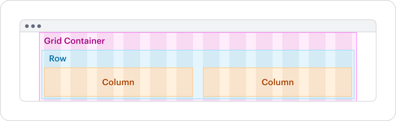
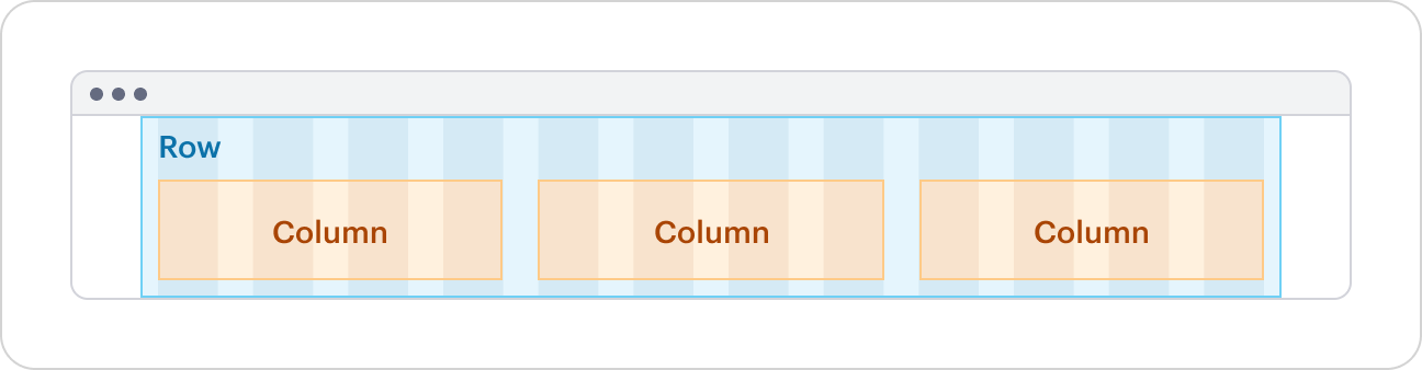
Structure
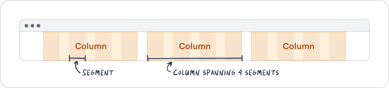
Grid is based on an invisible 12-segment structure, where each segment has a fluid width. As the grid resizes, segments scale proportionally.
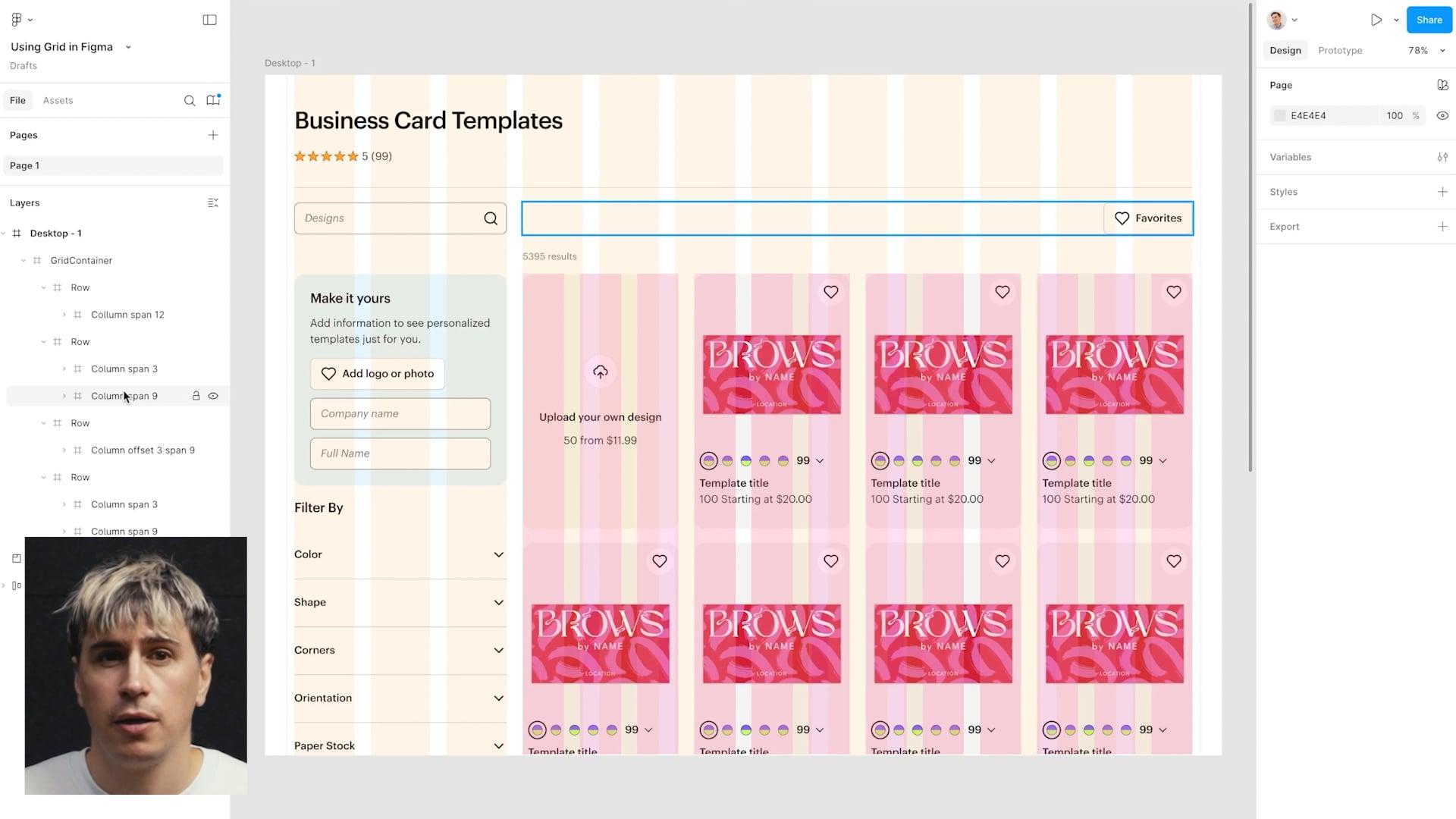
To structure layouts, Grid consists of three components that must be used in order: GridContainer > Row > Column. Nested layouts can be created by placing a GridContainer inside a Column.
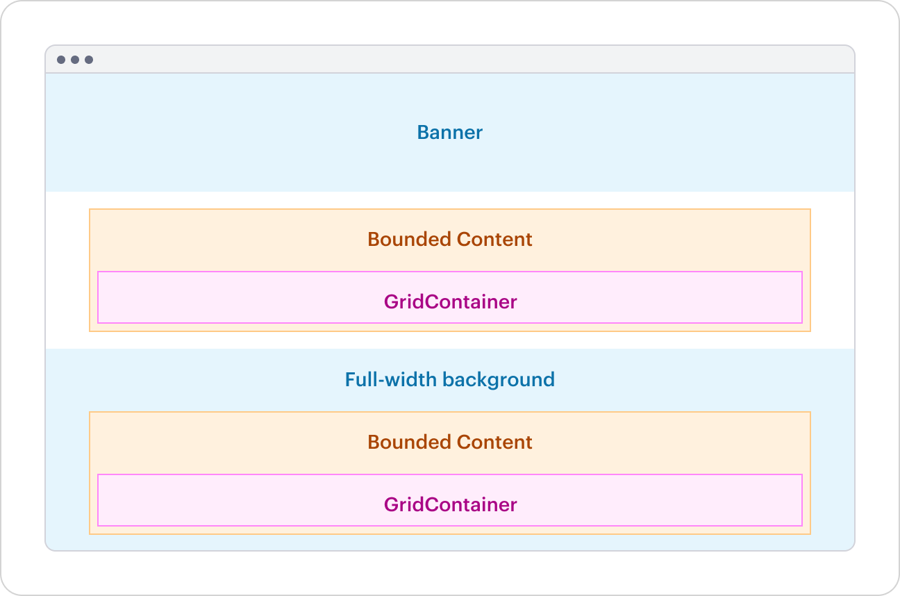
Never place Grid directly on the page. Always wrap it in BoundedContent to prevent columns from stretching to the viewport edges and to keep the layout aligned with the rest of the page.
The preview has been updated.
Do not add custom horizontal padding or margins to any Grid component, as this can cause layout issues and unwanted shifts. Grid components are purpose‑built to manage their own width and spacing.
Segment vs Column
- Segments define the layout structure, acting as invisible guides for alignment and spacing.
- Column is a flexible wrapper component that can span multiple segments, holding content and adapting responsively.
Segments create the structure, while the Column component controls how content is placed within that structure.

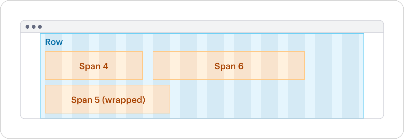
Spanning and wrapping
Columns can span 1 to 12 Grid Segments. If a Row does not contain enough Grid Segments, Columns will wrap within a row.
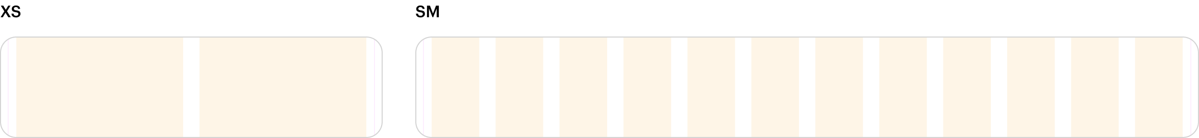
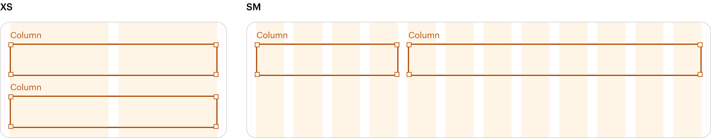
Columns without a set span will span 1 Segment. On xs breakpoints, all columns span 12 Segments, unless explicitly overridden with spanXs. Push, pull, and offset has no effect on xs breakpoints.
The preview has been updated.
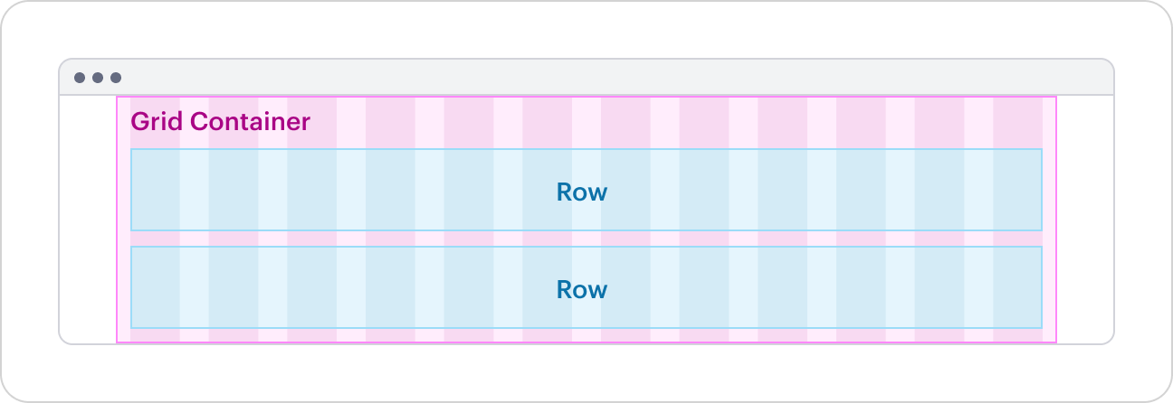
Grid Container
Use GridContainer to stack Rows vertically. Place the top level Grid Container inside Bounded Content for page layouts.
The preview has been updated.
Full-width elements
Use multiple sibling GridContainers to build your page layout. This lets you add full-width SWAN components like Banner (which shouldn’t go inside a Grid) or set a different background for a section. Each GridContainer must go inside a BoundedContent.
Refer to BoundedContent - Full-width Background Section for more information.
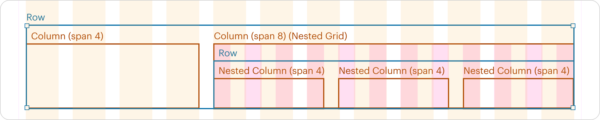
Nested Grid
GridContainer can be placed inside Column to create a nested Grid. Nested Grids do not contain the same outer padding as top-level Grids, allowing for alignment between the two.
Nested Grids must consist of the same structure of GridContainer > Row > Column.
The preview has been updated.
Dividers
Use dividers to add vertical lines between each Column.
The preview has been updated.
Tight Gutter
gutter is deprecated in SWAN v3.14
As it is rarely used, it has been deprecated to improve consistency for customers and reduce UX debt.
Use gutter="tight" only with product skin Standard Tiles to narrow the gutter between Columns.
The preview has been updated.
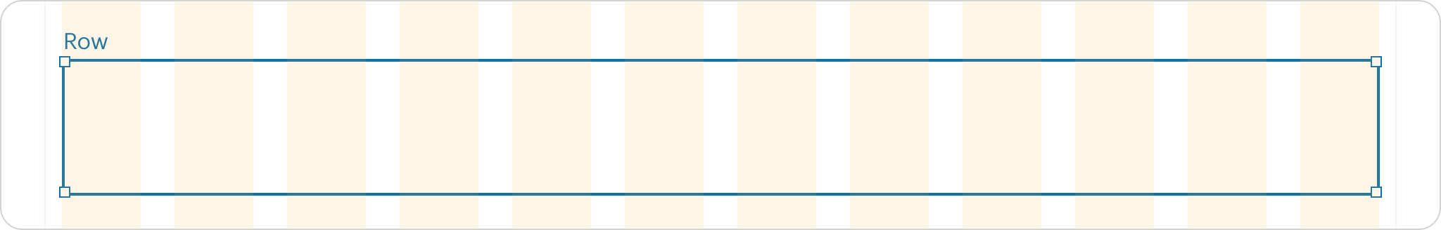
Row
Use Row to group Columns horizontally inside GridContainer.
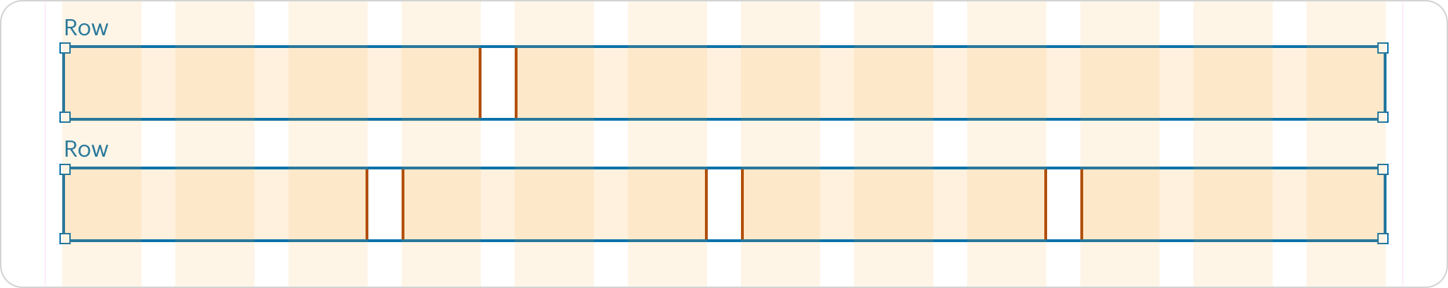
Vertical Gap
Grid does not provide any vertical spacing when columns wrap within a row. Use verticalGap to adjust this spacing as needed. verticalGap=”matchGutter” can be used to match the horizontal gutter.
Sticky
Use sticky on Row when a Column inside uses Sticky. Note that this will prevent columns from stretching to the same height.
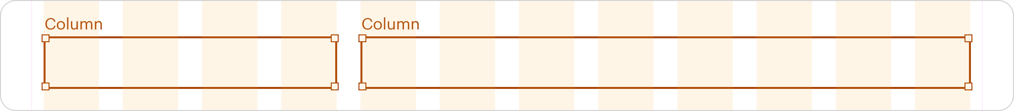
Column
Use Column inside Row to define flexible, responsive grid sections. Columns have padding inside that will align content to the grid segments.
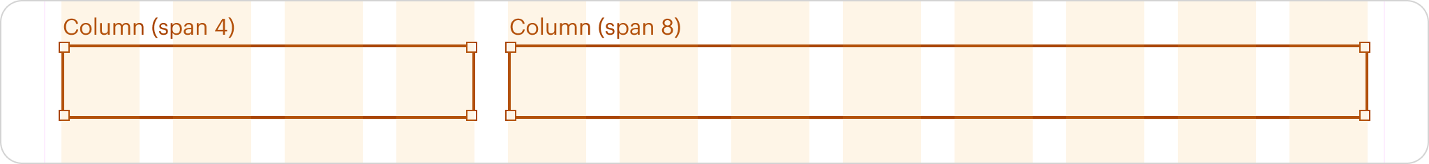
Span
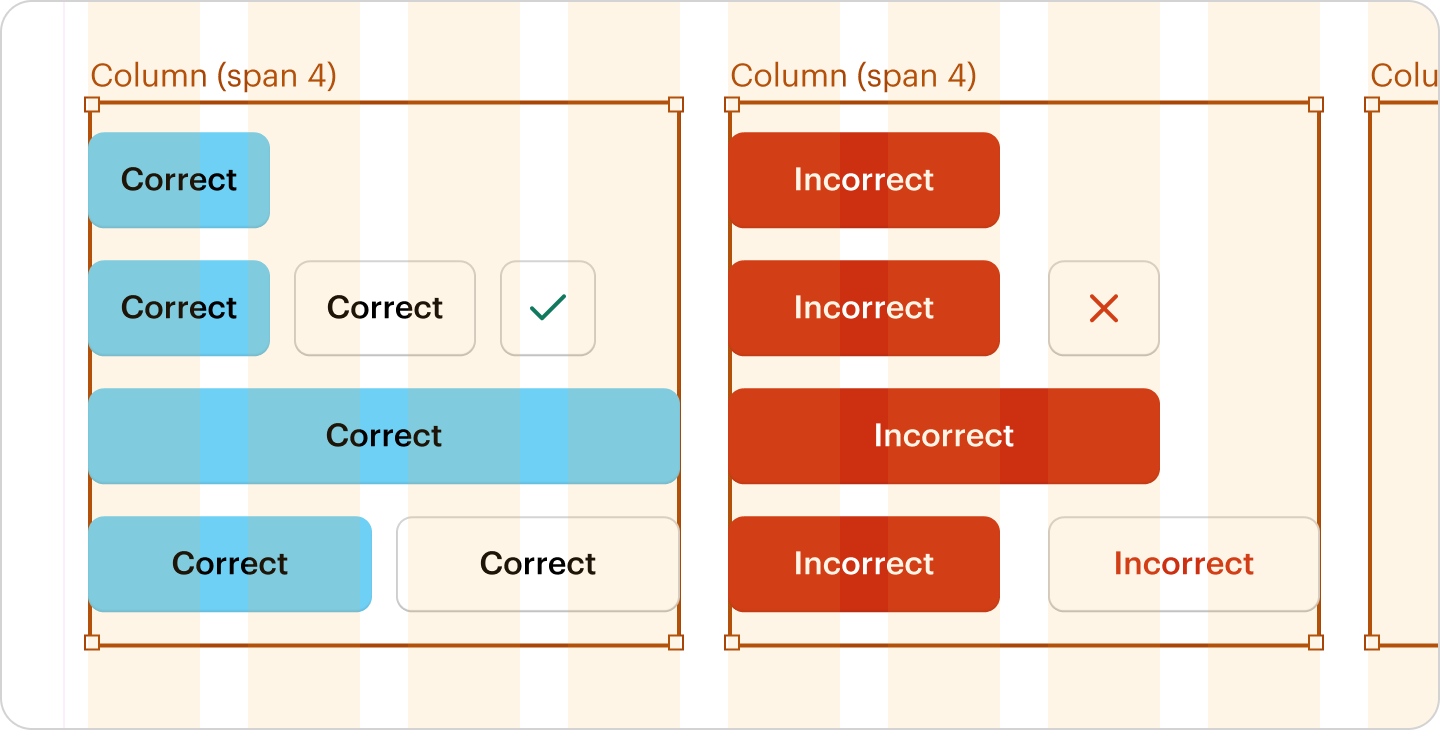
Use span={*} to extend columns across multiple Grid Segments.
The preview has been updated.
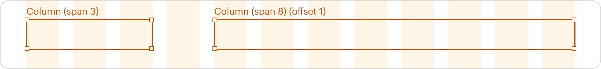
Offset
Use offset={*} to create horizontal spacing between columns. This is useful when adjusting spacing across different breakpoints. See responsive for more details.
The preview has been updated.
Align content within a subset of columns
Use offset to position content across a portion of the row without extra padding or custom CSS.
The preview has been updated.
Push and Pull
Use push={*} and pull={*} to reorder columns. Push moves columns to the right, while pull moves them to the left. This is useful for arranging content differently in the DOM than it appears visually, or for reordering content at different breakpoints. See responsive for more details.
The preview has been updated.
Sticky
Use sticky on the column and parent row to keep a Column on screen while its Row is visible during scrolling.
The preview has been updated.
Flex Column
Use flexColumn to evenly distribute the column content vertically.
The preview has been updated.
Vertically Center Content
Use verticallyCenterContent to vertically center the content.
The preview has been updated.
Floating Container
Use floatingContainer on a child Column with a span value to position it at the top left of the parent Column, allowing content to flow around it.
The preview has been updated.
Use floatingContainerAlignment="right" in addition to floatingContainer to align it to the right.
The preview has been updated.
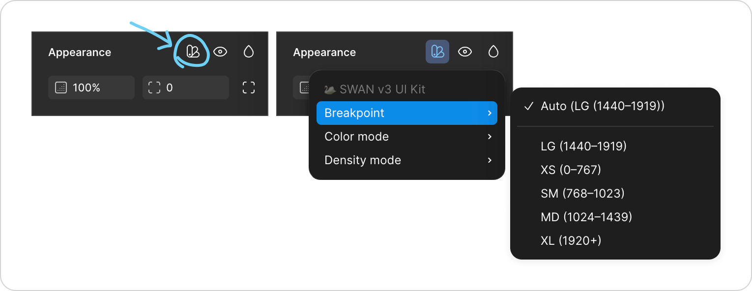
Responsive
Different props can be used to adjust column properties at Responsive System breakpoints, for example spanSm={2} and offsetLg=(4). These overrides do not cascade to other breakpoints.
Replace X with the appropriate breakpoint, e.g. spanSm.
Span
- Use
spanX={*}.
Offset
- Use
offsetX={*}.
Push and Pull
- Use
pushX={*}andpullX={*}.
Sticky
- Use
unsticky="xs"on the column to override sticky onxsbreakpoints.
In the Vanilla API:
Span
- Use
swan-col-*(0-12). - Use
swan-col-X-*for breakpoint-specific overrides.
Offset
- Use
swan-col-offset-*(0-12) withswan-col-*. - Use
swan-col-X-offset-*for breakpoint-specific overrides.
Push and Pull
- Use
swan-col-push-*andswan-col-pull-*. - Use
swan-col-X-push-*andswan-col-X-pull-*for breakpoint-specific overrides.
Sticky
- Use
swan-col-push-*andswan-col-pull-*. - Use
swan-col-X-push-*andswan-col-X-pull-*for breakpoint-specific overrides.
Flex Column
- Use
swan-col-flex-column.
Vertically Center Content
- Use
swan-col-vertically-center.
Floating Container
- Use
<aside>instead of<div>when the floating content (e.g., an image or quote) is secondary to the main content.
Accessibility
Grid as a List
In the React API, use as="ul" on GridContainer and as="li" on Rows for list-based content.
In the Vanilla API, use <ul class="swan-grid-container"> and <li class="swan-row"> instead of <div>.


