Use Pagination...
- For navigation across a range of pages of related content.
- To indicate a user's position within that range.
Don't use Pagination...
- For navigation within a small set of elements, where simple scrolling can suffice.
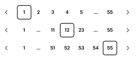
Pagination allows for navigation across a range of pages of related content and also indicates a user's position within that range. SWAN provides a standard set of controls, leaving it up to the particular page to implement the pagination logic behind them.
Pagination across pages
Use PaginationButton and PaginationStep with an href to navigate between pages or update the URL (e.g., routing or query param changes). These components render as anchor (<a>) tags by default
accessibleText is deprecated in SWAN 3.24. This prop will be removed in favor of SWAN's i18n system. Please opt in to the i18n system and remove this prop.
children prop in PaginationStep is deprecated in SWAN v3.24, instead pass page number in the pageNumber prop
The preview has been updated.
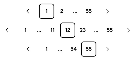
Pagination within a page (in-place updates)
When your pagination updates content dynamically within the same page, i.e., without a URL change or navigation, you should render each item as a <button> instead of an <a> tag.
To do this, omit the href prop and pass as="button" to each PaginationStep and PaginationButton.
The preview has been updated.
Disabled
Use disabled onPaginationButton to indicate a boundary has been reached. Do not disable PaginationStep numbers.
The preview has been updated.
disabled on PaginationStep is deprecated in SWAN v3.24
Individual pages should not be disabled, as doing so prevents users from accessing them and leaves them uncertain about the reason for their unavailability. Please remove using this prop.
Implementation
- Pagination is a simple set of controls with no actual pagination logic behind them. The page that uses it will need to:
- attach the URLs and/or handle any clicks to the Previous and Next buttons
- attach a change handler to the input field, taking the user to the specified page when the input's value is changed
- Pagination buttons can use either
<a>or<button>tags. The React PaginationButton component will default to<a>tags. Use<a>tags if a click takes the user to a new page; use<button>tags if a click loads new content into the same page. - If the user is on the first or last page, the Previous or Next button should be disabled accordingly:
- In the React API: add the
disabledprop to thePaginationButton. - In the Vanilla API: if your Pagination use
<a>tags, change the Prev/Next button to a<span>tag and add classswan-pagination-button-disabled. If your Pagination uses<button>tags, disable the button as you normally would for a button, by adding the attributedisabled="disabled".
- In the React API: add the
Accessibility
- The "buttons" in Pagination default to
<a>tags, which means they are links and need anhrefattribute. If your Pagination buttons aren't links, and instead perform in-page actions, they should be<button>tags, such as by usingas="button"in the React API. - The buttons need additional text to guide the user as to their function.
- In the React API, if you’re not using SWAN’s i18n system, use the
accessibleTextprop to provide guidance (as shown in the code example above). - In the Vanilla API, use
aria-labelandaria-describedbyattributes (as show in the code example above). Anyaria-labelvalues will need to be localized, since they will be presented to the user by screen readers and assistive devices.
- In the React API, if you’re not using SWAN’s i18n system, use the
 Do
Do