
Accessibility
Features that SWAN offers for accessibility support.
All Tokens
A list of all SWAN tokens
Color
Color is a crucial aspect of our visual language, conveying meaning, emphasis, and hierarchy in our product UI.
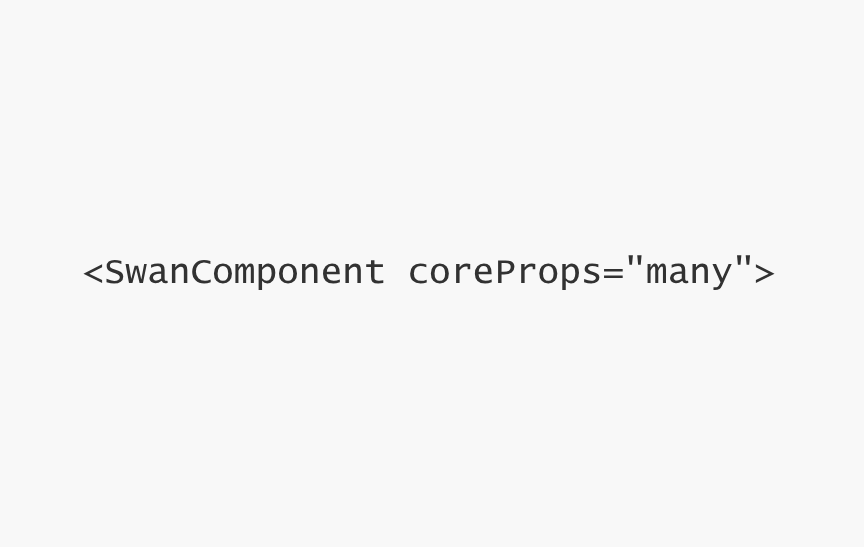
Core props
Core props usable on all SWAN components

Glossary
Terms and terminology used in SWAN
Page Layout
Building consistent page layouts using SWAN

Icons
Symbolic representations of concepts and actions that are intuitively recognizable to users.
Modes
Modes utilize alternate values in SWAN tokens to adjust the appearance of UI. Modes cascade through to all tokens and components used within the mode.
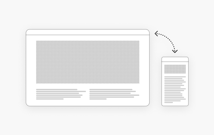
Responsive System
Breakpoints and screen classes to control page layouts and components at different screen sizes
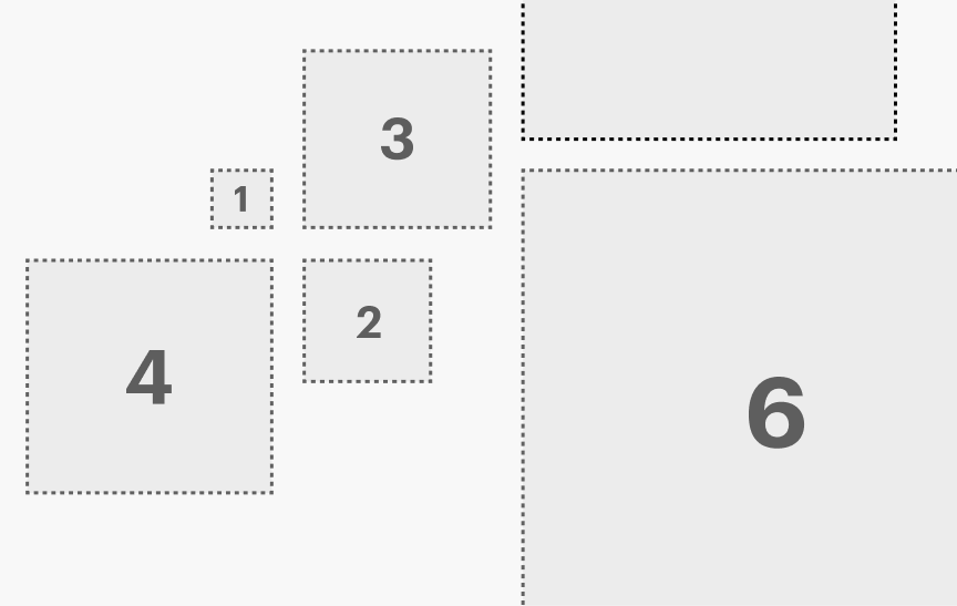
Space
Space is used to bring structure and hierarchy to pages. Proper spacing enhances readability, guides user flow, and creates a clean, uncluttered interface.
Typography
Typography can help guide users through an experience by organizing information and creating clear visual hierarchy.