Color is a fundamental element of our visual language, used to convey meaning, emphasis, recognizable consistency, and hierarchy across Vista product UI’s.
Based on Vista brand guidelines, our color palette enhances user experience by clearly differentiating elements, guiding interactions, and ensuring visual consistency.
For a quick overview of Colors, take a look at the following learning materials:


Palettes
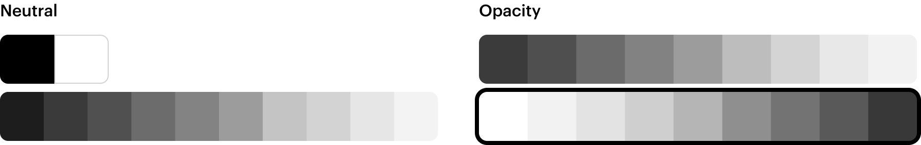
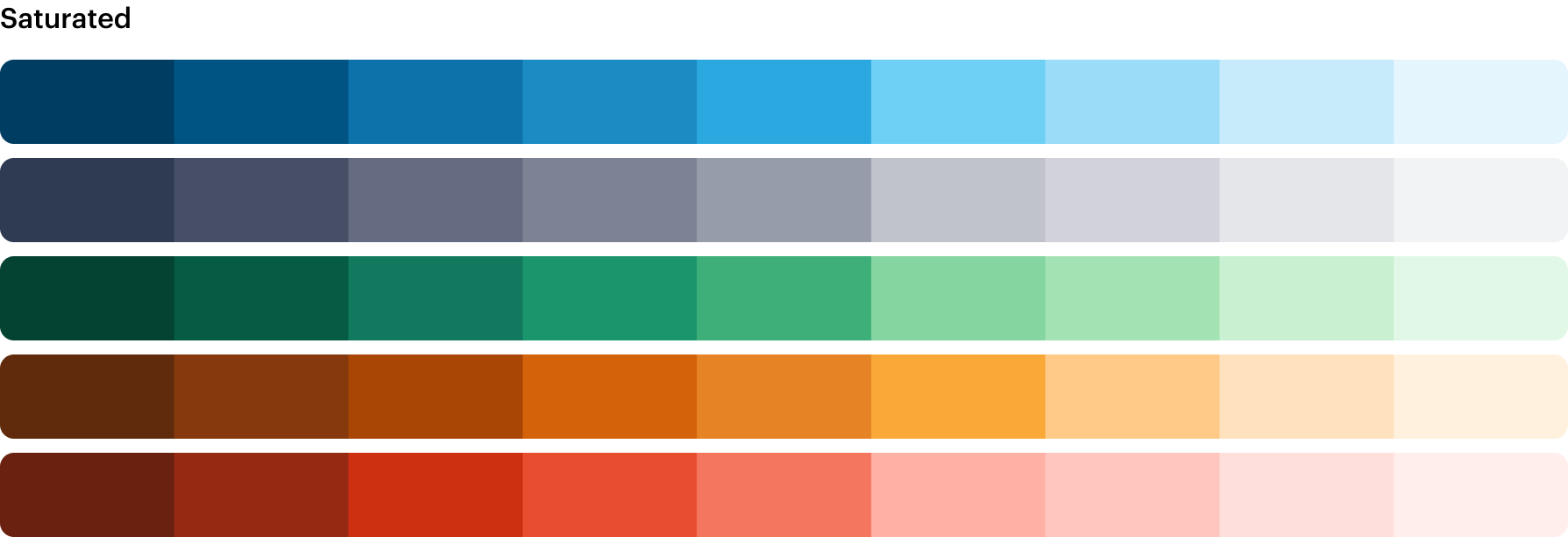
SWAN’s color system is composed of eight palettes for different UI needs:
- A neutral color palette is commonly used for text, icons, backgrounds, borders, and interactive states.
- Two opacity palettes align to the grey palette, used on backgrounds and elevations allowing them to blend into the surface below when used on a page background, the contrast of the opacity palette aligns with the neutral palette.
- Five saturated color palettes are used for semantic roles, such as error and warning.
Semantic roles
SWAN's saturated palettes form the basis of semantic color roles. These roles and their associated colors provide feedback for user actions, conveying information, and indicating state.
 Do
Do
Always align your use case with the specific semantic role.
Dont
Use a semantic role merely to achieve a desired color hue.
The preview has been updated.
Tokens
Color decisions are managed through design tokens that synchronize between code and Figma, with their application defined by their semantic purpose.
All color tokens are prefixed with base, sem, or comp. sem tokens are followed by their intended property: bg, border, icon, or text.

Refer to Tokens for more details, and All Tokens for a searchable list.
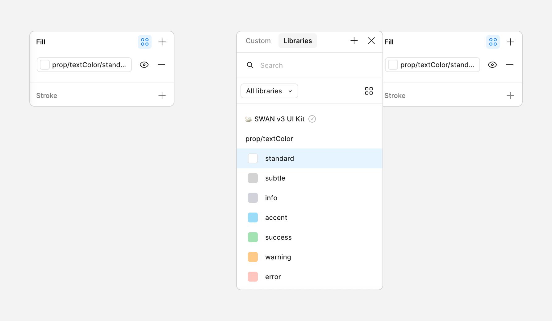
Props
SWAN provides textColor and backgroundColor props to utilize these tokens in code. See Color Props Documentation.
Pairing roles and alternative text colors
Role-related colors are designed to be flexible, allowing text colors like sem.color.text.success to be used with their equivalent background colors like sem.color.bg.success. Alternate text colors, such as sem.color.text.success-alt for desaturated text, can be used to achieve subtle aesthetic variations.
The preview has been updated.
A specific subset of role colors designated with "paired" in their name (e.g., sem.color.text.success-strong-paired and sem.color.bg.success-strong-paired) must be used as a pair.
This pairing is critical to meet accessibility contrast requirements across both Standard and Dark color schemes.
The preview has been updated.
Brand colors
Brand colors are used sparingly in key UI components to create an identifiable brand aesthetic.
Vista Blue is our main brand color, however, it should only appear in key parts of the UI and be used only by the SWAN team. It is purposefully not available as a prop.
The preview has been updated.
Do
Use accent brand color for stand outs brand moments.
Dont
Apply Vista Blue to other components, or UI.
Additional brand colors can be used to enrich designs and create a strong brand aesthetic.
The preview has been updated.
Do
Apply Warm White to "text-only" areas and FAQs backgrounds to highlight and contrast them from other content.
Do
Warm White and Midnight can be used for marketing Banner.
Do
Apply Midnight to the site footer.
Do
Apply Fern to backgrounds on sustainability-related Vista intiatives.
Don't
Apply Fern to UI that isn't directly related to a Vista sustainability initiative.
Seasonal palettes
Marketing campaigns utilize seasonal color palettes of five colors, which are distinct from our system colors and change throughout the year. These are applied directly to components via the Contentful CMS, where applicable.
Refer to the Seasonal Color Guidelines for details on current palettes and timing.
Interaction
To ensure consistent and informative feedback, use the provided color tokens for interaction states. Interaction states can be applied to backgrounds, borders and texts. Colors frequently include variations for states like hover, active, and focus, extending the base color's emphasis. For example, use sem.color.bg.action-hover to represent the hover state of sem.color.bg.action.
The following table illustrates the different interaction states available for sem.color.bg.input
The preview has been updated.
Dark mode
Dark mode reverses the colors of a section of your page, enabling text and components to be legible on darker backgrounds.
For more information on modes, check the Modes page.
Applying color in Figma
In Figma, color is managed using variables. To apply a color, select the element and property, then choose the appropriate color variable from the variables panel.
- Select the element to which you want to apply the color.
- In the properties section on the right side of the screen (Figma UI 3), find the Fill or Stroke property panel and click the four dots icon (Apply styles and variables).
- Select the semantic color you want to apply.
Do
Apply color variables for different states (e.g., hover, active, disabled) to maintain consistency
Dont
Don't Override the value of a color variable within a specific instance unless absolutely necessary and with clear justification
Do
Choose color variables based on their semantic meaning (e.g.: sem.color.text.primary) rather than just their visual appearance.