Modes utilize alternate values in SWAN tokens to adjust the appearance of the user interface. When a mode is applied, its specific token values cascade through to all nested SWAN components and tokens used within that mode's scope.
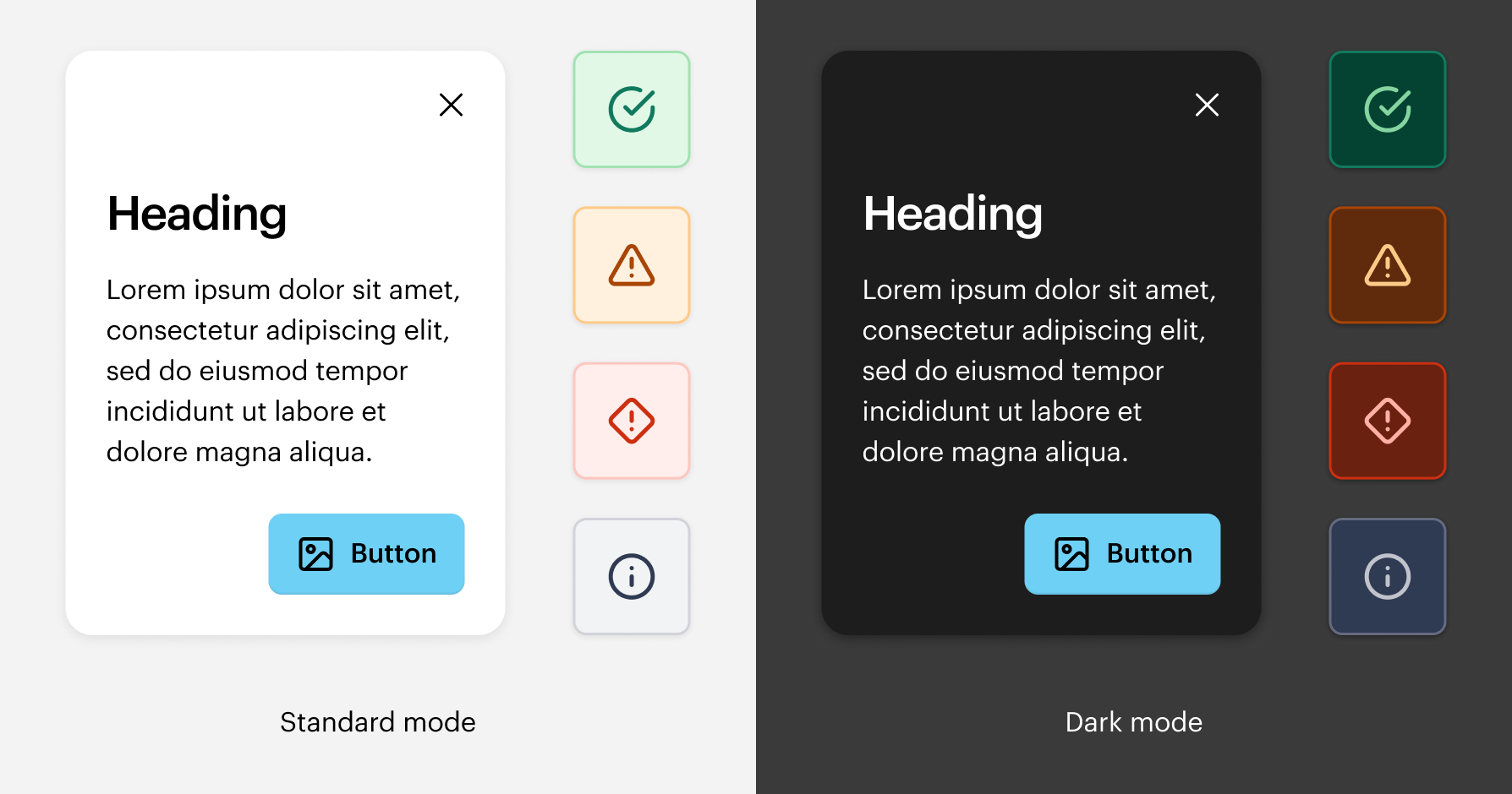
SWAN currently supports three modes for color theming and UI density: Standard mode (default), Dark mode, and Compact mode.
For a quick overview of Modes, take a look at the following learning materials:

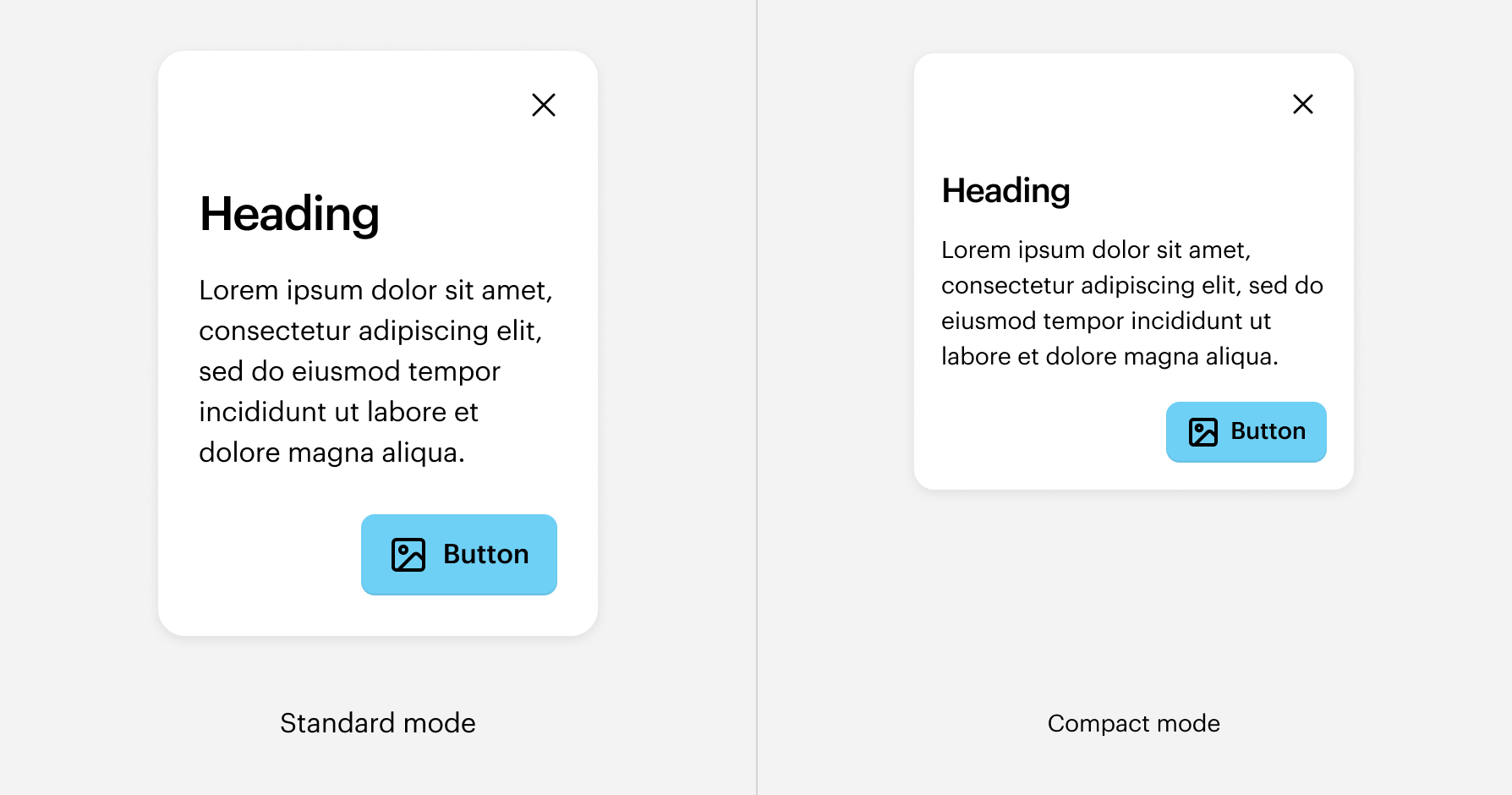
Standard mode
The default appearance, used when no other modes are specified. Standard mode utilizes a light color palette with dark text and vibrant accents, and provides the default sizing and spacing for SWAN tokens and components.
Examples include: Homepage, Category pages, Product Detail Pages, blog posts, marketing landing pages, and general content areas.
Dark mode
Dark mode provides an alternative visual theme using dark background surfaces with contrasted foreground elements. Is applied sparingly in key elements of the site, to create a distinct visual emphasis that contrasts.
Examples include: Promotional banners, Promotional bar.
 Do
Do
Use Dark mode on specific sections of the site that have a dark background.
Dont
Apply Dark mode to entire pages.
Compact mode
Density modes adjust the spacing and sizing of UI elements. Compact mode reduces spacing and paddings, allowing more information to fit within the available screen space.
Examples include: Studio, Logomaker, and the Collaboration app. It also may be a candidate for internal Vista tools where content density is important.
Do
Apply compact mode to the entire page layout.
Dont
Mix Standard mode and Compact mode on the same page by applying them to specific components or sections.
Usage
In code
- Use
darkModeto apply dark mode to a section of the page. - Use
compactModenear the <body> to apply compact mode to the entire page. - Use
standardModeto override other modes with standard mode.
When nesting Dark mode inside Compact mode, Compact mode must be re-set. This is a known issue that we will address in a future version.
The preview has been updated.
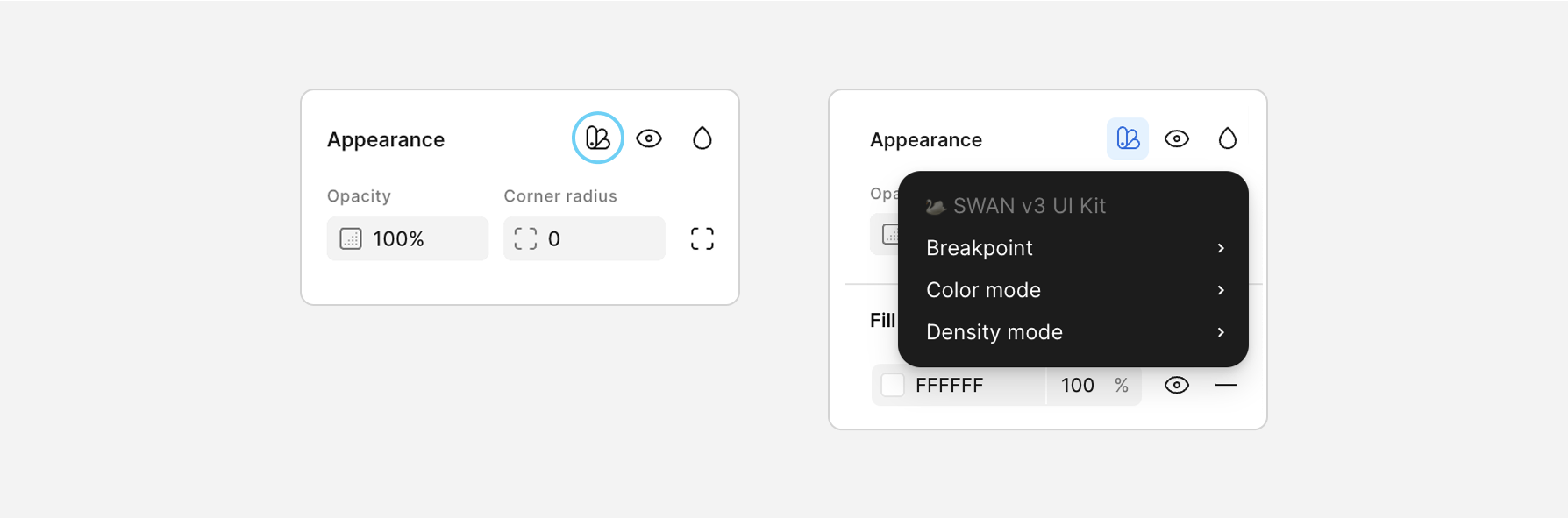
In Figma
Modes are managed using Figma's built-in Variables and Modes features in the SWAN UI Kit.
While breakpoints aren't considered "modes" in code, they are applied the same way in Figma. In code, modes are applied using Core Props.
For more information, refer to Responsive System .
Applying modes:
- Select the frame that you want to change modes. Usually this should be the parent frame.
- Find Appearance section on the right side of the screen (Figma UI 3) and click the sample book icon (Apply variable mode).
- Select the mode you want to apply.