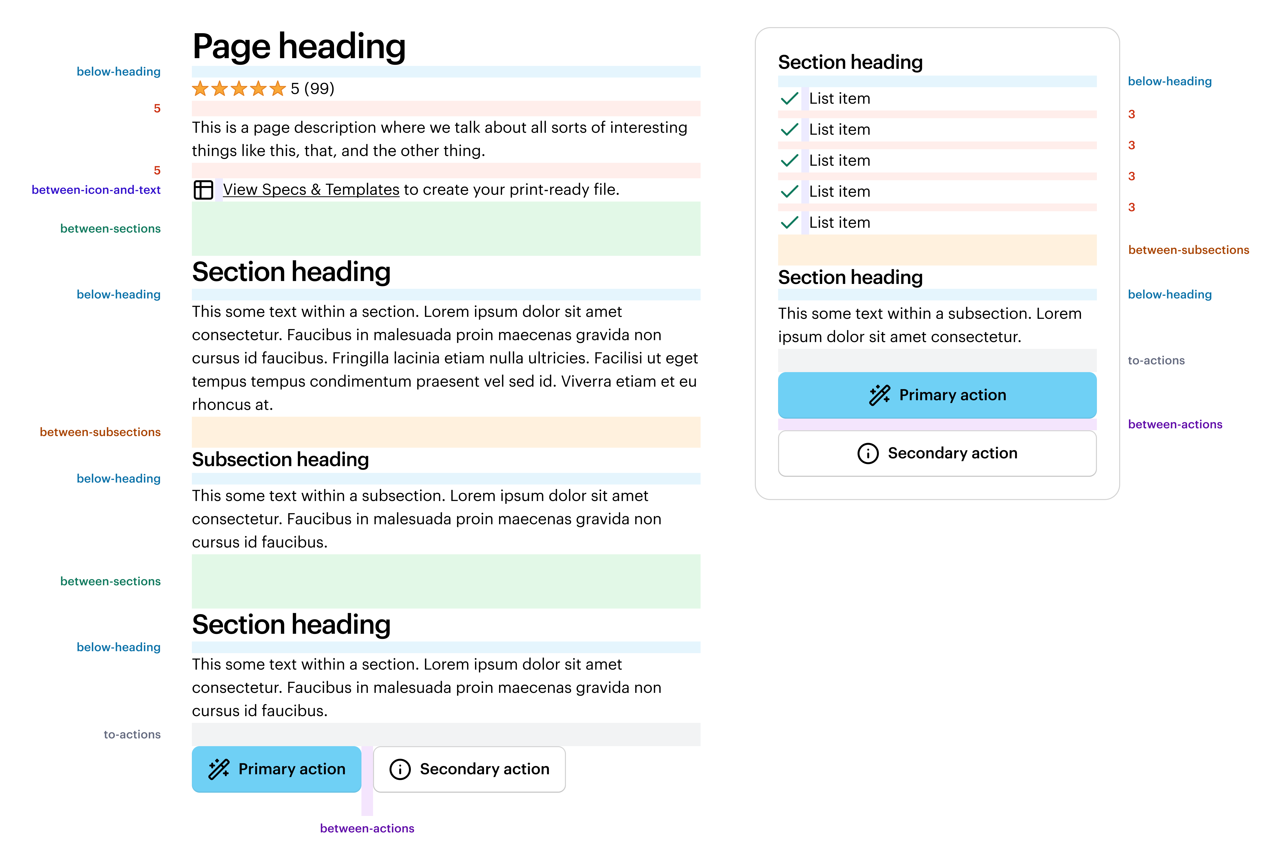
Space is used to bring structure and hierarchy to pages. Proper spacing enhances readability, guides user flow, and creates a clean, uncluttered interface.
Space decisions are stored in design tokens which sync between code and Figma. All space-related design tokens start with the word space.
See the All Tokens page for a full list of space tokens.
Semantic space
Semantic space brings structured usage guidelines to common spacing needs. Designers can use semantic space variables in Figma, and engineers can use semantic space via props or tokens. These have smaller values in Compact mode.
If a use case doesn’t fall within the semantic space options, use numeric space.
The preview has been updated.
Numeric space
Numeric space is used when semantic space doesn’t fit for a particular use case. It should not be for non-space-related styling such as widths and heights. These have smaller values in Compact mode.
The preview has been updated.
The preview has been updated.
Compact mode
Compact mode increases the overall density of your page, from the space between sections to padding within components.
For more information, see Modes.
Putting it all together
Below is an example layout, using various spacing options together. Refer to Typography for more information on using font skins to further indicate content hierarchy.
Applying space in Figma
Like all tokens, space tokens are represented in Figma as variables. To apply space, wrap components in an Auto Layout frame, then apply the intended space variable to the gap.
 Do
Do
Use named semantic space when the use case matches the semantic meaning.
Don't
Try to force named semantic space in places where it doesn’t fit. Instead, use numeric semantic space.
Do
Use space variables for the gaps between SWAN components.
Don't
Use space variables for horizontally laying out the sections of your page. Use Grid instead.
Do
Use space variables when creating bespoke components (outside of SWAN). This will ensure all components are using a consistent spacing system.
Don't
Alter the default spacing on SWAN components, as this may cause issues with the components' innate margin or padding that they may need for their internal layout.
For a quick overview of Space, take a look at the following learning materials:

Translating space from Figma to code
Designers, please talk with the engineer implementing your designs! Engineers may not be aware of the semantic spacing options. As you talk through design intent, also walk through concepts such as font skins and semantic space.
In code, space is represented as props which can be applied to any margin, padding, or gap. Refer to Core props and FlexBox for more information.
Applying space in code
Do not alter the default spacing on SWAN components, as this may cause issues with the components' innate margin or padding that they may need for their internal layout.
To put space between two elements, wrap them in a FlexBox component and apply the spacing to the gap property. Alternatively, wrap one of them in the Box component, and put the margin or padding onto the Box. Use Grid to structure page layout horizontally.
Grid
Use the Grid for the underlying structure of a page. Don’t use it for adjacent, inline elements. Refer to Grid for more information.
FlexBox
Use the gap prop on the FlexBox component to set a uniform gap (gutter) between the flex container’s children. Both semantic and numeric space values can be used. Refer to FlexBox for more information.
Core props
Use space core props to set the margin or padding. Both semantic and numeric space values can be used. For a full list of props, refer to Space props.
Tips
- All else equal, use margin instead of padding.
- All else equal, use bottom spacing instead of top spacing.