A destructive action deletes or discards data. It should be presented to users in a way that highlights the impact of the action. Destructive actions should have additional friction by taking place over multiple steps, always including the “Trigger” and the “Confirmation”. Wherever possible, a customer should be able to undo a destructive action once taken.
Destructive Actions
Use the Destructive Actions pattern...
- Whenever presenting users with the option to delete or discard data.
- For consistent and predictable UI, allowing users to apply knowledge across multiple scenarios.
Overview
Preventing errors is better than helping users recover from them, which is why destructive actions require some friction before the action can be executed. Use additional visual signals (such as the destructive semantic color and icons) to differentiate between actions and destructive actions on an Object to help avoid user errors. Wherever possible, users should be able to undo a destructive action once taken.
The Destructive Actions pattern requires the use of several SWAN components. There are four parts to destroying content—the “Object”, the in-context “Trigger”, the “Confirmation” Modal Dialog, and the “Outcome”.
Object
The UI element that the destructive action will affect. Examples are projects, addresses, payment methods, etc.
Usually represented as an Expansion Pack Tile, Card, File Tile or Table.
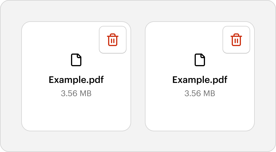
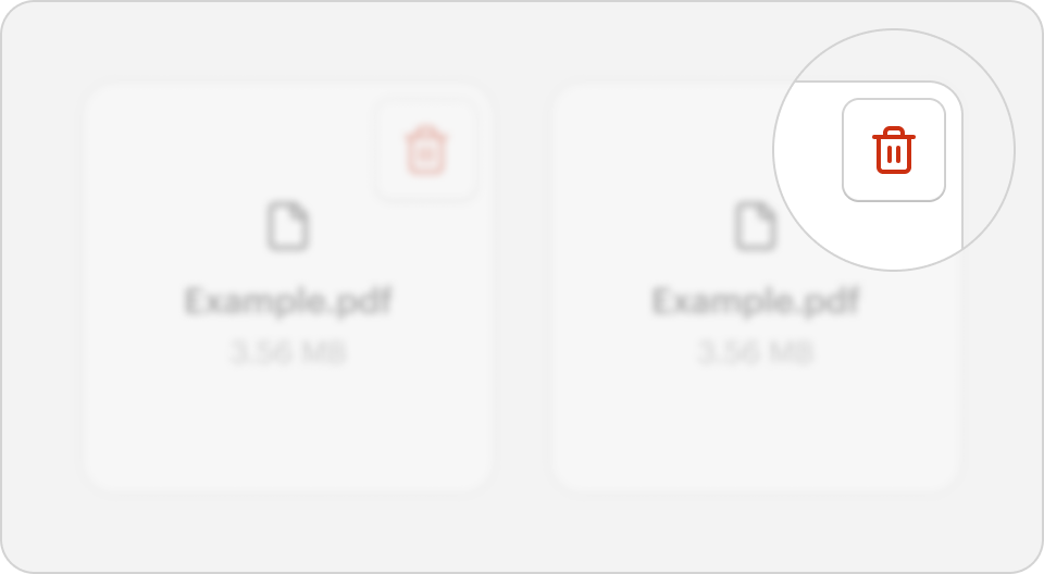
Trigger
UI that captures the customer’s intent.
Usually represented as a Button styled with the skins destructive-primary, destructive-secondary, or destructive-tertiary.
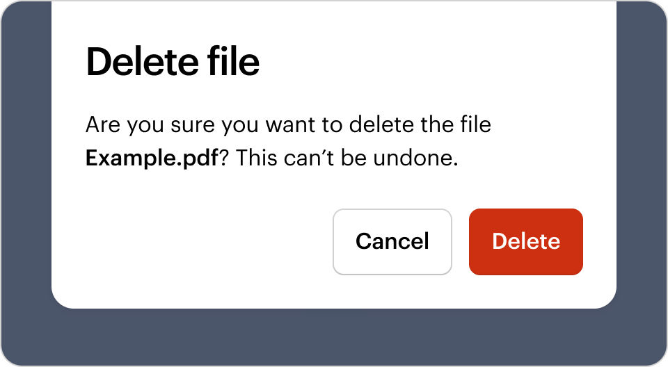
Confirmation
This step interrupts the user to ensures they understand and are confident in moving forward with the destructive action.
Usually represented as a Modal Dialog and containing a simple message with a confirmation and cancel action.
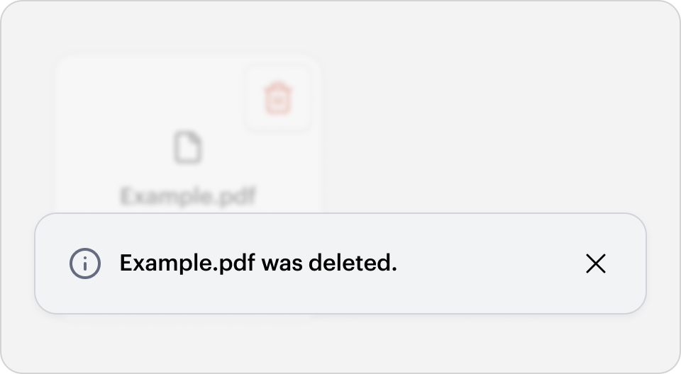
Outcome
UI that demonstrates to the user that the destructive action was completed successfully (or not).
The Outcome can be represented in different ways depending on the context. Possible examples include a floating Alert Box, a Modal Dialog, or a Card.
Tip: Less impactful actions (such as clearing a filter, or when there is no data loss) may skip the Confirmation and Outcome.
Behavior
Use consistent verbs
Use specific verbs to represent the specific action taken. Use the chosen verb consistently to communicate the outcome of the action clearly. e.g. do not mix the verbs “Delete” and “Remove” when describing a single destructive action.
The preview has been updated.
Use additional visual signals
The Trigger is usually represented as a Button styled with the skins destructive-primary, destructive-secondary, or destructive-tertiary. The Button may be icon-only, icon with a label, or label-only. Use the icon delete and the Button label text may use a variety of verbs such as “Delete”, “Remove”, or “Discard” (see the Use consistent verbs section for more information). Ensure the selected verb is used consistently.
The preview has been updated.
Communicate the consequences
Larger destructive actions should have a Confirmation step in the form of a Modal Dialog. This ensures the user understands the consequences of the action. The Modal Dialog should have a consistent structure—with a heading, description, and a Button group.
Heading
Use the same verb as the Trigger and include the Object being acted on. e.g. “Delete file”, “Remove item”, “Discard changes”, “End subscription”.
Description
Use the description to communicate the consequences of the destructive action. It may include content and other elements that clarify what the destructive action applies to or any additional information (e.g. “What you’ll miss out on” bulleted list, “This will permanently remove the recipient from the mailing list”).
- For recoverable destructive actions, communicate and potentially provide access to how the customer may undo the destructive action (e.g. “This file will still be available in My Projects”).
- For non-recoverable actions, include the copy “This can’t be undone.” at the end of the description.
Button group
The Confirmation Button should use the skin destructive-primary and be placed on the far right. The Button label text should be the same verb. e.g. “Delete”. Directly beside the destructive action should be a “Cancel” Button using the skin secondary. All Buttons in the group are right-aligned. See the Button Placement pattern for more information.
The preview has been updated.
Provide visibility of the Outcome
Larger destructive actions should have an Outcome step, where the UI is updated to reflect that the Object has been removed. There are multiple ways of expressing this based on the context. e.g. Alert Box, another Modal Dialog, replacing the deleted UI with a Card. Provide a graceful transition to the end state (e.g. element or page loader; fade-out deleted item and transition other items appropriately; order status changes from “In progress” to “Cancelled”). The Outcome should only ever be dismissed by users—don’t put it on a timer.
Destructive actions should be recoverable unless there is a technical limitation preventing it. This may take the form of an “Undo” Button styled as a Link. If the action is undone, present UI communicating that the Object has been restored.
If a destructive action fails, ensure that the user is given an alternative action to try again or resubmit.
The preview has been updated.
The preview has been updated.
How does Destructive Actions meet your needs?