Users can upload files in different contexts across Vista. The File Upload pattern ensures users are presented with a consistent UI regardless of the file types uploaded or the specific page navigated to. This pattern covers the most common scenarios but is not intended to be comprehensive. If you have a unique use case, reach out to #help-swan so we can track its usage for future iterations of this pattern.
File Upload
Use the File Upload pattern...
- When presenting users with the ability to upload files.
- To display a user’s previously uploaded files.
- For consistent and predictable UI, allowing users to apply knowledge across multiple scenarios.
Overview
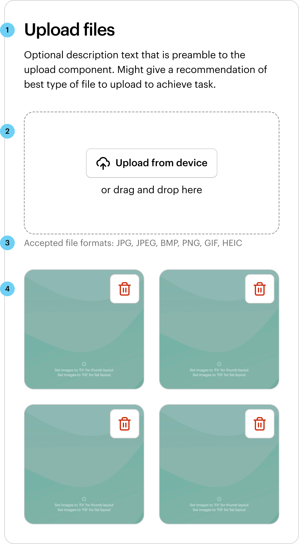
The File Upload pattern requires the use of several SWAN components. There are four parts to uploading files—the “Heading and description”, the “Upload initiation”, the “File requirements”, and the “Uploaded files”.
1. Heading and description
For the heading, use a font skin that corresponds with the visual hierarchy of the page. The description might give a recommendation of best type of file to upload to achieve task. Both are optional depending on scenario.
2. Upload initiation
Use File Dropzone by default when presenting users with a view to upload a file. File Dropzone allows the user to upload one or multiple files via drag-and-drop. Alternatively, use File Input for scenarios where there’s limited space for uploads.
The recommended appearance of File Input has an icon positioned left, with iconType=”upload”, and the Button label “Upload from device”.
3. File requirements
Wrap the File Dropzone or File Input inside a FormInputGroup to list out the file upload requirements file upload requirements and errors.
4. Uploaded files
Use File Tile to depict a file that has been uploaded by a user. File Tile is a representation of a file such as an uploaded image or a template asset. Use Grid to organise File Tiles. See Layout for more information.
Behavior
Single file upload
In scenarios where only a single file can be uploaded (e.g. uploading an avatar), add the File Tile as a child of the File Dropzone. This approach allows the UI to stay consistently sized. Refer to File Dropzone for more information.
The preview has been updated.
Multiple file upload
In this scenario, multiple files can be uploaded and displayed. Add File Tiles directly below the File Dropzone. Refer to Layout for more information.
The preview has been updated.
Interaction
File requirements
Since it is an input element, File Dropzone or File Input can be used inside of a FormInputGroup along with a separate, external label and/or helper text. Helper text should display upload criteria such as accepted file formats and maximum file size. FormLabel can be added if a specific scenario calls for it. List any file upload requirements as follows:
- File format requirement: Use the term “Accepted file formats” and style file extensions in uppercase with no dot. e.g. “JPG, PNG, GIF”.
- Size requirement: Use the term “Max file size” and style data as digits, a space, and file size. e.g. “10 MB”.
- Max files requirement: Use the term “Max number of files” and style data as a digit. e.g. “4”.
For uploads with multiple file requirements, use a bulleted list to easily distinguish between each requirement.
The preview has been updated.
Errors
For upload validation errors, use the FormError on the FormInputGroup component. The error text should be descriptive and give users a recommended action to rectify the issue.
The preview has been updated.
File Tile can also show errors specific to the file. e.g. a file has failed to upload or is corrupted. To show an error on a File Tile, set skin="error" and set an errorMessage.
The preview has been updated.
Loading
File Tile has multiple skins to display different file states. The queued skin is for files that are waiting to be uploaded, while the loading skin is for files that are currently being uploaded.
The preview has been updated.
Layout
Use the semantic space between-subsections to put vertical space between the File Dropzone and any uploaded files.
Files should be ordered from newest to oldest, therefore, as more files are uploaded, they’re added to the top of the stack.
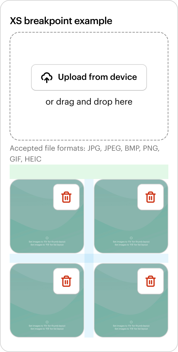
File Tiles have a fixed square ratio. The parent container size will determine the overall size of each File Tile. Use Grid to organise File Tiles from newest to oldest. The amount of File Tiles per row is flexible depending on the parent container width and the density goals of the design. Have at least two per row at all breakpoints.
Condensed list view
Use layout="list" for a more condensed list view that stacks vertically. Best suited to scenarios where the files uploaded are not images.
The preview has been updated.
Displaying previously uploaded files
In this scenario, notify the user that files have been uploaded from previous sessions by displaying the heading “Previously uploaded” using the font skin title-subsection.
The preview has been updated.
Primary vs secondary actions
Use the secondary skin on File Dropzone and File Input for most use cases. The primary skin may be used if the task "uploading a file" is the primary action on the page view. In the example below, the “Next” Button is the primary action, so the File Dropzone uses the secondary skin.
The preview has been updated.
Two “upload” actions
In this scenario, the user is presented with two options for initiating an upload. In cases like this, use a File Input and a Button. The preferred or main action should usually use the primary skin, but consider what other primary actions are elsewhere on the page.
The preview has been updated.
Alternate option for single file upload
See Single file upload for the preferred method. If using a File Input to upload a single file, add a File Tile with layout=”list” directly below the File Input. Any additional file upload initiated from File Input should replace the existing file.
The preview has been updated.
How does File Upload meet your needs?
Related