Start designing
The SWAN Design System is a collection of standards, components, tools, and resources that empower Cimpress teams to deliver usable, delightful experiences to our customers, faster and more efficiently.
Quick links


Documentation
The SWAN Design System site (you are here now) is the go-to place for all things design system related. View guidelines and coded examples of components, foundational design elements such as colors and typography, and live code playgrounds.

Figma
Figma is Vista’s design and prototyping tool of choice. If you are new to it, refer to the Intro to Figma presentation.
Once you are ready to start your first project, use the Project template to structure your Figma files.
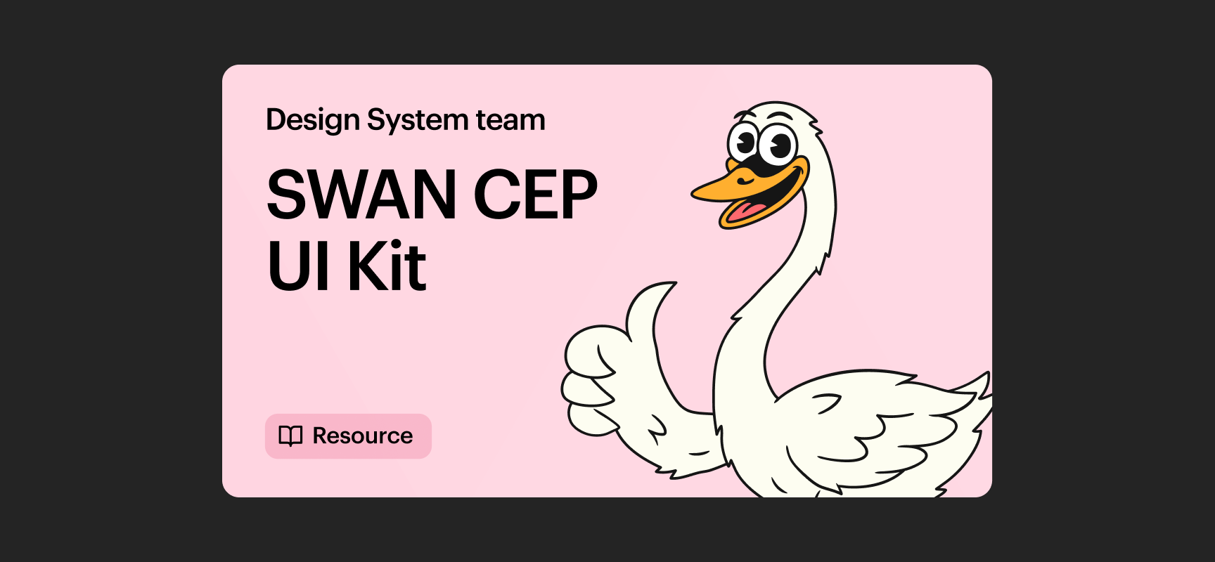
UI Kit
SWAN foundations and components can be used in Figma via the 🦢 SWAN CEP UI Kit library. The library should be enabled in all Vista Figma files by default. If not, it can be enabled via the  Team library menu.
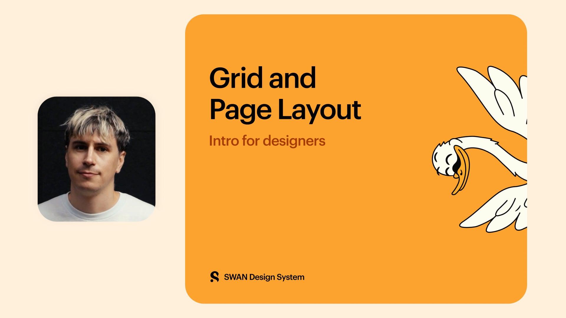
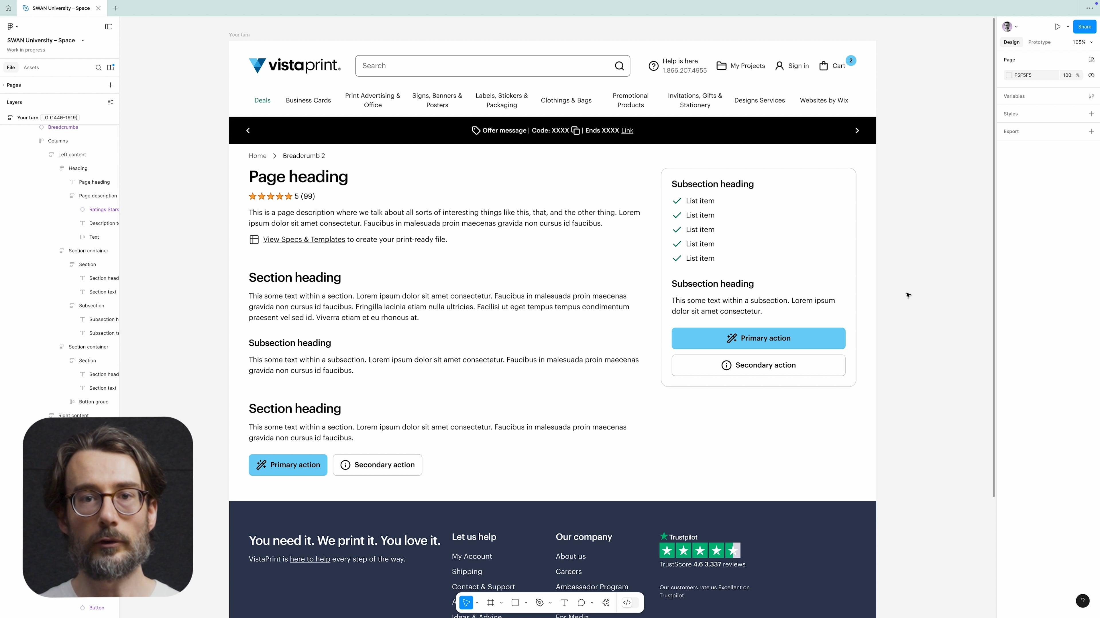
Page Layout
Page layouts are created using Page Wrappers, BoundedContent, Grid, the Responsive System, and Space. Correct use is essential for maintaining consistent content alignment across pages.
Refer to Page Layout for more information.
For a quick overview of Grid and Page Layout, check out the following learning materials:
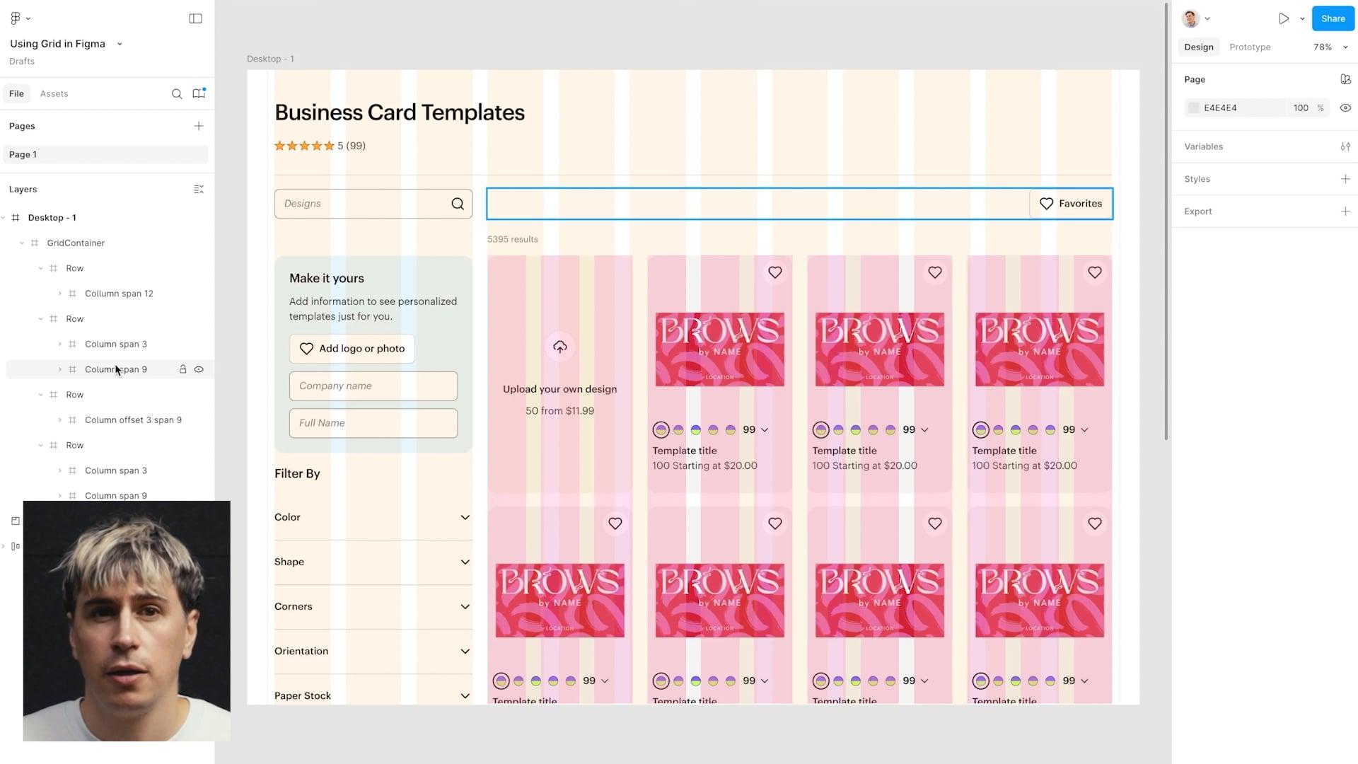
Grid
Grid provides a structured layout framework for page content, ensuring consistent alignment, spacing, and responsiveness across components and screens.
Refer to Grid for more information.
Responsive System
The Responsive System is a collection of breakpoints and screen classes used to control page layouts and components at different screen sizes
Refer to Responsive System for more information.
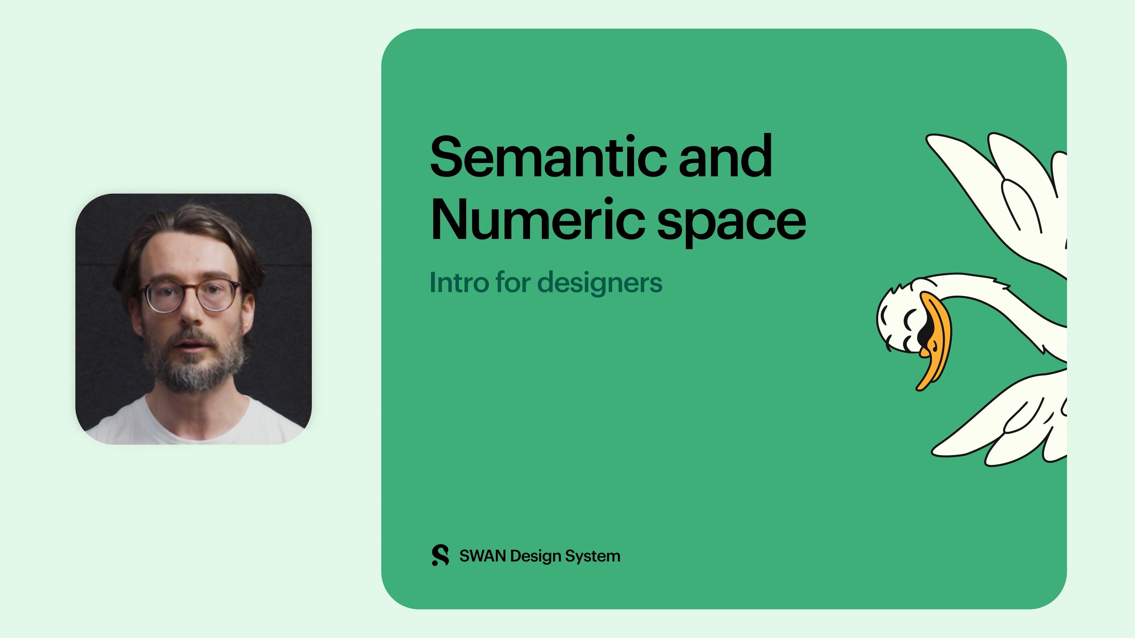
Space
Space is used to bring structure and hierarchy to pages. Proper spacing enhances readability, guides user flow, and creates a clean, uncluttered interface.
Refer to Space for more information or take a look at the following learning materials:
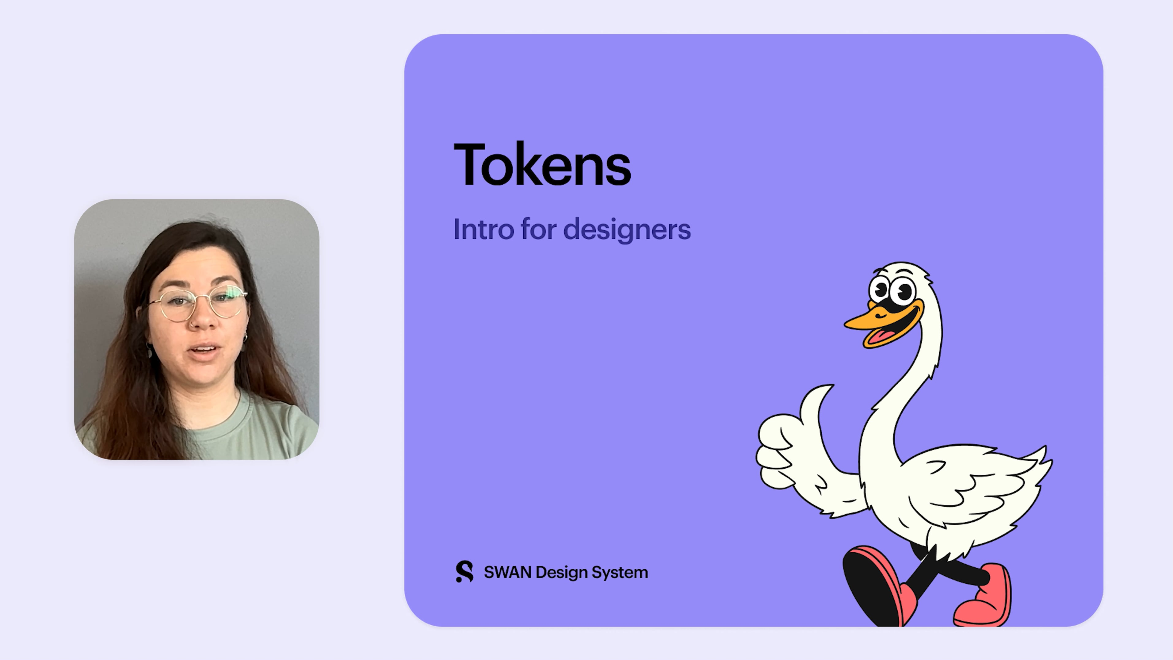
Tokens
Tokens (also known as Design Tokens) are reusable variables that define design properties like color, typography, and spacing. They represent shared design decisions across the UI, serving as the building blocks for consistent and cohesive experiences. They enable designers and developers to easily create and maintain these experiences using a shared language.
Refer to Tokens for more information or take a look at the following learning materials:
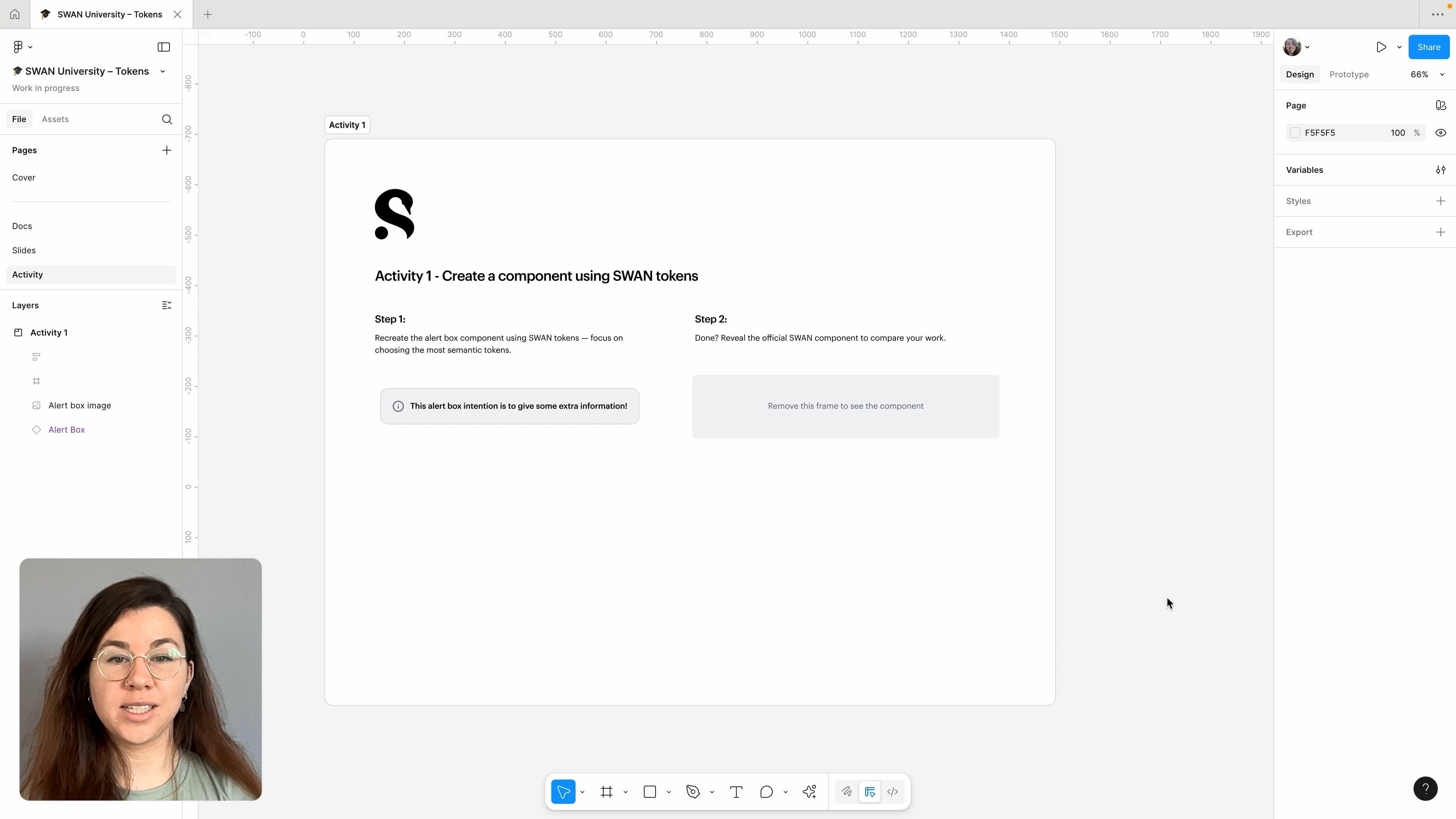
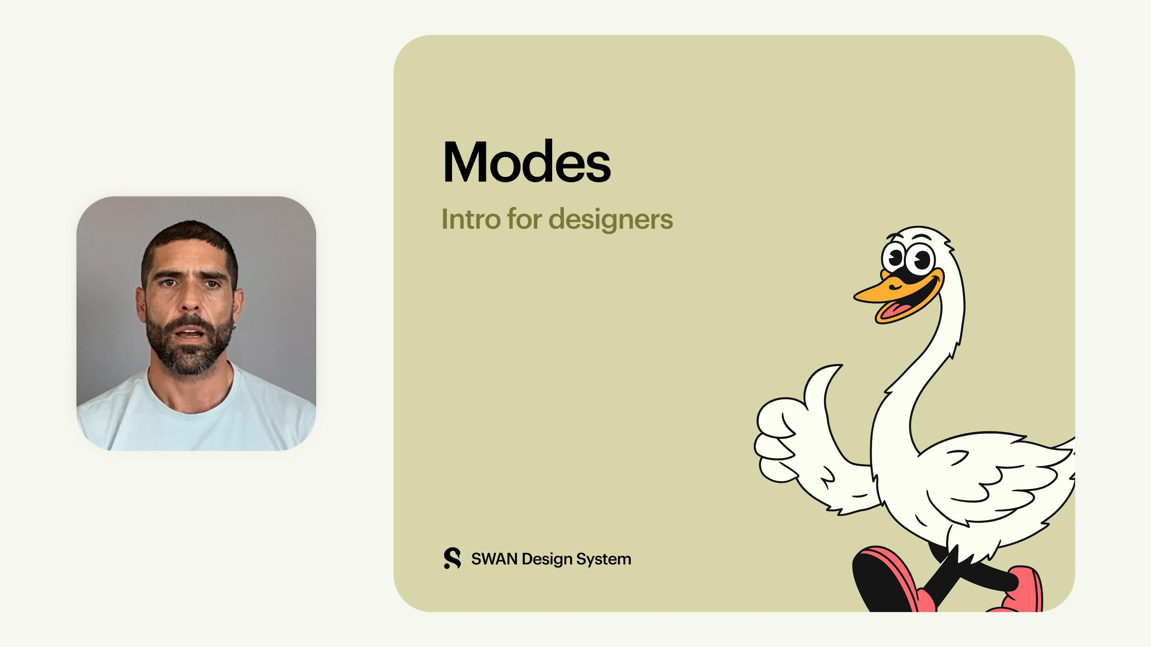
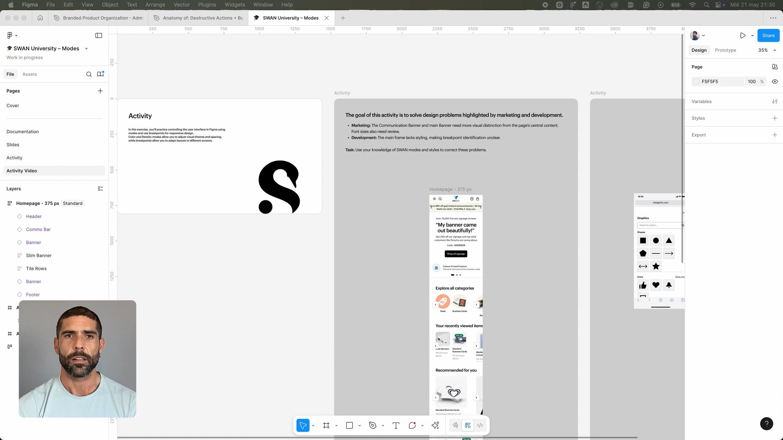
Modes
Modes in SWAN adjust token values to change the appearance of the UI. They apply to all related tokens and components. SWAN supports three modes: Standard (default), Dark, and Compact.
Refer to How to apply modes in Figma for more information or take a look at the following learning materials:
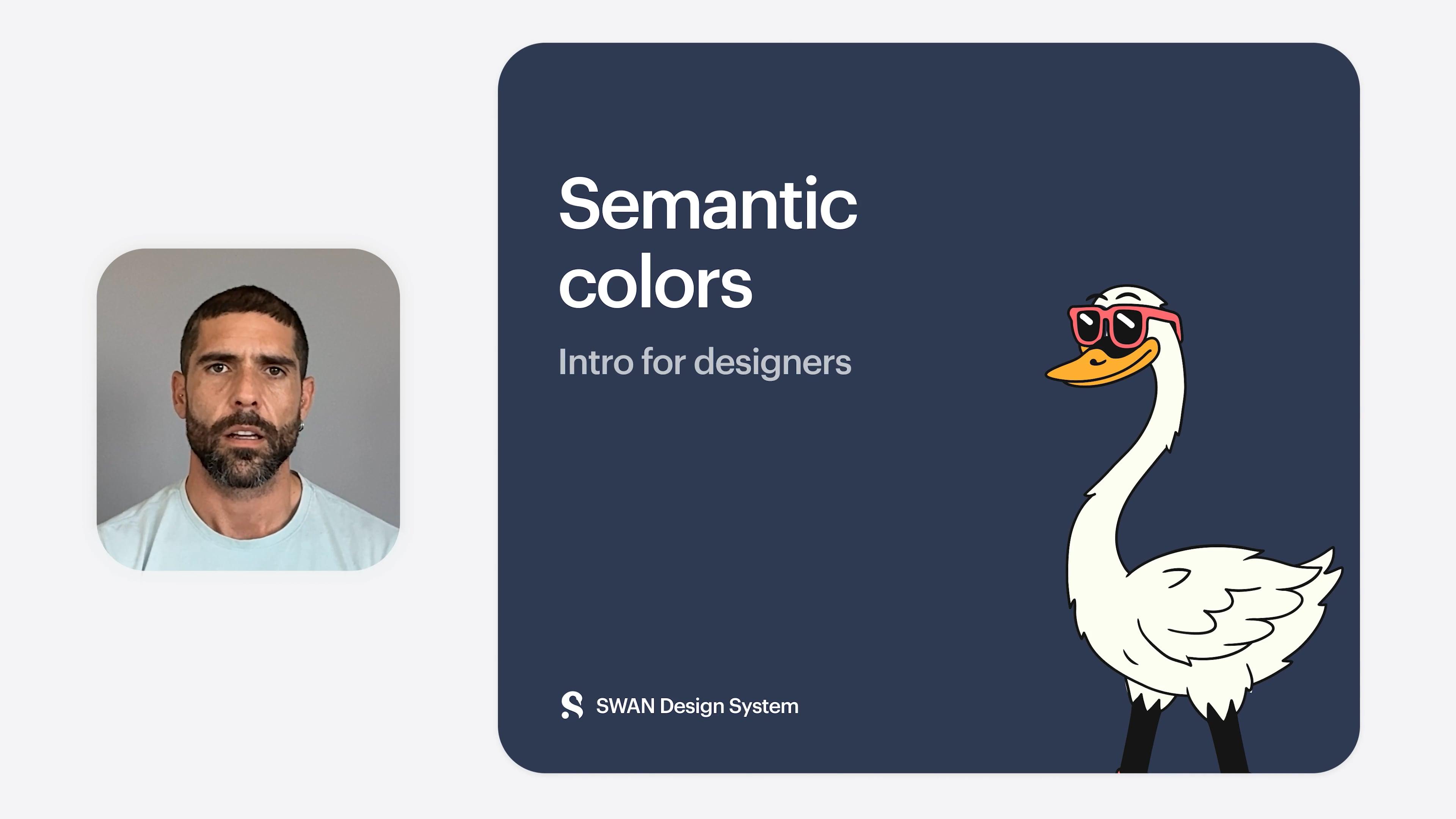
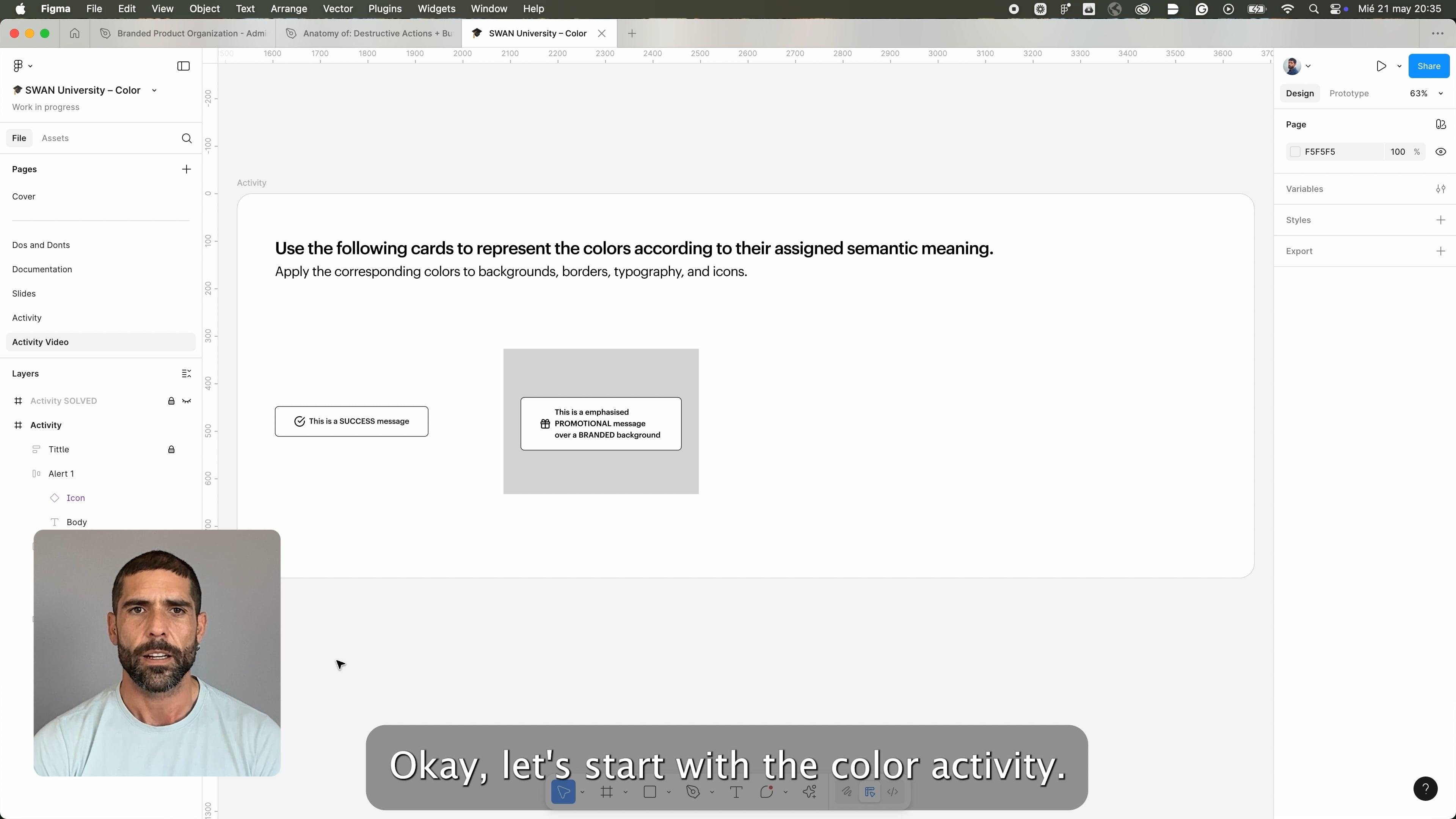
Color
Color is a fundamental element of brand visual languages, used to convey meaning, emphasis, recognizable consistency, and hierarchy across Cimpress product UI’s. Color palettes enhance the user experience by clearly differentiating elements, guiding interactions, and ensuring visual consistency.
Refer to Color for more information or take a look at the following learning materials:
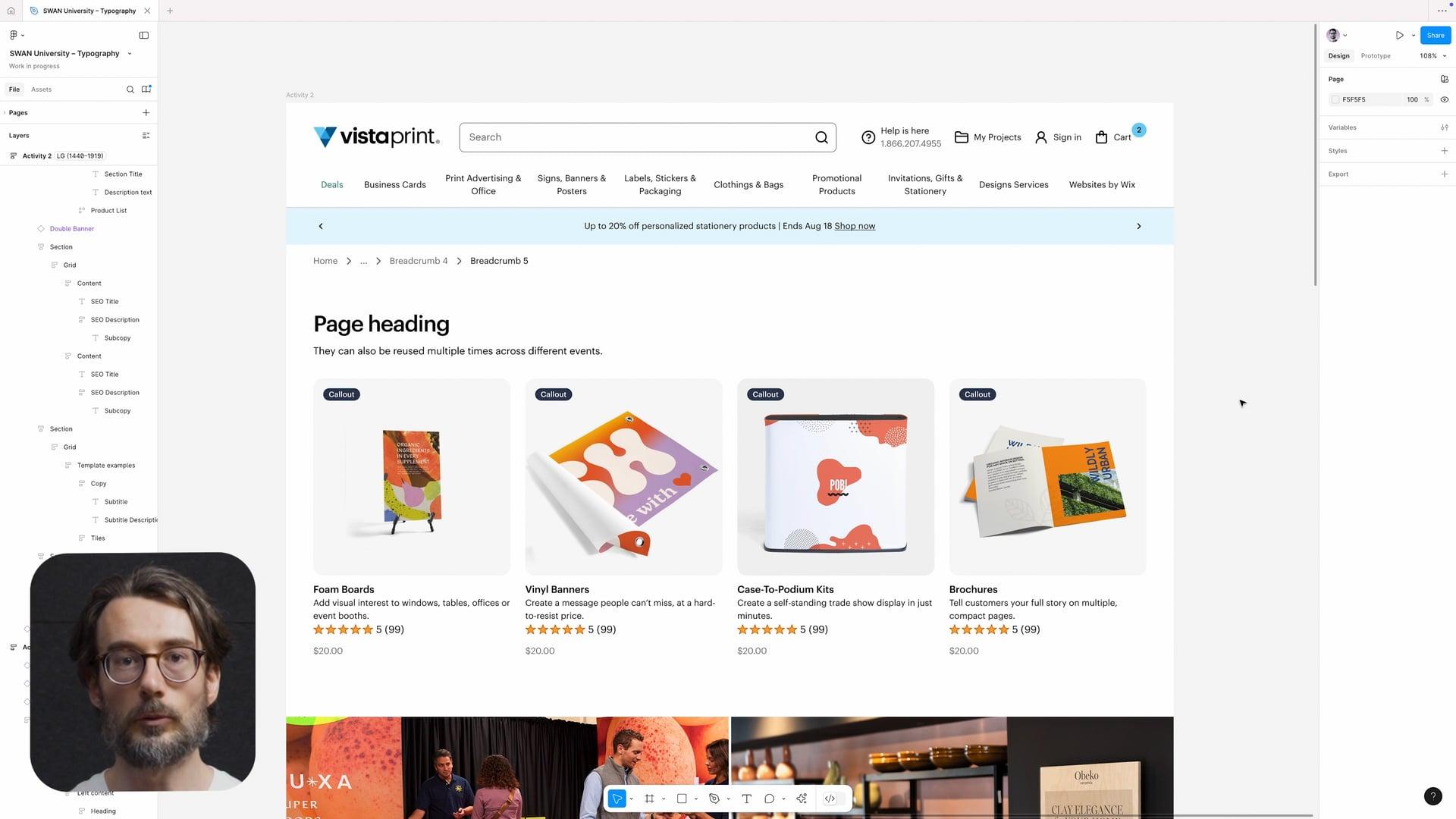
Typography
Typography guides users through an experience by organizing information and creating a clear visual hierarchy.
Typography decisions are stored in design tokens which sync between code and Figma. All typography-related design tokens start with the word font, followed by a property: family, size, weight, line-height and letter-spacing.
Refer to Typography for more information or take a look at the following learning materials:
Font skin
The recommended path for setting typography is the fontSkin prop, which bundles together styling decisions for font size, font weight, font family, line height, and letter spacing. Don’t use other explicit typographic props (e.g. fontFamily) in combination with fontSkin.
Fonts
Vista primarily uses Graphik for all heading and body typography. Tiempos is an alternative heading font used only for seasonal campaigns.
Both fonts are loaded automatically via Figma. If you need to use these fonts outside of Figma, follow these instructions.
Themes
SWAN supports theming, allowing brand styling to be applied by updating token values within a fixed token architecture. This is designed to support the Cimpress Experience Platform (CEP), a shared UI platform that standardises components and layouts across brands while still allowing for individual brand expression and content.
Refer to Theming for more information.
Expansion Packs
Expansion Packs (EPs) are a structured method for sharing bespoke UI Components. These are reusable components created and owned by product teams that solve a specific design or functional need. If widely adopted, these may be considered for graduation to SWAN.
Shared libraries
Other useful Figma libraries when designing SWAN experiences are the 🧩 Shared Components and the 🧭 Design Helper Kit. Contributions to both libraries are encouraged.


SWAN Overlay
The SWAN Overlay is a browser extension that highlights SWAN components in the UI to help assess page layout and alignment.
Find out more: SWAN Overlay
Support
Need some help or have an awesome idea? Reach out to us on Slack or via email: designsystemproductteam@vista.com