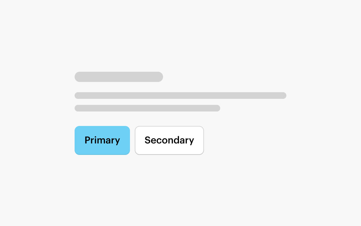
Button Placement
Groups of Buttons should be left-aligned for most layouts, with the Primary Button on the left.
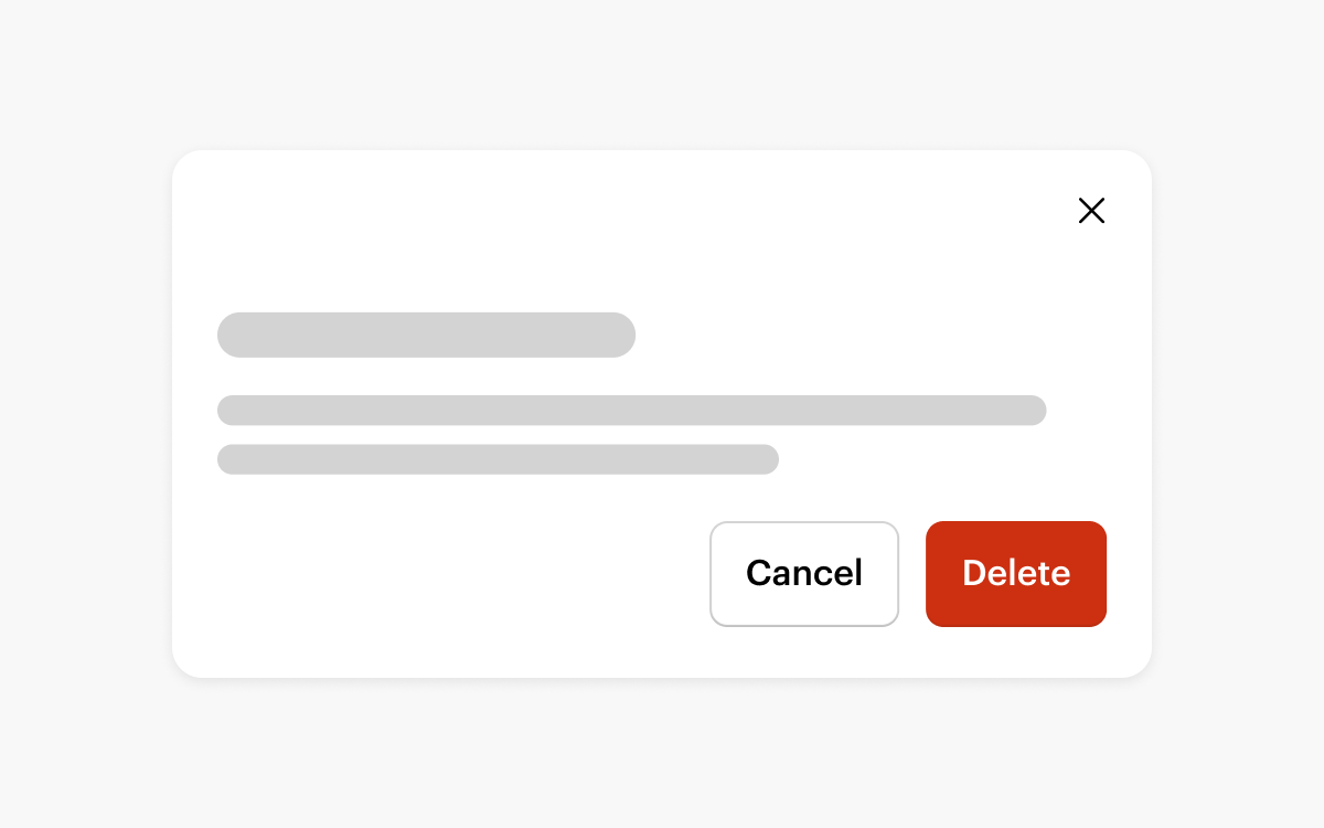
Destructive Actions
A destructive action deletes or discards data. It should be presented to users in a way that highlights the impact of the action.
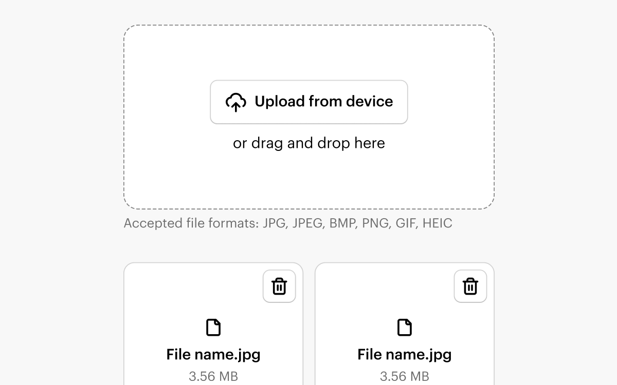
File Upload
The File Upload pattern ensures users are presented with a consistent UI regardless of the file types uploaded or the specific page navigated to.
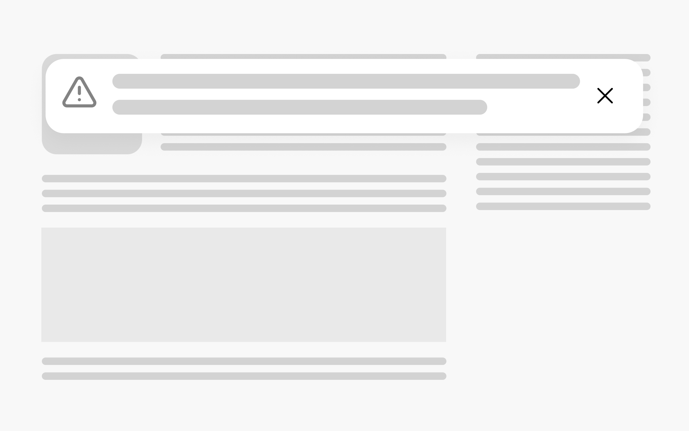
Communicating System Feedback
NewStatus Communication components help users understand and react to system feedback.

Date & Time
NewThe Date & Time pattern ensures users are presented with a consistent UI regardless of the type of date they select or the specific page navigated to.