Definition
Something is considered an error state if it meets these requirements:
- Triggered after a user interaction or system failure
- Blocks the user from progressing with their task
- Requires the user to take action in order to move forward. This action could be specific (correcting the number of digits in a phone number) or generalized (trying again later)
Localization
Our source language is EN-US (US English). Remember to hand off designs to the Localization team.
- Confluence: Localization Operations Team
- Slack: #prj-translations
Formatting and structure
Use a consistent, structured framework
Error messages should always do 2 things:
- Tell the user what went wrong (the problem). Provide a clear, concise statement about the current state. This provides context for the user and builds trust. In some scenarios the problem can be implied, as shown in Example #2
- Tell the user how to fix it (the resolution). Provide a direct, actionable path forward. An error message without guidance on how to resolve the problem is a dead end
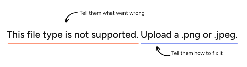
Example #1
In this example, the problem and resolution are explicitly stated. The first sentence tells us what’s wrong, and the second tells us what to do next. Each part is straightforward, and it’s a good go-to format to follow.
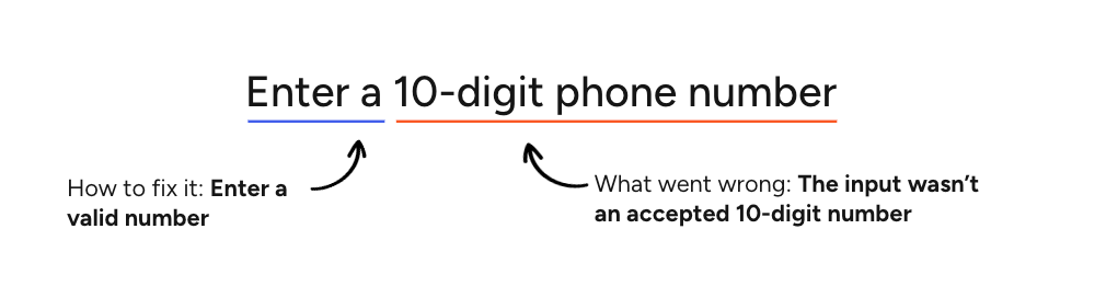
Example #2
In this example, the problem is expressed implicitly. By telling the user that the phone number needs to be 10 digits, we’re letting them know that what they entered didn’t follow that format. The solution remains explicit: they must enter the number to proceed.
Be concise and front-load important information
Aim for clarity and brevity, prioritizing critical information to enable users to understand the problem and unblock themselves as quickly as possible.
Always position Links at the end of the error
In error messages, Links should function as actionable CTAs. These should be placed at the end of the message so users get the full context of the message before being prompted to take an action.
Don’t use end punctuation after a Link.
Don’t use Links in Form errors.
Don't rely solely on color to indicate an error
The message must explicitly state the problem so screen readers and users with visual impairments don't have to rely on a red outline or icon to know something is wrong.
Grammar and mechanics
Use sentence case
It’s easier to read and helps people scan the content. Proper nouns are an exception:
- Always capitalize proper nouns such as brand names (Example: Gildan)
- Always capitalize features or site areas that have been designated as proper nouns by the organization (Example: Brand Kit or Help Center)
Never use all caps.
Remove unnecessary punctuation
Don’t use end punctuation for errors with just 1 sentence or phrase.
In multi-sentence messages, use end punctuation for all sentences.
- Exception: When an error message ends with a Link, don’t use end punctuation after the Link
Never use exclamation marks as they can imply a false sense of urgency or severity.
An error message should never include a question, so don’t use question marks either.
 Examples
- Please enter an email address
- We’re having trouble loading this preview. Please refresh the page or try again later.
Use consistent tenses for ongoing or completed issues
Use present tense for ongoing issues or states. Use past tense to describe a distinct, completed event that caused a problem.
Examples (Present)
- This file format is not supported
- We're having trouble loading this preview
Example (Past)
- We couldn't save your address
Don’t use Latin abbreviations
Don't use Latin abbreviations like i.e. or e.g. to introduce examples.
Instead of
Enter a 10-digit US number including the area code (e.g., 555-555-5555)
Use
Enter a 10-digit US number with an area code (555-555-5555)
Language, voice and tone
Don’t use technical jargon or negative language
Never use technical backend terms such as: error codes, null, API, 404, timeout, syntax, database, invalid, failed, forbidden. Use plain language instead.
Don’t create a false sense of urgency
Never use all caps or exclamation points and avoid language that could be considered alarming, such as: urgent, critical, warning. This can make a situation seem worse than it is, causing unnecessary stress for users. Keep messaging straightforward and constructive.
Write meaningful CTAs
If the error message includes a Button or Link, the copy must clearly describe the action.
Instead of
- Update
- Go back
- Click here (to edit)
- OK
Use
- Update billing information
- Return to cart
- Edit shipping address
- Save changes
Write for a Flesch reading ease score of 60–80 (US Grade 6–8 reading level)
Clear, simple phrasing is essential for minimizing mental effort and to ensure successful translation / localization. Use the Error message generator (beta) to check the reading ease score.
Don’t blame the user
Avoid using pronouns like “you” or “your” in a way that implies fault. Instead, focus on neutral, solution-oriented language.
Instead of
You didn't select a date
Use
Select a date
Use “please” cautiously
Using "please" can undermine our authority. It could lead users to think a required next step is an optional suggestion. Use clear, direct verbs instead.
Instead of
Please enter your first name
Use
Enter your first name
Use “sorry” cautiously
Saying "sorry" too often or in the wrong context can make the situation feel worse, especially if multiple apologies in a single session compound.
Take responsibility with words like “we,” “us” or “our”
When our systems fail, it's better to take responsibility using "we" than to say "sorry." Focus on the resolution rather than dwelling on the apology.
Instead of
We're sorry, something went wrong. Please try again.
Use
Something went wrong on our end. Refresh the page or try again.
Only apologize when we’re at fault
When an apology is necessary, keep it concise and focus on the resolution.
Instead of
This payment method is currently unavailable. We apologize for the inconvenience this may cause.
Use
Sorry, this payment method is currently unavailable. Select a different payment method or try again later.
Use the relevant Cimpress brand name when requesting access to third party platforms
Using brand names provides better clarity in security contexts and aligns with the formal "App Name" displayed by third-party OAuth screens (like Google or Meta). Never use “we” when requesting access to third-party accounts.
Instead of
We need access to Google Drive
Use
VistaPrint needs access to Google Drive